Corr-correlation
We recently read two blog posts from Robot Wealth and FOSS Trading on calculating rolling pairwise correlations for the constituents of an S&P 500 sector index. Both posts were very interesting and offered informative ways to solve the problem using different packages in R: tidyverse or xts. We’ll use those posts as a launchpad to explore the rolling correlation concept with respect to forecasting returns. But we’ll be using Python to do a lot of the heavy lifting. However, as this blog is produced using blogdown, it will be wrapped in the reticulate package.
If all that package talk is gobbley gook, don’t worry; our goal, as always, is to present the data and results in a format that doesn’t require familiarity with R or Python. If you are familiar and you want to see how we produced the results, you’ll find the code at the end of the post.
One further administrative point, you can now subscribe to the blog via the button at the top right. If there any glitches in the initial subscription, please bear with us, as this is a work in progress. We added this functionality because we’ve had requests for the subscription option, so this should help keep you abreast of new content. At the moment, we post two to four articles a month. We’d love to post more, but job and life get in the way. Enough admin stuff. Let’s get to the data!
It’s an old saw among traders that correlations go to one in bear markets. In other words, when the fit hits the shan, most stocks move the in the same direction—down—which yields high positive correlation. But other factors make correlations increase too. When there’s a lot of uncertainty around key macroeconomic or political variables or factors that affect the discount rate, then the performance and outlook for individual companies often matters less, and correlations rise. But randomness and noise could be factors too. The main question then is, do changes in correlations offer any predictive value?
Unlike the posts mentions above, for this post, we’ll use the constituents of XLI, an ETF offered by State Street Global Advisors meant to track companies in the S&P 500 that fall within the sector known as “industrials”. We’ll start off pulling the data since 2005. We’ll then split the data into the traditional train and test sets with the cut-off at about mid-2015 (about 70% of the data). We then calculate the average pairwise correlation for the constituents on a rolling 60-trading day window, roughly equivalent to three-months. Using that data we’ll compare the constituent correlations to the actual ETF. Clearly, there’s survivorship and weighting bias, but let’s crawl before we sprint. Here’s a graph of the rolling correlation.
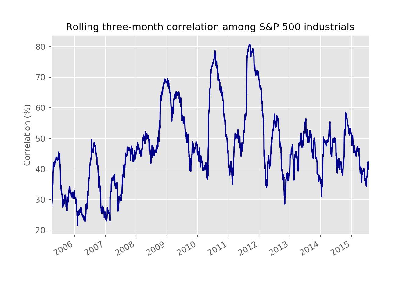 From the graph above we see that the average of the rolling correlation was about 47%. During the global financial crisis, correlations did rise to about 70%, but that wasn’t the highest. In late 2011, correlations peaked out at 81%. This coincided with a drop in the market, but one not nearly as severe as the financial crisis. Nonetheless, the macro was at the forefront, as the risk of contagion from a potential sovereign debt crisis in Europe and a downgrade to the USA’s debt rating stoked fears of another financial crisis. We can see that more clearly by adding in the cumulative return of the industrials index in the graph below.
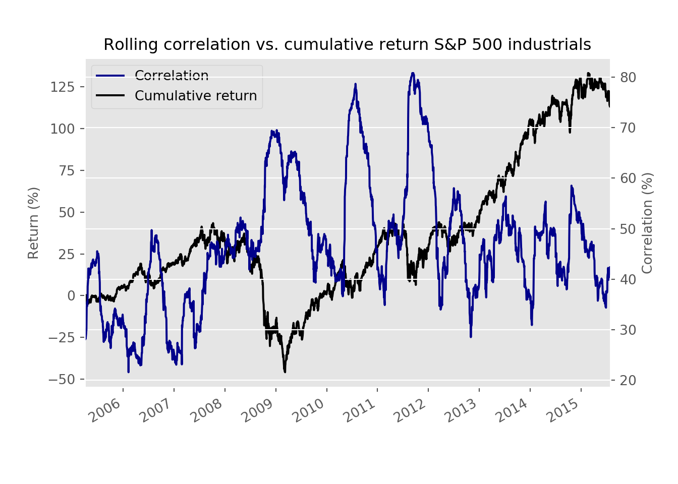 The graph certainly supports the “correlation to one” notion even if correlations didn’t actually get to one. They did, however, increase with downturns in the index, although the magnitude of the decline didn’t always seem to match the spike in correlations. Additionally, while a positive trend to returns does appear to align with declining correlations, the rates of change don’t. Part of that is due to the scale as well as the fact that correlation is a metric bounded by negative one and one. Interestingly, correlation bottoms out at about 22%. It also doesn’t ever go negative for fundamental1 and mathematical2 reasons.
Before we move on to modeling, we want to show one more graph. Here we look at the rolling correlations again but, compare them to the forward rolling three-month return. In other words, we’re comparing the average correlation among all the stocks over the last three months against the endpoint return three months hence.
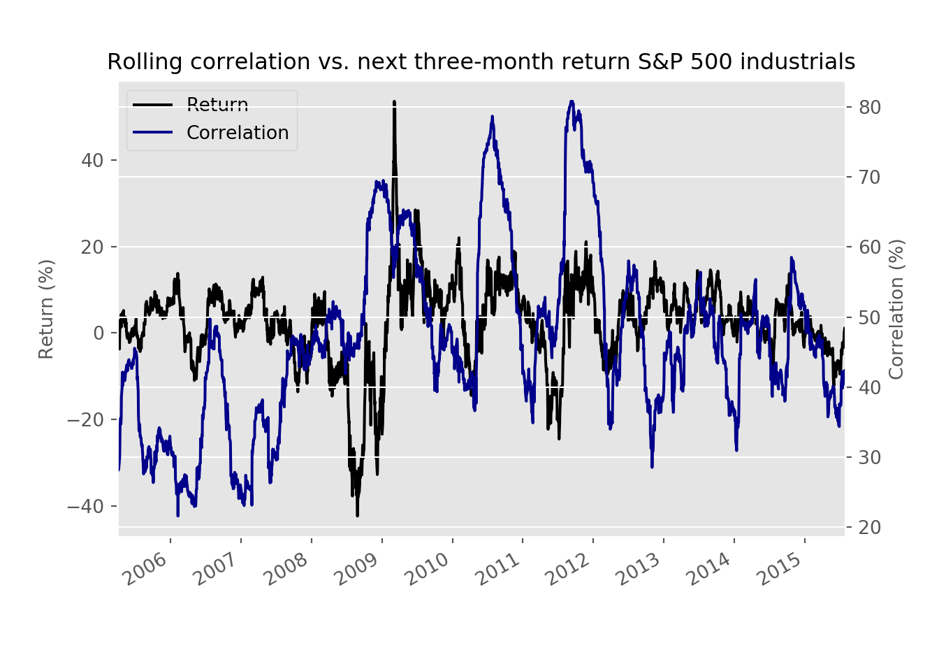 While not a high correlation, there is still some relationship that warrants investigation. Our first pass will be to run a linear regression on the rolling correlation vs. the next day return. We know, we know there isn’t a fundamental reason for this analysis, so much as a way to establish a baseline. We show the root mean squared error (RMSE) and that error scaled by the standard deviation of return (the dependent variable) in the table below. We don’t show the model’s coefficient, but it is positive.
| Metric | Results |
|---|---|
| RMSE | 0.014 |
| RMSE scaled | 1.000 |
We like to show a scaled RMSE because even though RMSE’s are useful when comparing models, the absolute number doesn’t always give you much information if you don’t know the basis. How much of an error does the model represent relative to what was observed? In this case, we see that that model’s error might only be less than 1.5% points. But that amount is almost 100% of the daily average variation. While that might seem atrocious, recall that correlation was never negative and the regression coefficient was positive too. Hence, getting the direction wrong has a sizable impact on the error rate, even if we’ve mitigated it somewhat by using standard deviation instead of the average return to scale the RMSE.
Let’s now look at the error relative to prediction to get a sense of how much the variability of error changes with the model’s prediction. We want this error to appear random and within a defined boundary—think cloud rather than lightning.
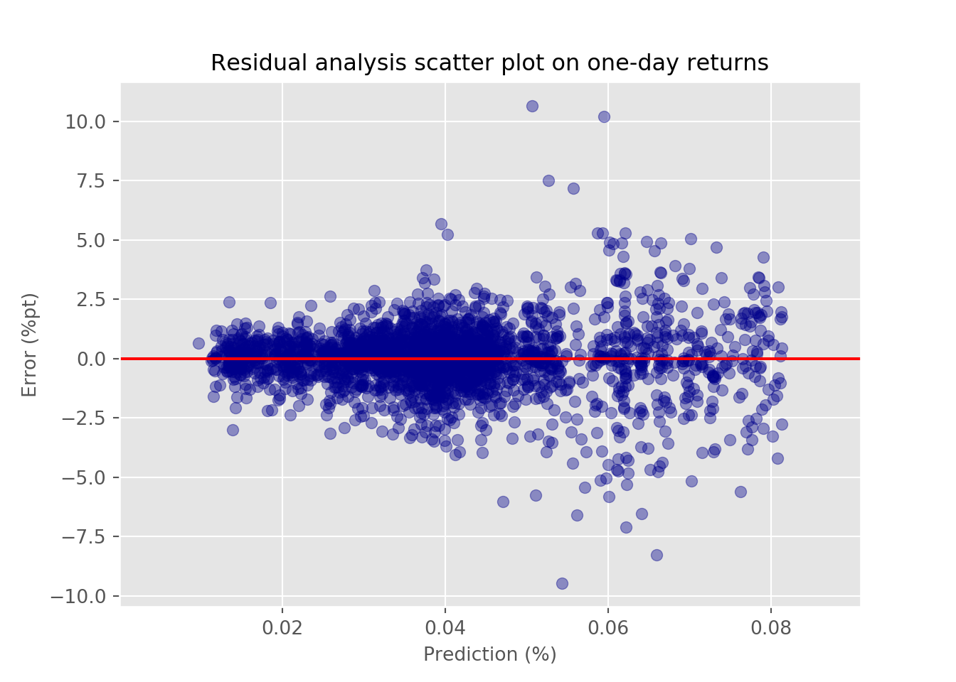 We see that up to about a prediction of a 50bps move in the underlying index, the variability of error seems fairly random. Afterward, however, it spreads out suggesting the variability is not stable.3 That will raise some flags as to the model’s estimates, which we’ll have to deal with later. Whatever the case, let’s run the regression using the next three month return. We show the error rates in the table below.
| Metric | Results |
|---|---|
| RMSE | 0.097 |
| RMSE scaled | 0.991 |
The RMSE increases, but that’s most likely because three-month returns tend to be greater and one-day returns. We see the scaled RSMSE is about the same as in the previous model. We graph the error vs. the prediction below.
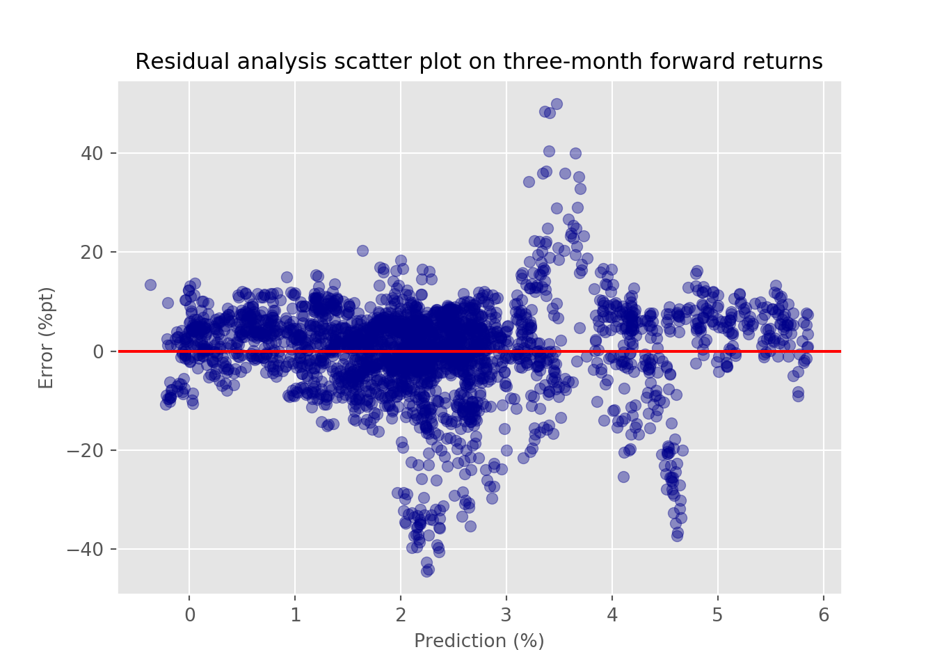 In this case, we see even greater variability in error relative to the prediction, suggesting even more issues on the longer time frame with the model. Moreover, there appears to be a chevron shape between the prediction range of 2% to 5%, implying a non-linear model might be better in some cases.
What have we learned so far?
Spikes in a simple average of three-month rolling pairwise correlations of the members of the S&P 500 industrials sector coincide with declines in the underlying index.
This rolling correlation also exhibits some relationship with returns of varying lengths in the index.
A linear model used to describe the relationship between the rolling correlation and one-day or three-month forward returns doesn’t do that great of job given its relatively high error rate, whose variability is also pretty unstable.
Given these findings, what’s the plan?
We could apply different models that handle the changing variability of error to see if those algorithms explain the relationships better.
Instead of assuming rolling correlations predict returns, we could examine whether they predict environments, such as bear, mean-reverting, or trending markets.
Instead of using an aggregate correlation figure, we could break the pairs into quantiles to describe the relationship of future returns relative to the index or each other.
We could weight the pairwise correlations by market cap or some other factor. The simple average we’re using implies equal weighting, which means it may be giving more or less weight to stocks that don’t drive the underlying index’s returns to the same degree.
We haven’t decided which avenue to pursue, but if you have a preference, or, don’t want to read another thing about correlations, email us at nbw dot osm at gmail. Until next time, here’s the code behind the above. And please subscribe!
# Built using R 3.6.2 & Python 3.7.4
# Since this post uses both R and Python. We'll distinguish them in the code below by [R] or [Python]

### [R]
## Load packages
suppressPackageStartupMessages({
  library(tidyquant)
  library(tidyverse)
  library(reticulate) # development version
})

# Allow variables in one python chunk to be used by other chunks.
knitr::knit_engines$set(python = reticulate::eng_python)


### [Python]
## Load libraries
import numpy as np
import pandas as pd
import matplotlib.pyplot as plt
import matplotlib
import os
os.environ['QT_QPA_PLATFORM_PLUGIN_PATH'] = 'C:/Users/user_name/Anaconda3/Library/plugins/platforms'
# This last bit of code resolve a "QT" error we couldn't figure out. Depending on enviroment, you'll probablybe ussing a differnt path

# Note: Although many users recommend using use_condaenv(), that gave us a not recognized error. So we omitted it without any issues.

plt.style.use('ggplot')

## Load prices
# Get tickers
url = "https://www.ssga.com/library-content/products/fund-data/etfs/us/holdings-daily-us-en-xli.xlsx"
tickers = pd.read_excel(url, skiprows=4)

ticker_list = list(tickers['Ticker'][:66])
ticker_list = [ticker.replace(".", "-") for ticker in ticker_list]
ticker_list = [ticker for ticker in ticker_list if ticker not in ["OTIS", "CARR"]]

# Download prices
start_date = "2005-01-01"
end_date = "2019-12-31"

try:
    prices = pd.read_pickle('xli_prices.pkl')
    print('Data loaded')
except FileNotFoundError:
    print("Data not found. Downloading...")
    prices = dr.DataReader(ticker_list,"yahoo", start_date, end_date)
    prices.to_pickle('xli_prices.pkl')

## Create return df
returns = prices.pct_change()[1:]

## Create correlation function
def mean_cor(df):
    corr_df = df.corr()
    np.fill_diagonal(corr_df.values, np.nan)
    return np.nanmean(corr_df.values)

cor_df = pd.DataFrame(index = returns.index[60:])
cor_df['corr'] = [mean_cor(returns.iloc[i-60:i,:]) for i in range(60,len(returns))]

## Create training df
tr_idx = round(len(cor_df)*.7)
train = cor_df[:tr_idx]
test = cor_df[tr_idx:]

## Plot correlation
train.plot(color = "darkblue")
plt.xlabel("")
plt.ylabel("Correlation")
plt.title("Rolling three-month correlation among S&P 500 industrials")
plt.show()

## Stats
train_mean = np.round(train['corr'].mean(),2)*100
train_max = np.round(train['corr'].max(),2)*100
train_min = np.round(train['corr'].min(),2)*100
train_09_max = np.round(train.loc["2009",'corr'].max(),2)*100

## Load XLI prices
start_date = "2005-01-01"
end_date = "2019-12-31"

xli = dr.DataReader("XLI", "yahoo", start_date, end_date)['Adj Close']
xli_ret = xli.pct_change()[1:]

xli_df = pd.DataFrame(xli_ret)
xli_df.columns = ['return']

## Merge XLI with train df
train = pd.merge(train, xli_df, how="left", on = 'Date')
train['cum_ret'] = (1+train['return']).cumprod()

## Graph correlations and index
train_graf = train.copy()
train_graf.columns = ['Correlation', 'Return','Cumulative return']

ax = (train_graf[['Correlation','Cumulative return']]*100).plot(secondary_y = ['Correlation'],
                                                          color=['darkblue','black'],
                                                          mark_right = False)
ax.set_ylabel("Return")
ax.right_ax.set_ylabel('Correlation')
ax.set_xlabel("")
plt.title("Rolling correlation vs. cumulative return S&P 500 industrials sector")
plt.show()

## Create forward return dfs
xli_30 = xli.pct_change(20).shift(-20)
xli_90 = xli.pct_change(60).shift(-60)

## Gragh correlation vs three-month foward return
train_graf['Return'] = xli_90['2005-04-01':'2015-07-29'].values

ax = (train_graf[['Return', 'Correlation']]*100).plot(secondary_y = ['Correlation'],
                                                          color=['black', 'darkblue'],
                                                          mark_right = False)
ax.set_ylabel("Return (%)")
ax.right_ax.set_ylabel('Correlation (%)')
ax.set_xlabel("")
lines = ax.get_lines() + ax.right_ax.get_lines()
ax.legend(lines, [l.get_label() for l in lines], loc='upper left')
ax.set_title('Rolling correlation vs. next 90-day return S&P 500 industrials')
plt.show()

## Run linear regression
from sklearn.linear_model import LinearRegression
from sklearn.metrics import mean_squared_error

X_train = train['corr'].values.reshape(-1,1)[:-1]
y_train = train['return'].shift(-1).values[:-1]

lin_reg = LinearRegression()
lin_reg.fit(X_train,y_train)
pred = lin_reg.predict(X_train)

rmse = np.sqrt(mean_squared_error(y_train, pred))
rmse_sc = rmse/np.std(y_train)


### [R]

## Create df to print error stats
data.frame(Metric = c("RMSE", "RMSE scaled"), Results = c(py$rmse, py$rmse_sc)) %>%
  mutate(Results = round(Results, 3)) %>%
  knitr::kable()

### [Python]

## Graph error vs. prediction
error = y_train - pred

plt.figure()
plt.scatter(pred*100, error*100, color='darkblue', alpha=0.4)
plt.xlabel("Prediction (%)")
plt.ylabel("Error (%)")
plt.axhline(0, color='red')
plt.title("Residual analysis scatter plot");

## Run regression on three-month forward return
X_train = train['corr'].values.reshape(-1,1)[:-1]
y_train = xli_90['2005-04-01':'2015-07-29'].values[:-1]

lin_reg = LinearRegression()
lin_reg.fit(X_train,y_train)
pred = lin_reg.predict(X_train)

rmse = np.sqrt(mean_squared_error(y_train, pred))
rmse_sc = rmse/np.std(y_train)

### [R]

## Create df to print error stats
data.frame(Metric = c("RMSE", "RMSE scaled"), Results = c(py$rmse, py$rmse_sc)) %>%
  mutate(Results = round(Results, 3)) %>%
  knitr::kable()

### [Python]

## Graph error vs predictions on three-month model
error = y_train - pred

plt.figure()
plt.scatter(pred*100, error*100, color='darkblue', alpha=0.4)
plt.xlabel("Prediction (%)")
plt.ylabel("Error (%)")
plt.axhline(0, color='red')
plt.title("Residual analysis scatter plot for three-month forward returns");
Most of the companies are influenced by the same macro factors↩
Each company would need to move in a different direction from the majority of the others—something difficult when there are only two directions: up or down!↩
Indeed, a Breusch-Pagan test reveals a heteroscedastic relationship with a p-value less than 0.05.↩