Mean expectations
We’re taking a break from our extended analysis of rebalancing to get back to the other salient parts of portfolio construction. We haven’t given up on the deep dive into the merits or drawbacks of rebalancing, but we feel we need to move the discussion along to keep the momentum. This should ultimately tie back to rebalancing, but from a different angle. We’ll now start to examine capital market expectations.
Capital market expectations are the bedrock of portfolio construction. From pension funds to hedge funds, from portfolio managers to financial advisors, one needs to make some sort of assumption about the future—explict or otherwise. The reason: you’re building a portfoliog to achieve some expected return. The starting point, then, is to estimate the expected returns of various asset classes worthy of inclusion in a satisfactory portfolio. Yet, where do these expectations come from?
Practictioners use three main methods:
- Historical means
- Discounted cash flow
- Risk premia
Each has its advantages and drawbacks. For this post we’ll introduce the concept of using historical means to formulate expected returns without going into an exhaustive analysis of the benenfits and drawbacks of this method.
The mean return over a sufficient period is a very economical way to estimate expected returns. The data and calculation are relatively easy to procure. And the concept is easy to understand: the future will look somewhat like the past. But there are a number of problems with this approach:
- What’s the confidence that this mean is the right one?
- What’s the right period to use to calculate the mean?
- How do we know the future will resemble the past?
We’ll use the S&P 500 to explore some of these questions. We start by graphing a histogram of monthly returns from 1950 to the present. We overlay a normal distribution (red line) and boundaries for two standard deviations (vertical blue lines).
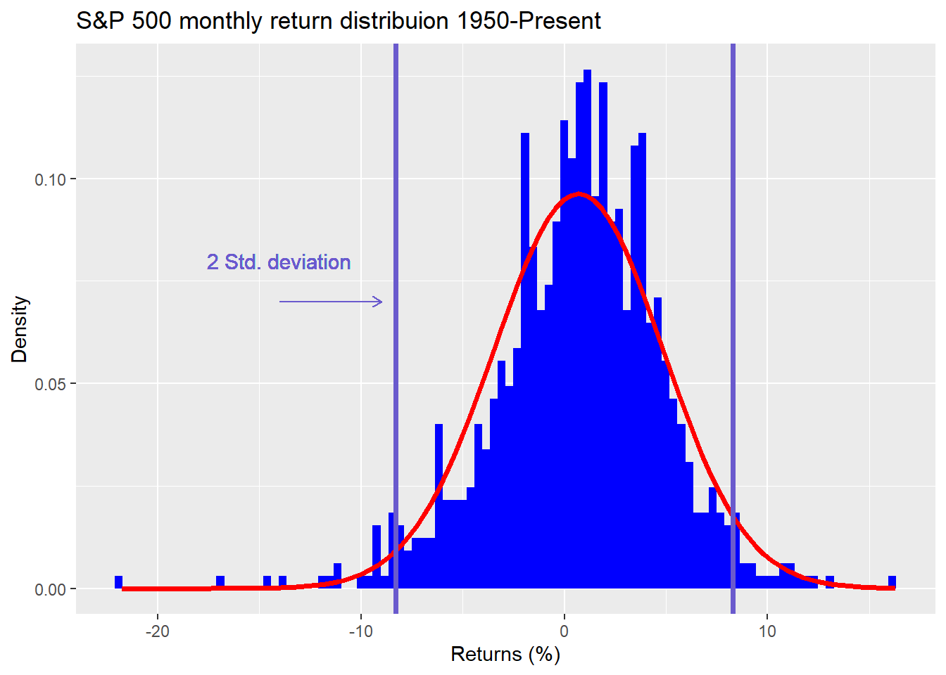
As is evident, the returns don’t fall into a normal distribution, are negatively skewed (more negative observations), and are fat-tailed (more observations pierce the red line at the ends of the graph). Why is this an issue? Using the properties of a normal distribution on non-normal data won’t yield the same degree of confidence that the calculated mean is a good estimate of the true mean. Moreover, the range of likely outcomes will be different than a normal distribution. The normal distribution estimates that only 5% of the observations will fall outside of two standard deviations. For the S&P, it’s more than that and not symmetric—more observations outside of a negative two standard deviations, less observations outside of a positive two.
There are ways to get around this. One is to bootstrap the data to arrive at non-parametric estimates. That is, pull returns from the data thousands of times to arrive at multiple samples of mean returns. Since the present data set is so large, bootstrapping won’t produce a huge difference. but we’ll show the results for completeness in the table below.
| Estimate | Return | Lower | Upper |
|---|---|---|---|
| Sample | 8.4 | 5.0 | 11.8 |
| Bootstrap | 8.2 | 4.7 | 11.7 |
As one can see the bootstrapped return is not that far off from the sample return and the confidence intervals are pretty close too. But should we be using the entire dataset to estimate the mean return?
There’s a good argument to claim that the period from 1950s to the 1980s was much different than the period afterward, and not because of nostalgia. The U.S., the main economy underpinning the S&P, saw a siginficant shift from a manufacturing to a consumer-driven economy. Then there’s technological change, globalization, and financial innovation.
Our point is not to argue that we’re living in a brave new world; rather, it’s to stress that the factors driving returns many decades in the past, are not likely to be the same factors that drive returns in the future. Hence, why should long ago returns have the same weight as the near term on our estimates of the future, which is what is implied when one uses a simple average? A graphic should help highlight this phenomenon. In the graph below, we present the average return calculated over a period that starts on every year since the beginning of our data set until the present. The last start year is 2000 so even the shortest timeframe features 20 years of data.
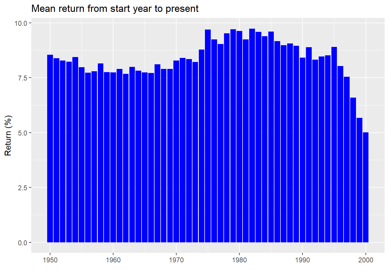
As one can see, even for long periods of time, mean returns aren’t stable. The range is 4.8 percentage points. While that might seem small, using the top end would yield 20% more money than the bottom after five years. And this doesn’t account for the confidence interval of that estimate. We graph the mean return along with the 95% confidence interval below.
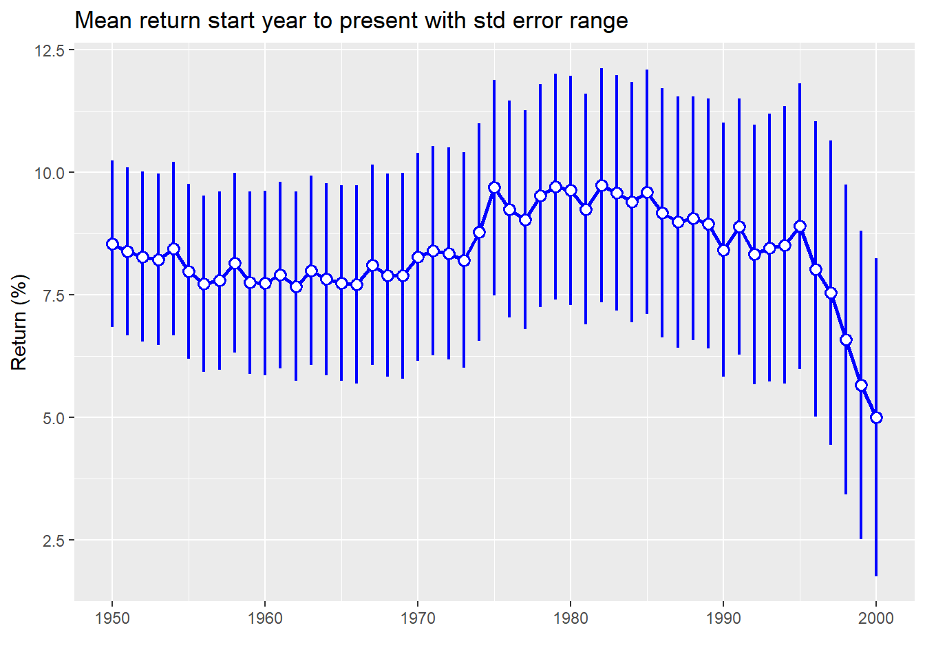
Here we see that not only is the mean return declining, but the confidence interval is getting wider. That suggests we should be less certain how close that single estimate of return is to the true return.
To see how wide the confidence intervals have become, in the chart below we graph the absolute value of the potential range of returns as a percentage of the mean. In other words, we take the standard width of the confidence interval (whether up or down) and divide it by the mean return. This gives one a standardized estimate as to how wide the outcomes could be.
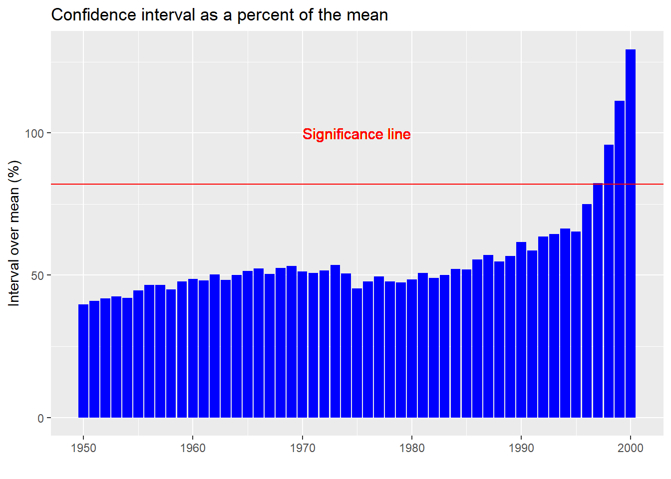
A few points to note with ths graph. First, even at the low end, a confidence interval that is 40% above or below the mean is pretty wide. But one that is 129% of the mean (the ratio at the high end) borders on absurdity. In truth, if your confidence interval crosses zero (implied by the 100% or greater ratio), then you might as well assume that the sample mean is not much different than noise. The red line on the plot shows where that cut-off occurs. In other words, from 1997 on, it is really hard to pinpoint what the true average return might be.
But don’t let statistics get in the way of a good story! That period included two major drawdowns—the tech bubble and the global financial crisis—along with an unprecedented drop in interest rates globally and massive money printing. So shouldn’t it feature different returns than the past? If we graph the distributions before and after 1997, an artificial cut-off to say the least, we don’t see a dramatic difference
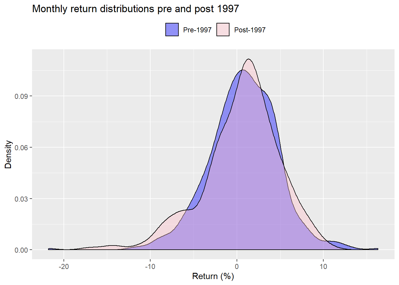
When we bootstrap the difference in means for the period pre and post-1997, we find that only 25% of the samples produced a lower mean for the post-1997 data vs. the pre-1997 data. That suggests that the differences we do see in the mean returns (post-1997 is lower than pre on the actual data) are likely due to chance. Seem’s like we’re in a quandary.
Ultimately, even if we had a great deal of confidence that the mean return we calculate was the correct number, what confidence do we have that it will be the right number in the future? Don’t all those investment brochures tell us that that past performance is not indicative of future results?
Part of the problem might be methodological. The approach we’re using assumes there is some true population mean, and the data we have is only one sample from that population. Our confidence that the average returns we’ve calculated are the true averages, assumes there is some underlying order to the population distribution. Bootstrapping doesn’t assume as much, but it certrainly doesn’t believe we’re drawing data from a chaotic soup. However, other approaches don’t make an assumption about the population. They turn it around, believing that one can make an educated guess about the distribution based on the data observed. This approach fits the distribution to the data vs. fitting the data to the distribution, as in the prior method.1 Perhaps using this second approach, we can achieve more confidence about which mean return to use. But we’d have to test that in another post.
A different approach might be to use some sort of rolling average of past returns to forecast a future return. We might average the past five years of monthly data as a way to forecast the next year or few years of returns. For example, when we regress the rolling five-year monthly annualized returns against the forward three-year annualized returns we arrive at the following statistics.
| Term | Estimate (%) | Statistic |
|---|---|---|
| Intercept | 8.6 | 18.2 |
| Five-year returns | -0.1 | -2.3 |
The estimates are significant and the intercept approximates the long-run mean return we calculated previously, while capturing some degree of mean reversion. We’d want to analyze this approach using a train-test split to see how well this would work out-of-sample. It could prove interesting, but that will also have to wait for another post.
Let’s review. The historical mean return is an intuitive, easy-to-use proxy for expected future returns. But having confidence in any particular estimate is relatively low. A range of likely outcomes would seem better, except that depending on the period used, that range may be too wide to be useful. Which brings us to a third point: deciding which period to use leads to some very different estimates of the future.
Clearly, this wasn’t an exhaustive examination of using the historical mean to formulate expected returns. It asked more questions than answered. But the goal was only to introduce the concept. Next we’ll examine the other methods we mentioned above; that is, discounted cash flow and risk premia methods. After we’ve discussed all these approaches, we can then analyze which approach or combination of approaches is likely to produce the most accurate forecast. Until then, here’s all the code behind this week’s post.
### Load packages
suppressPackageStartupMessages({
  library(tidyquant)
  library(tidyverse)
  library(boot)
  })

options("getSymbols.warning4.0"=FALSE)

### Load data
# SP500 price
sp <- getSymbols("^GSPC", src = "yahoo", from = "1950-01-01", auto.assign = FALSE) %>%
  Ad() %>%
  `colnames<-`("sp")

sp_mon <- to.monthly(sp, indexAt = "lastof", OHLC = FALSE)
sp_ret <- ROC(sp_mon, type='discrete')
df <- data.frame(date = index(sp_ret), sp = as.numeric(sp_ret))

## Histogram
df %>%
  ggplot(aes(sp*100)) +
  geom_histogram(aes(y = ..density..),
                 fill = "blue",
                 bins = 100) +
  stat_function(fun = dnorm,
                args = list(mean = mean(df$sp*100, na.rm = TRUE),
                            sd = sd(df$sp*100, na.rm = TRUE)),
                color = "red",
                lwd = 1.25) +
  geom_vline(xintercept = sd(df$sp*100, na.rm = TRUE)*-2, size = 1.25, color = "slateblue") +
  geom_vline(xintercept = sd(df$sp*100, na.rm = TRUE)*2, size = 1.25, color = "slateblue") +
  geom_text(aes(x = -12, y = .08,
                label = "2 Std. deviation"),
            size = 4,
            color = "slateblue") +
  geom_segment(aes(x = -14, xend = -9,
                   y = .07, yend = .07),
               arrow = arrow(length = unit(2, "mm")),
               color = "slateblue") +
  labs(x = "Returns (%)",
       y = "Density",
       title = "S&P 500 monthly return distribuion 1950-Present")

mean_ret <- round(mean(df$sp, na.rm = TRUE),3)*1200

med_ret <- round(median(df$sp, na.rm = TRUE),3)*1200


t_test <- t.test(df$sp)
t_stat <- t_test$statistic
low <- round(t_test$conf.int[1],3)*1200
high <- round(t_test$conf.int[2],3)*1200

## Create function for boot
mean_boot <- function(df,index){
  dat <- df[index,]
  mean(dat$sp, na.rm = TRUE)
}


## Run boot
set.seed(123)
b_strap <- boot(df,mean_boot,1000)

## Create summmry stats
bs_mean <- mean(b_strap$t)*1200
bs_up <- (mean(b_strap$t)+2*sd(b_strap$t))*1200
bs_low <- (mean(b_strap$t)-2*sd(b_strap$t))*1200

sderr <- sd(df$sp,na.rm = TRUE)/sqrt(nrow(df))
samp_mean <- mean_ret
samp_up <- (mean_ret/1200 + 2*sderr)*1200
samp_low <- (mean_ret/1200 - 2*sderr)*1200

## Compile data frame
stats <- data.frame(Estimate = c("Sample", "Bootstrap"),
                    Return = c(samp_mean, bs_mean),
                    Lower = c(samp_low, bs_low),
                    Upper = c(samp_up, bs_up))

## Print table
stats %>%
  mutate_at(vars(-Estimate), function(x) round(x,1)) %>%
  knitr::kable(caption = "Estimates with lower and upper confidence levels (%)")


## Create rolling forward to present mean return

# create index and function
index <- data.frame(start = seq(as.Date("1950-01-01"),length = 51, by = "years"),
                    end = rep(as.Date("2019-12-31"),51))

time_func <- function(start, end, dframe){
  out <- dframe %>%
    filter(date >= start, date <= end) %>%
    summarise(mean = mean(sp, na.rm = TRUE),
              sd = sd(sp, na.rm = TRUE),
              sderr = sd(sp,na.rm = TRUE)/sqrt(n())) %>%
    as.numeric()

  out

}

## Create rolling avege data frame
roll_est <- data.frame(ret = rep(0,51), sd = rep(0,51), sderr = rep(0,51))
for(i in 1:51){
  roll_est[i,] <- time_func(index[i,1], index[i,2], df)
}
roll_est <- roll_est %>%
  mutate(date = seq(1950,2000,1)) %>%
  select(date, everything())

# Graph results
roll_est %>%
  ggplot(aes(date, ret*1200))+
  geom_bar(stat = 'identity', fill = "blue") +
  labs(x = "",
       y = "Return (%)",
       title = "Mean return from start year to present")

range <- round(max(roll_est$ret) - min(roll_est$ret),3)*1200

# POint range blog
roll_est %>%
  mutate(upper = ret + sderr,
         lower = ret - sderr) %>%
  ggplot(aes(x=date))+
  geom_line(aes(y = ret*1200), color = "blue", size =1) +
  geom_pointrange(aes(y=ret*1200,
                      ymin = lower*1200,
                      ymax = upper*1200),
                  color = "blue",
                  fill = "white",
                  fatten = 3,
                  size = 0.8,
                  shape = 21) +
  labs(x = "",
       y = "Return (%)",
       title = "Mean return start year to present with std error range")

# Sderr as % of mean
roll_est %>%
  mutate(ret_range = (2*sderr)/ret * 100) %>%
  ggplot(aes(date, ret_range)) +
  geom_bar(stat = "identity", fill = "blue") +
  geom_hline(yintercept = 82, color = "red") +
  geom_text(aes(x = 1975,
                y = 100,
                label = "Significance line"),
            color = "red",
            size = 4)+
  labs(x = "",
       y = "Interval over mean (%)",
       title = "Confidence interval as a percent of the mean")

conf_int <- roll_est %>%
  mutate(ret_range = (2*sderr)/ret * 100) %>%
  summarise(max = max(ret_range),
            min = min(ret_range)) %>%
  as.numeric() %>%
  round()

## Pre and post 1997 histogram
df %>%
  mutate(div = ifelse(date <= "1997-01-01", "a", "b")) %>%
  ggplot(aes(sp*100)) +
  geom_density(aes(fill = div), alpha = 0.4) +
  scale_fill_manual("", labels = c("Pre-1997", "Post-1997"),
                    values = c("blue", "pink"),
                    drop = FALSE) +
  labs(x = "Return (%)",
       y = "Density",
       title = "Monthly return distributions pre and post 1997") +
  theme(legend.position = "top")

# T-test
diff_func <- function(df, index){
  df1 <- df %>% filter(date < "1997-01-01")
  df2 <- df %>% filter(date >= "1997-01-01")
  dat1 <- df1[index,]
  dat2 <- df2[index,]
  mean(dat2 < dat1, na.rm = TRUE)
}

t_boot <- boot(df, diff_func, 1000)
t_out <- round(mean(t_boot$t),2)*100

# Regression model
df %>%
  mutate(five_yr = rollapply(sp, width = 60, mean, align = "right", fill = NA)*1200,
         three_yr = rollapply(sp, width = 36, mean, align = "left", fill = NA)*1200) %>%
  lm(three_yr ~ five_yr, .) %>%
  broom::tidy() %>%
  mutate(Term = c("Intercept", "Five-year returns")) %>%
  select(Term, estimate, statistic) %>%
  rename("Estimate" = estimate,
         "Statistic" = statistic) %>%
  mutate_at(vars(-Term), function(x) round(x,1)) %>%
  knitr::kable()
We’re of course discussing the differences between the Frequentist and Bayesian approaches.↩