Macro variance
In our last post, we looked at using a risk factor model to identify potential sources of variance for our 30,000 portfolio simulations. We introduced the process with a view ultimately to construct a model that could help to quantify, and thus mitigate, sources of risk beyond a simplistic volatility measure. In this post, we’ll look at building a factor model based on macroeconomic variables to see if such a model does what it says on the tin.
Why macro variables? Recall that the risk factors we used in the last post were the classic Fama-French (F-F) three factor model plus momentum. However, these factors are built mostly using stocks, so it begs the question what relevance they would have for a portfolio of diversified assets. True, factors like credit, currency, inflation, interest rate, or commodity price risk might be contained, implicitly, in some of the F-F factors. For example, we might find some of those macro factors in the small cap vs. large cap (SMB) factor, as small firms tend to have a more levered capital structure and less geographic diversification (hence more exposure to one currency or less capacity to exploit interest rate differentials). But that’s a lot to unpack. And even if one could pinpoint these factors, they’d probably be highly diluted, and still might not explain the variance in other asset classes.
Indeed, there are many factors that drive asset variance, but the starting point—at least intuitively—is the economy. The struggle is which economic variables should we chose? Ideally, we’d want forward-looking estimates for a number of robust factors. Sadly, such estimates tend to cost money and thus would undercut the blog’s goal of reproducible research. Another problem is how variable the frequency of releases tend to be. GDP is released after the quarter and updated many times after that. While some interest rates are quoted intra-day.
For this post, we’ll pick a bunch of figures we hope will capture the major components of the economy. To wit, we’ll use consumer sentiment, PMI, the unemployment rate, housing permits, personal consumption expenditures, the yield spread between 10-year and 2-year Treasury securities, and the yield spread between Moody’s rated Baa and Aaa corporate bonds.
Perhaps not the most perfect list, but these series should capture a lot of the economy as well as some elements of future risk like term structure of interest rates and credit quality. Before we launch into the analysis, we need to highlight the steeplechase of methodological hurdles we face:
- The data are not released on the same day of the month. PMI is released on the first for the prior month, for example. Choosing which day of the month to align all the data means that older data is likely to have less of impact than newer data. If you’re an efficient market true believer, it may not have an impact at all!
- The data represent different units: indices, percentages, dollars, and yields. How we normalize the data could have a big impact on the outcomes.
First, we’ll load the data and then run the regressions as usual. We’ll dispense with showing some of the same charts from last time, but we’ll be sure to include graphs of how much the risk factors explain the variance of each asset class (\(R^2\)s), each asset’s risk factor exposures (aka, betas), and how much the risk factors explain the four major portfolios we’ve been analyzing—the Satisfactory, Naive, and mean-variance optimized Maximum Sharpe ratio and Maximum Return.
Let’s look at a spaghetti chart of the macro variables. Note, we’re starting with the 1987 period as before. Also, we’re using percent change for all factors except unemployment and yield spreads, since those are already in percentage terms.
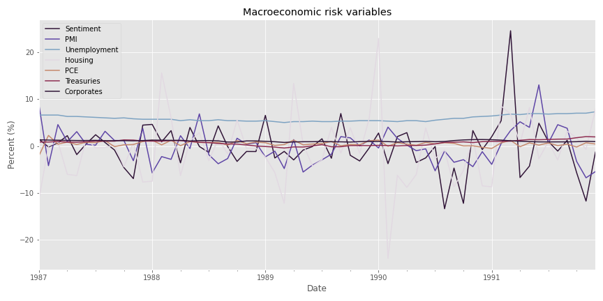
As one can see, there is some volatility in many of the factors. But notice too that unemployment and yield spreads don’t change that much. This lack of unit comparability should raise some eyebrows. If we were to apply the percent change transformation on unemployment and yield spreads, we’d get some pretty large numbers relative to the other factors, which we don’t want. Hence, we’ll remove unemployment and yield spreads for now. Later, we’ll bring them back when we normalize the factors. Let’s move on to see what we can see in terms of how much the risk factor model explains returns to each asset class.
In the graph below, we show the \(R^2\)s for each asset class calculated by regressing the returns on that asset class against the risk factors.
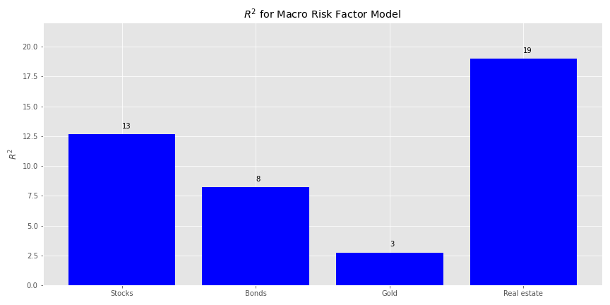
Not very encouraging. The risk factors don’t explain returns much at all even for, surprisingly, real estate. No matter, let’s examine the factor exposures and then the explained portfolio variance.
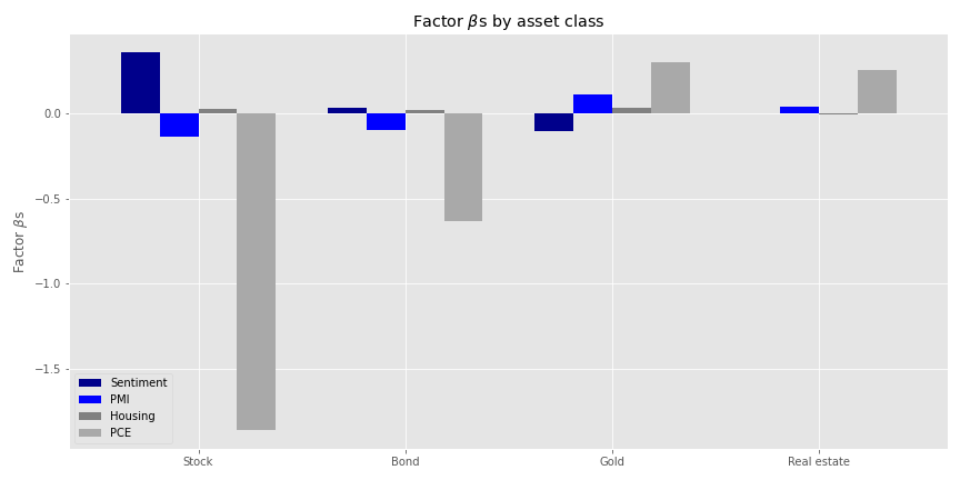
Personal consumption expenditures (PCE) seem to have the largest absolute impact on stock returns. This should not be too surprising given the how much consumption drives the US economy. But that the size effect is negative is a bit odd. A possible explanation for this is that by the time the PCE figures are published the market has already discouned the move. But we’d need to dig into this notion in greater detail to see if it holds water. Whatever the case, we’ll jump to how much the macro variables explain the variance of the four portfolios. Spoiler alert: not much.
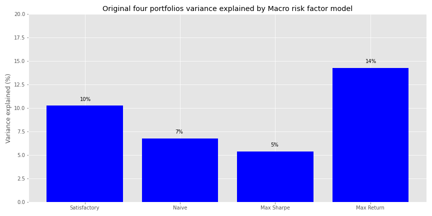
It is remarkable that these four macro variables that capture a fair amount of the economy do so little in explaining the variance of portfolios whose assets represent the broadest exposure to the major asset classes. Of course, this is a bit of a set up, we’re comparing risk factors to returns in the same period. We want to see what macro variables today tell us about the future, which begs the question as to how much in the future we should look.
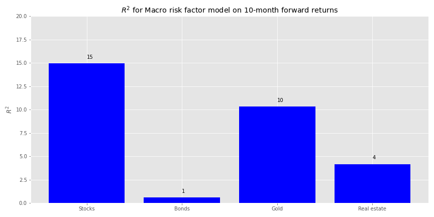
We could run a simplistic search and perform regressions for every period of interest in the future. For example, when we regress ten-month forward returns against the macro factors, we find that the macro variables achieve the highest explanatory power for stocks, but are pretty modest for most everything else.
On twelve-month forward returns we find more balance in overall, albeit still low, explanatory power among the asset classes.
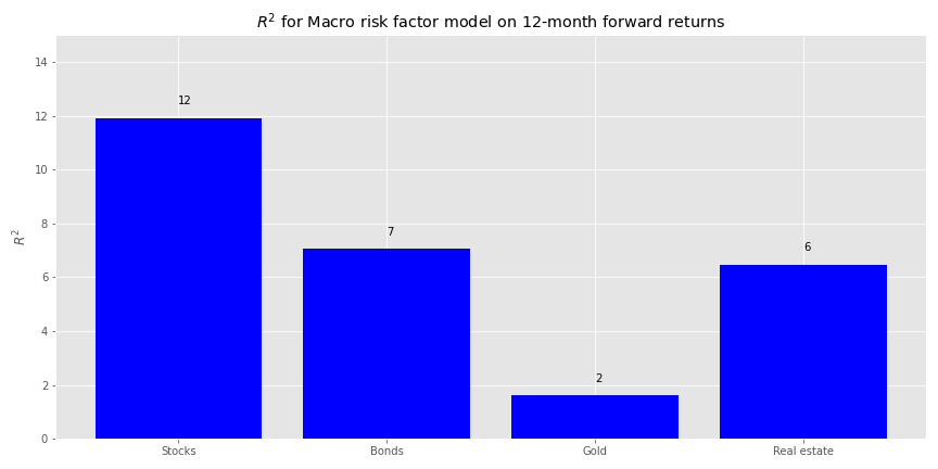
Is there any economic rationale why ten or twelve months should be favored for our model? Perhaps twelve just because we tend to think in results over the past year. But that is more behavioral than economic. It should come as no surprise that if we keep searching through this haystack we’re bound to find something even it wasn’t the needle we were looking for. In other words, we’re p-hacking the model. P-hacking doesn’t have to be the sin that sends us to the ninth ring of statistical hell if it yields insights that lead to more robust models. But we’ll save that argument another time.
Part of the issue of low explanatory power may be due to the unit variability issue we mentioned above. We’ll now normalize the risk factors to units of standard deviation and run the regressions on forward returns. Note, this is a time series, not cross-sectional normalization. The big question then: how much of a lookback for normalization and how many months forward for returns should we use? We have no idea! We’ll implement a grid search and see what comes up.
For the grid search we normalize each macro variable based on a rolling window of the last three to twelve months1 and then for each of those rolling windows regress the one to twelve-month return against it. This results in 120 regressions. We show a table of the top five normalized window and forward return combinations by explanatory power for stock and bonds below.
| Month lookback | Month Forward | Stocks | Bonds | Gold | Real estate |
|---|---|---|---|---|---|
| 3 | 10 | 25.6 | 8.6 | 16.1 | 16.9 |
| 8 | 3 | 22.2 | 10.0 | 12.1 | 55.3 |
| 4 | 10 | 20.7 | 7.9 | 17.4 | 23.8 |
| 7 | 3 | 19.6 | 8.6 | 10.0 | 58.2 |
| 9 | 3 | 19.0 | 12.1 | 12.6 | 54.2 |
Well this certainly is a funny puzzler. Why a rolling three-month normalization would explain a quarter of the variance in 10-month forward stock returns more than an nine-month normalization and three-month forward is not obvious to us. If we look at the next five in the top ten, we find a surprising clustering of higher explained variance in the nine to eleven-month range for normalization and forward returns.
| Month lookback | Month Forward | Stocks | Bonds | Gold | Real estate |
|---|---|---|---|---|---|
| 4 | 2 | 18.2 | 9.6 | 8.6 | 55.7 |
| 10 | 9 | 18.1 | 10.9 | 3.7 | 28.1 |
| 9 | 9 | 17.8 | 13.5 | 4.9 | 27.1 |
| 9 | 2 | 17.5 | 7.7 | 7.6 | 66.9 |
| 11 | 9 | 17.3 | 10.1 | 3.3 | 28.7 |
We’re not saying there’s something magical about this. But let’s go with the nine-nine combination—at least it’s symmetric and aligns with three quarters of results. We could probably concoct a story about why nine months of data is more important than a year, but we’ve had too much spiked egg nog of late to get our brain to come up with anything compelling. Here’s the \(R^{2}\) chart by asset class.
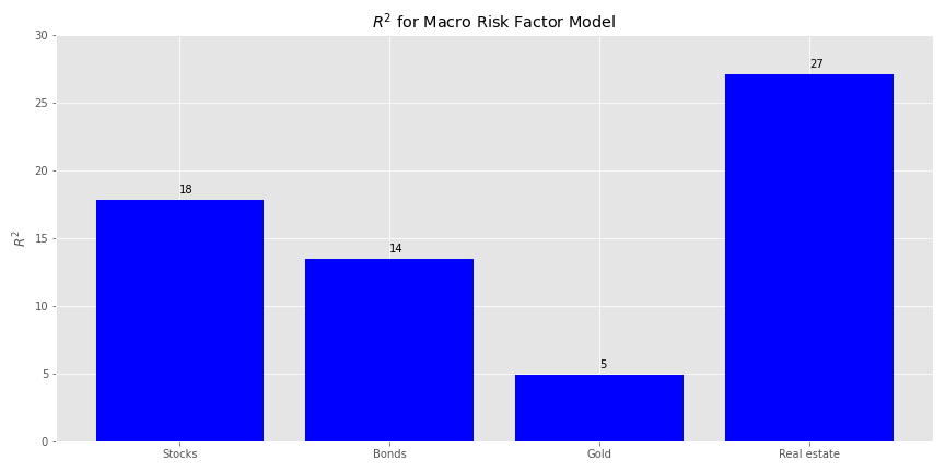
The relative explanatory power is modestly better than the first model. Real estate still commands a higher position, and outweighs stocks and bonds a bit more too. Gold has the lowest as before. Now we’ll check out the factor exposures.
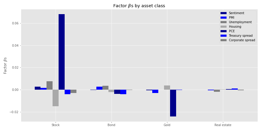 The exposures don’t look too bad. PCE still enjoys the largest size effect for stocks, and is positive this time. That probably aligns with the rolling normalization. Note that the overall size effects are modest for a one standard deviation move. Personal consumption expenditures has the largest size effect in absolute terms for gold, mirroring the negative relationship to economic trends vs. flight to safety. Finally, we’ll look at how much this risk factor model explains portfolio variance in our original four portfolios.
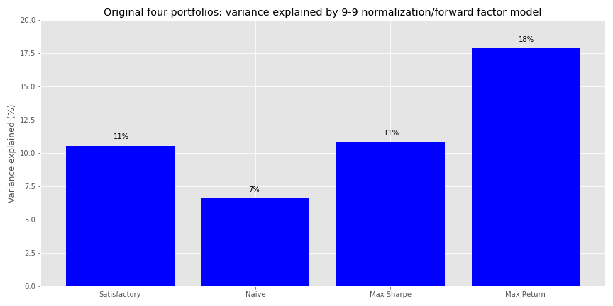
A modest improvement overall from the first model, with the Max Return portfolio seeing the greatest increase in explained variance.
While not a terrible result, it’s still a bit disappointing in that we didn’t get anywhere near identifying the major sources of portfolio variance. All coded up with nowhere to go!
Clearly, finding macroeconomic variables that drive returns and variance for broad asset portfolios isn’t a walk in the park. True, there were a number of data quality and methodological issues. And, recall we only used a five-year period beginning in 1987. But there’s also the fact that a well-diversified group of assets will react differently to changes in the economy, presumably dampening economic risk. That’s sort of the point. Hence, maybe we shouldn’t have expected macroeconomic variables to explain too much of our portfolio variance in the first place! At least we can reasonably conclude that if we want to use macro variables for a risk model, we’ll either need to do more work on data processing or feature selection than we did here. We could also change our data set exclusively to using leading indicators. But we’ll save that for next time.
As this is our last post of 2020, we hope you’ve enjoyed the work. Our goal has always been to produce high quality, intellectually honest, reproducible content. If you’ve found the posts useful or not, please let us know by sending an email to content at optionstocksmachines dot com. And please let us know if there’s a topic you’d like to see addressed in the future. Happy New Year and happy reading the code below!
## Built using R 4.0.3 and Python 3.8.3

# [R]
## Load packages
suppressPackageStartupMessages({
  library(tidyverse)
  library(tidyquant)
  library(reticulate)
})

# Allow variables in one python chunk to be used by other chunks.
knitr::knit_engines$set(python = reticulate::eng_python)

# [Python]
## Load libraries
import warnings
warnings.filterwarnings('ignore')
import numpy as np
import pandas as pd
import statsmodels.api as sm
import matplotlib
import matplotlib.pyplot as plt
import os
os.environ['QT_QPA_PLATFORM_PLUGIN_PATH'] = 'C:/Users/user_name/Anaconda3/Library/plugins/platforms'
plt.style.use('ggplot')

## For saving images to png.
## AS noted in the previous post reticulate does not seem to handle plt.annotate() so
## we've taken to saving the graphs as png files and then loading them within Rmarkdown.

import os
DIR = "~/your_directory/"

def save_fig_blog(fig_id, tight_layout=True, fig_extension="png", resolution=300):
    path = os.path.join(DIR, fig_id + "." + fig_extension)
    print("Saving figure", fig_id)
    if tight_layout:
        plt.tight_layout()
    plt.savefig(path, format=fig_extension, dip=resolution)

## Load asset return and portfolio data
df = pd.read_pickle('port_const.pkl') # see previous posts for how this frame was constructed
df.iloc[0,3] = 0.006

port1, wts1, sharpe1  = Port_sim.calc_sim_lv(df.iloc[:60, :4], 10000,4) # see previous posts for Port_sim class and methods

## Load economic data
# Quandl data
import quandl
quandl.ApiConfig.api_key = 'your_key'
start_date = '1970-01-01'
end_date = '2019-12-31'

aaii = quandl.get("AAII/AAII_SENTIMENT", start_date = start_date, end_date = end_date)
aaii_mon = aaii.resample('M').last()
aaii_sen = aaii_mon.loc[:,'Bull-Bear Spread']

con_sent = quandl.get("UMICH/SOC1", start_date=start_date, end_date=end_date)
pmi = quandl.get("ISM/MAN_PMI", start_date=start_date, end_date=end_date)
pmi = pmi.resample('M').last() # PMI is released on first of month. But most of the other data is on the last of the month

# FRED data
start_date = '1970-01-01'
end_date = '2019-12-31'
indicators = ['UNRATE', 'PERMIT','PCE', 'T10Y2Y', 'DAAA', 'DBAA']
fred_macros = {}

for indicator in indicators:
    fred_macros[indicator] = dr.DataReader(indicator, 'fred', start_date, end_date)
    fred_macros[indicator] = fred_macros[indicator].resample('M').last()

## Combine data series
from functools import reduce

risk_factors = pd.merge(con_sent, pmi, how = 'left', on = 'Date')

for indicator in indicators:
    risk_factors = pd.merge(risk_factors, fred_macros[indicator], how = 'left', left_index=True, right_index=True)

# Create corporate yield spread
risk_factors['CORP'] = risk_factors['DBAA'] - risk_factors['DAAA']
risk_factors = risk_factors.drop(['DAAA', 'DBAA'], axis=1)

# Transform factors
macro_risk_chg_1 = risk_factors.copy()
macro_risk_chg_1.iloc[:,[0,1,3,4]] = macro_risk_chg_1.iloc[:,[0,1,3,4]].pct_change()
macro_risk_chg_1.iloc[:, [2,5,6]] = macro_risk_chg_1.iloc[:,[2,5,6]]*.01
macro_risk_chg_1 = macro_risk_chg_1.replace([np.inf, -np.inf], 0.0)

# Graph factors
(macro_risk_chg_1['1987':'1991']*100).plot(figsize=(12,6), cmap="twilight_shifted")
plt.legend(['Sentiment', 'PMI', 'Unemployment', 'Housing', 'PCE', 'Treasuries', 'Corporates'])
plt.ylabel('Percent (%)')
plt.title('Macroeconomic risk variables')
save_fig_blog('macro_risk_factors')
plt.show()

# Run regressions on chosen factors and asset classes
import statsmodels.api as sm
x = macro_risk_chg_1.loc['1987':'1991', ['Index', 'PMI', 'PERMIT', 'PCE']]

X = sm.add_constant(x.values)

rsq = []
for i in range(4):
    y = df.iloc[:60,i].values
    mod = sm.OLS(y, X).fit().rsquared*100
    rsq.append(mod)

asset_names = ['Stocks', 'Bonds', 'Gold', 'Real estate']

# Plot R-squareds
plt.figure(figsize=(12,6))
plt.bar(asset_names, rsq, color='blue')

for i in range(4):
    plt.annotate(str(round(rsq[i]),), xy = (asset_names[i], rsq[i]+0.5))

plt.ylim([0,22])
plt.ylabel("$R^{2}$")
plt.title("$R^{2}$ for Macro Risk Factor Model")
save_fig_blog('macro_risk_r2')
plt.show()

# Find factor exposures
assets = df.iloc[:60,:4]
betas = pd.DataFrame(index=assets.columns)
pvalues = pd.DataFrame(index=assets.columns)
error = pd.DataFrame(index=assets.index)

# Calculate factor risk exposures and pvalues
x = macro_risk_chg_1.loc['1987':'1991', ['Index', 'PMI', 'PERMIT', 'PCE']]
X = sm.add_constant(x.values)
factor_names = [j.lower() for j in x.columns.to_list()]

# Iterate through asset classes
for i in assets.columns:
    y = assets.loc[:,i].values
    result = sm.OLS(y, X).fit()

    for j in range(1, len(result.params)):
        betas.loc[i, factor_names[j-1]] = result.params[j]
        pvalues.loc[i, factor_names[j-1]] = result.pvalues[j]

    error.loc[:,i] = (y - X.dot(result.params))

# Graph betas
betas.plot(kind='bar', width = 0.75, color=['darkblue', 'blue', 'grey', 'darkgrey'], figsize=(12,6))
plt.legend(['Sentiment', 'PMI', 'Housing','PCE'])
plt.xticks([0,1,2,3], ['Stock', 'Bond', 'Gold', 'Real estate'], rotation=0)
plt.ylabel(r'Factor $\beta$s')
plt.title(r'Factor $\beta$s by asset class')
save_fig_blog('factor_betas')
plt.show()

# Create function to calculate how much factors explaing portfolio variance
def factor_port_var(betas, factors, weights, error):

        B = np.array(betas)
        F = np.array(factors.cov())
        S = np.diag(np.array(error.var()))

        factor_var = weights.dot(B.dot(F).dot(B.T)).dot(weights.T)
        specific_var = weights.dot(S).dot(weights.T)

        return factor_var, specific_var

# Graph explained variance on original portfolios
satis_wt = np.array([0.32, 0.4, 0.2, 0.08])
equal_wt = np.repeat(0.25,4)
max_sharp_wt = wts1[np.argmax(sharpe1)]
max_ret_wt = wts1[pd.DataFrame(np.c_[port1,sharpe1], columns = ['ret', 'risk', 'sharpe']).sort_values(['ret', 'sharpe'], ascending=False).index[0]]

factors = macro_risk_chg_1.loc['1987':'1991', ['Index', 'PMI', 'PERMIT', 'PCE']]

wt_list = [satis_wt, equal_wt, max_sharp_wt, max_ret_wt]
port_exp=[]

for wt in wt_list:
    out = factor_port_var(betas, factors, wt, error)
    port_exp.append(out[0]/(out[0] + out[1]))

port_exp = np.array(port_exp)


port_names = ['Satisfactory', 'Naive', 'Max Sharpe', 'Max Return']
plt.figure(figsize=(12,6))
plt.bar(port_names, port_exp*100, color='blue')

for i in range(4):
    plt.annotate(str(round(port_exp[i]*100)) + '%', xy = (i-0.05, port_exp[i]*100+0.5))

plt.title('Original four portfolios variance explained by Macro risk factor model')
plt.ylabel('Variance explained (%)')
plt.ylim([0,20])
save_fig_blog('port_var_exp_21')
plt.show()

## Forward returns

## R-squared function
# A bit long. If we had more time we would have broken it up into more helper functions
def rsq_func(ind_df, dep_df, look_forward = None, period = 60, start_date=0, plot=True, asset_names = True, print_rsq = True, save_fig = False, fig_name = None):
    """ Assumes ind_df starts from the same date as dep_df.
        Dep_df has only as many columns as interested for modeling. """

    X = sm.add_constant(ind_df[0:start_date+period].values)

    N = len(dep_df.columns)

    rsq = []

    if look_forward:
        start = start_date + look_forward
        end = start_date + look_forward + period
    else:
        start = start_date
        end = start_date + period

    for i in range(N):
        y = dep_df.iloc[start:end,i].values
        mod = sm.OLS(y, X).fit().rsquared*100
        rsq.append(mod)
        if print_rsq:
            print(f'R-squared for {df.columns[i]} is {mod:0.03f}')


    if plot:
        if asset_names:
            x_labels = ['Stocks', 'Bonds', 'Gold', 'Real estate']
        else:
            x_labels = asset_names

        plt.figure(figsize=(12,6))
        plt.bar(x_labels, rsq, color='blue')

        for i in range(4):
            plt.annotate(str(round(rsq[i]),), xy = (x_labels[i], rsq[i]+0.5))

        # plt.ylim([80,100])
        plt.ylabel("$R^{2}$")
        plt.title("$R^{2}$ for Macro Risk Factor Model")
        if save_fig:
            save_fig_blog(fig_name)
        else:
            plt.tight_layout()
        plt.show()

    return rsq

# Graph figure for 10 month forward, save_fig=False if don't want to save!
ind_df_1 = macro_risk_chg_1.loc['1987':, ['Index', 'PMI', 'PERMIT', 'PCE']]
dep_df_1 = df.iloc[:,:-1]

_ = rsq_func(ind_df_1, dep_df_1, look_forward = 10, save_fig = True, fig_name = 'macro_risk_r2_10m')

#Graph figure for 10 month forward, save_fig=False if don't want to save!
_ = rsq_func(ind_df_1, dep_df_1, look_forward = 12, y_lim = [0,15], save_fig = True, fig_name = 'macro_risk_r2_12m')

# Scaled factors

# Grid search for best params
scale_for = pd.DataFrame(np.c_[np.array([np.repeat(x,12) for x in range(3,13)]).flatten(),\
                         np.array([np.arange(1,13)]*10).flatten(),\
                         np.array([np.zeros(120)]*4).T],\
                        columns = ['Month lookback', 'Month Forward', 'Stocks', 'Bonds', 'Gold', 'Real estate'])
count = 0
for i in range(3, 13):
    risk_scale = risk_factors.apply(lambda x: (x - x.rolling(i).mean())/x.rolling(i).std(ddof=1))['1987':]
    risk_scale.replace([np.inf, -np.inf], 0.0, inplace=True)
    for j in range(1,13):
        out = rsq_func(risk_scale, dep_df_1, look_forward = j, plot=False, print_rsq=False)
        scale_for.iloc[count,2:] = np.array(out)
        count+=1

## Sort data
scaled_sort = scale_for.sort_values(['Stocks','Bonds'], ascending=False).round(1).reset_index()

# [R]
## Table top five
py$scaled_sort %>% as.data.frame(check.names=FALSE) %>%
  select(-index) %>%
  slice(1:5) %>%
  knitr::kable('html', caption = "Top 5 combinations by $R^{2}$ for stocks and bonds")

## Table top six to ten
py$scaled_sort %>% as.data.frame(check.names=FALSE) %>%
  select(-index) %>%
  slice(6:10) %>%
  knitr::kable('html', caption = "Combinations six to 10 by $R^{2}$ for stocks and bonds")

## R-squared graph for 9-9 grid search
scale_9_9 = risk_factors.apply(lambda x: (x - x.rolling(9).mean())/x.rolling(9).std(ddof=1))['1987':]
scale_9_9.replace([np.inf, -np.inf], 0.0, inplace=True)

_ = rsq_func(scale_9_9, dep_df_1, look_forward = 9, y_lim=[0,30],save_fig=True, fig_name = 'r2_port_9_9')

# Find factor exposures
assets = df.iloc[8:68,:4]
betas = pd.DataFrame(index=assets.columns)
pvalues = pd.DataFrame(index=assets.columns)
error = pd.DataFrame(index=assets.index)

# Calculate factor risk exposures and pvalues
x = scale_9_9['1987':'1991']
factor_names = [j.lower() for j in x.columns.to_list()]
X = sm.add_constant(x.values)

for i in assets.columns:
    y = assets.loc[:,i].values
    result = sm.OLS(y, X).fit()

    for j in range(1, len(result.params)):
        betas.loc[i, factor_names[j-1]] = result.params[j]
        pvalues.loc[i, factor_names[j-1]] = result.pvalues[j]

    error.loc[:,i] = (y - X.dot(result.params))

# Plot betas
betas.plot(kind='bar', width = 0.75, color=['darkblue', 'blue', 'grey', 'darkgrey'], figsize=(12,6))
plt.legend(['Sentiment', 'PMI', 'Unemployment', 'Housing','PCE', 'Treasury spread', 'Corporate spread'])
plt.xticks([0,1,2,3], ['Stock', 'Bond', 'Gold', 'Real estate'], rotation=0)
plt.ylabel(r'Factor $\beta$s')
plt.title(r'Factor $\beta$s by asset class')
save_fig_blog('scale_9_9_betas')
plt.show()

# Plot explained variance for original portfolios
satis_wt = np.array([0.32, 0.4, 0.2, 0.08])
equal_wt = np.repeat(0.25,4)
max_sharp_wt = wts1[np.argmax(sharpe1)]
max_ret_wt = wts1[pd.DataFrame(np.c_[port1,sharpe1], columns = ['ret', 'risk', 'sharpe']).sort_values(['ret', 'sharpe'], ascending=False).index[0]]

factor_df_9 = scale_9_9['1987':'1991']

wt_list = [satis_wt, equal_wt, max_sharp_wt, max_ret_wt]
port_exp=[]

for wt in wt_list:
    out = factor_port_var(betas, factor_df_9, wt, error)
    port_exp.append(out[0]/(out[0] + out[1]))

port_exp = np.array(port_exp)

port_names = ['Satisfactory', 'Naive', 'Max Sharpe', 'Max Return']
plt.figure(figsize=(12,6))
plt.bar(port_names, port_exp*100, color='blue')

for i in range(4):
    plt.annotate(str(round(port_exp[i]*100)) + '%', xy = (i-0.05, port_exp[i]*100+0.5))

plt.title('Original four portfolios: variance explained by 9-9 normalization/forward factor model')
plt.ylabel('Variance explained (%)')
plt.ylim([0,12])
save_fig_blog('four_port_var_exp_9_9')
plt.show()
Normalizing on two months doesn’t seem to merit the effort.↩︎