Explaining variance
We’re returning to our portfolio discussion after detours into topics on the put-write index and non-linear correlations. We’ll be investigating alternative methods to analyze, quantify, and mitigate risk, including risk-constrained optimization, a topic that figures large in factor research.
The main idea is that there are certain risks one wants to bear and others one doesn’t. Do you want to be compensated for exposure to common risk factors or do you want to find and exploit unknown factors? And, perhaps most importantly, can you insulate your portfolio from unexpected risks? Generally, one will try to build a model that explains the return of an asset in terms of its risk factors. Presumably, this model will help to quantify:
- The influence of a particular risk factor on the asset’s return.
- The explanatory power of these risk factors.
- The proportion of the asset’s variance due to identified risk factors.
The model generally looks something like the following:
\[r_i = a_i + \sum_{k=1}^{K}\beta_{i,k} F_k + \epsilon_i\]
where:
\(r_i\) = the return for asset \(i\)
\(a_i\) = the intercept
\(\beta_{i,k}\) = asset \(i\)’s exposure to factor \(k\)
\(F_k\) = the return for factor \(k\)
\(\epsilon_i\) = idiosyncratic risk of \(i\), noise term, or fudge factor.1
The model can be extended to the portfolio level too. Risk factors can be as simple or arcane as you like. Common ones include CAPM’s \(\beta\) or Fama-French factors; economic variables; and/or technical or statistical metrics like moving averages or cointegration.
The problem is that there is no a priori list of factors that describe the majority of returns for any broad class of assets. And even if there were, there’s no guarantee those factors would explain returns going forward. Indeed, factor weightings change all the time and the risk premia associated with some factors may erode or disappear. Just type “Is the value factor dead?” into a Google search and you’ll find plenty of debate for and against.
While such debates might be fun, fruitful, or frivolous, let’s take a step back and think about what we hope our portfolio will achieve: a satisfactory trade-off between risk and return such that whatever return goal we have, there’s a high probability we accomplish it within the necessary time frame. Warren Buffett’s ideal holding period may be forever, but we’ll need the cash a lot sooner!
Recall, when we constructed the naive, satisfactory, and mean-variance optimized portfolios in our previous posts, the standard deviation of returns (i.e., volatility) stood in for risk. Volatility as a proxy for risk begs a lot of questions. The most intuitive being that risk in the real world is not a statistic but the actual risk of losing something—capital, for instance. But the beauty of volatility is that it can quantify the probability of such a risk if one is willing to accept a bunch of simplifying assumptions. We’ll leave the question of whether those assumptions are too simple—that is, too unrealistic—for another time.
If one of the biggest risks in portfolio construction is building a portfolio that doesn’t achieve the return goal it’s meant to achieve, how do we avoid such an event? Volatility can tell us roughly what’s the probability it might occur. But a risk factor model should, presumably, tell us what’s driving that risk and what’s not. Maybe even help us figure out which risks we should avoid.
While it might seem obvious that the first thing to do is to identify the risks. We want to build a risk model with common risk factors first, so that we can understand the process before we start to get creative searching for meaningful factors.
We’ll start by bringing back our data series of stocks, bonds, commodities (gold), and real estate and then also call in the classic Fama-French (F-F) three factor model along with momentum. We’re using F-F not because we believe those factors will feature a lot of explanatory power, but because they’re expedient and useful. Expedient because the data are readily available and many people are familiar with them, aiding the reproducible research goal of this blog. Useful because they’ll be a good way to set the groundwork for the proceeding posts.
Our roadmap is the following. Graph the F-F factors, show the portfolio simulations for an initial 60-month (five-year) period beginning in 1987, analyze how much the factors explain asset variance, and then look at how much the factors explain portfolio variance. Let’s begin.
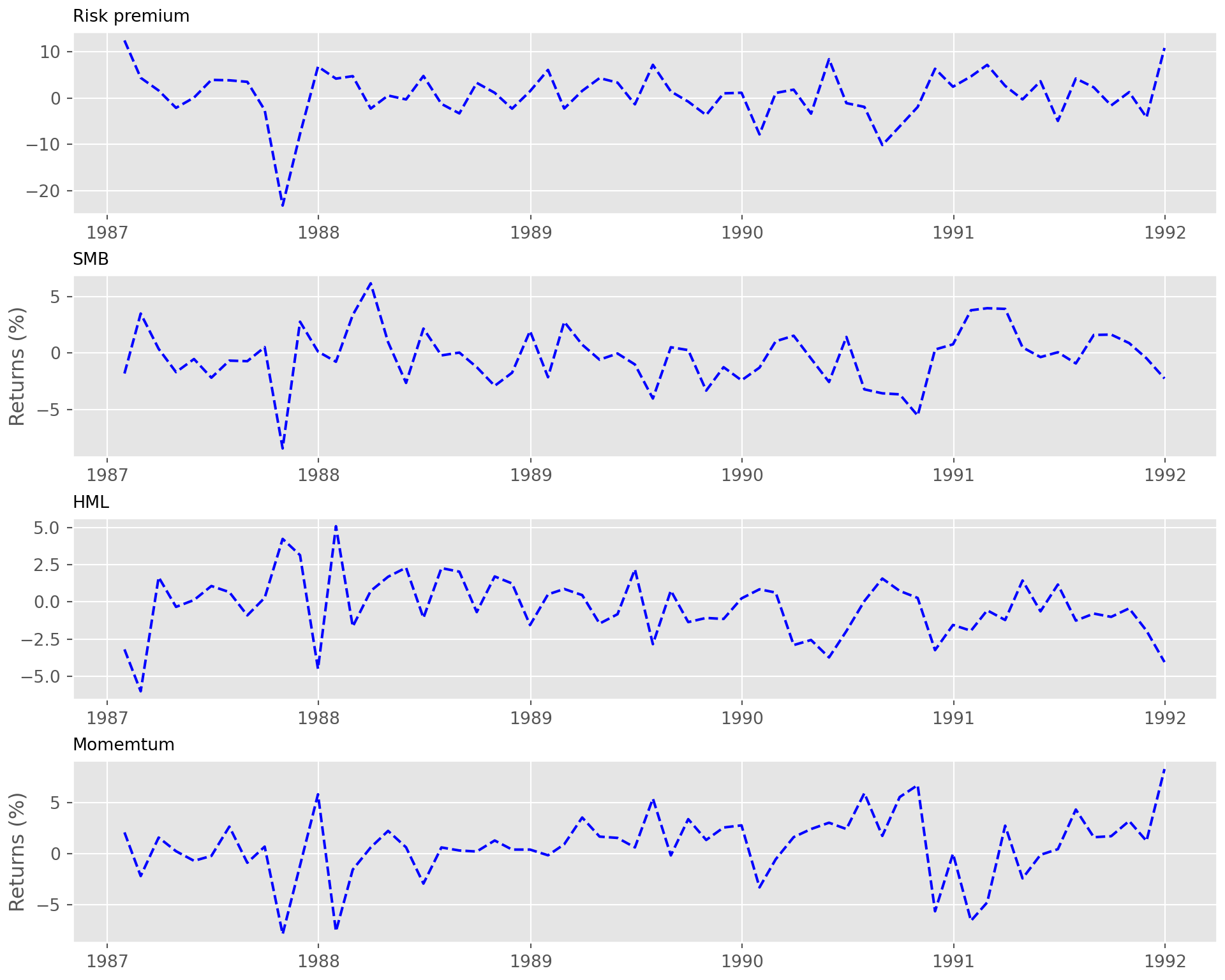
First, we plot the F-F factors below. Note that we’re only covering the first five-years of monthly data that matches the original portfolio construction. For those unfamiliar with the factors, risk premium is the return on the stock market less the risk-free rate. SMB is the size factor; i.e. returns to small cap stocks less large caps. HML is the value factor; i.e., returns to high book-to-price (hence, low price-to-book multiples) stocks (value) less low book-to-price (growth). Momentum is returns to stocks showing positive returns in the last twevle months less those showing negative returns. If you want more details visit Prof. K. French’s data library for more details.
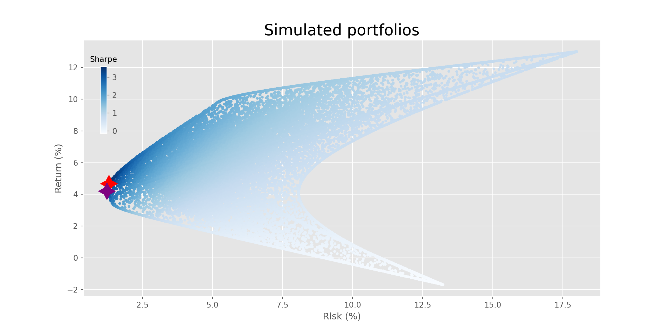
Now we’ll simulate 30,000 portfolios that invest in two to four out of the four possible assets. Recall this simulation can approximate (hack!) an efficient frontier without going through the convex optimization steps. The red and purple markers are the maximum Sharpe ratio and minimum volatility portfolios. We assume the reader can figure out the maximum (efficient) return portfolio.
Kinda pretty. Now we look at how well these factors explain the returns on each of the assets. Here, we regress each asset’s excess return (return less the risk-free rate) against the four factors and show the \(R^{2}\) for each regression in the graph below.
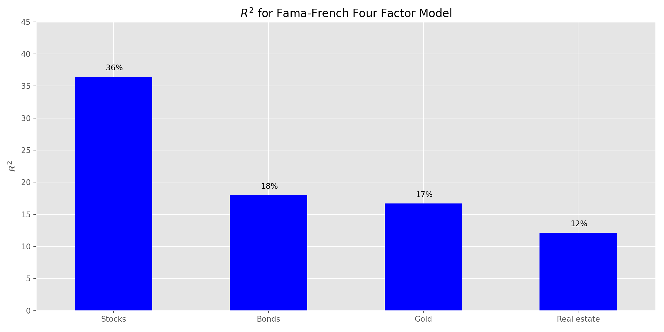
Not surprisingly, stocks enjoy the highest \(R^{2}\) relative to the factors, since those factors are primarily derived from stock portfolios. Two notes here. First, we’re not trying to create the best factor model in this post; rather, establish the intuition behind what we’re doing. Second, for the stock explanatory power we exclude the F-F market risk premium since that is essentially the same as the stock return.
Now let’s check out the factor sensitivities (or exposures, or beta) for each asset class. We graph the sensitivities below.
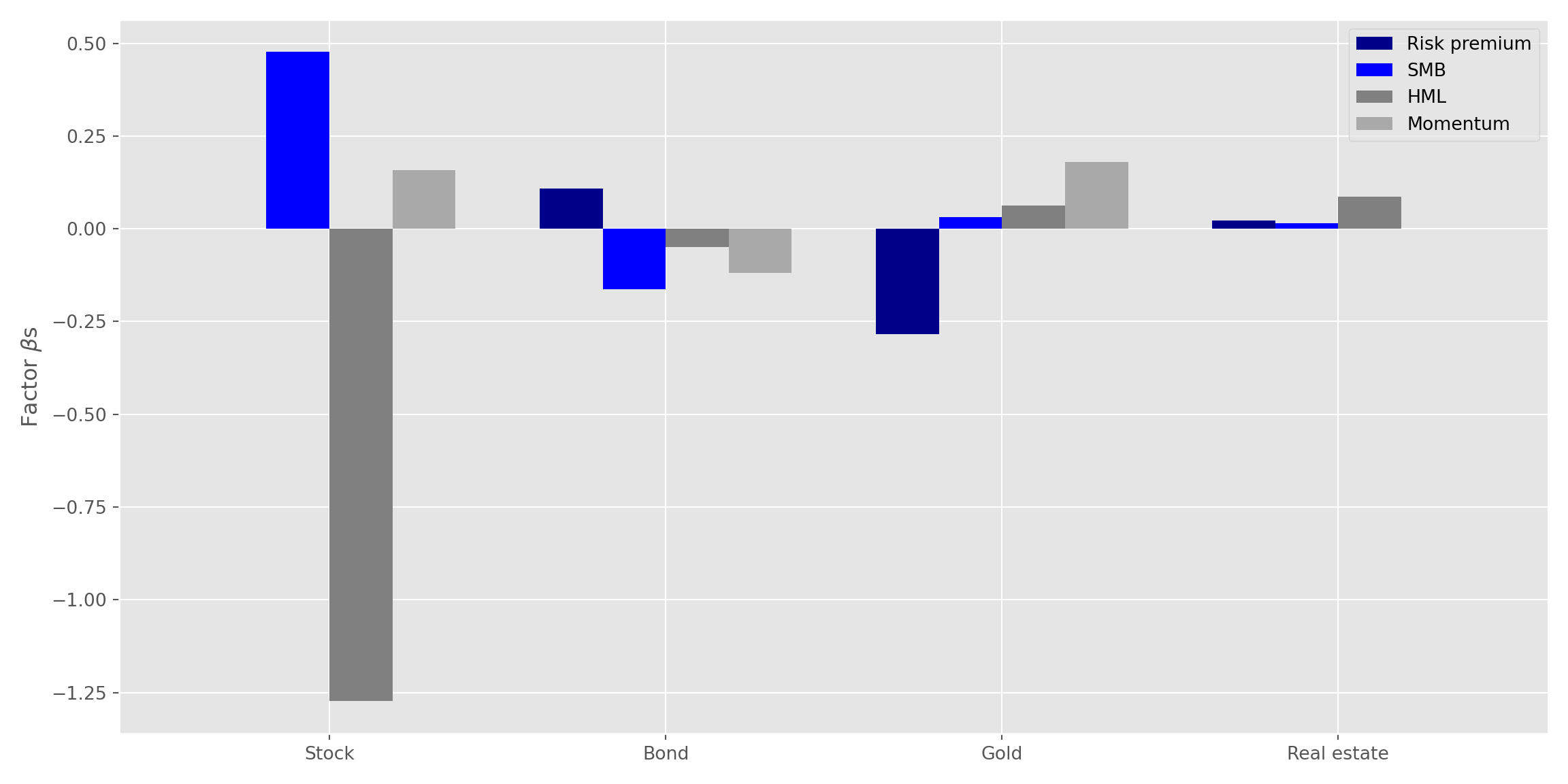
For stocks, it’s not clear why the value factor has sucha a large negative size effect other than the observation that value underperformed size for that period. Momentum generally has the lowest impact on returns for most of the asset classes. But, the regression output suggests the momentum factor’s significance is not much different than zero. We won’t show the p-values here, but the interested reader will see how to extract them within the code presented below.
Now we’ll calculate how much the factors explain a portfolio’s variance. The result is derived from the following formula based on matrix algebra:
\[Var_{p} =X^{T}(BFB^T + S)X\]
Where:
\(Var_{p}\) = the variance of the portfolio
\(X\) = a column vector of weights
\(B\) = a matrix of factor sensitivities
\(F\) = the covariance matrix of factor returns
\(S\) = the diagonal matrix of residual variance. In other words, the variance of the returns not explained by the factor model.
Having calculated the variances, the question is what can this tell us about the portfolios? Time for some exploratory data analysis! First off, we might be interested to see if there’s any relationship between portfolio volatility and explained variance. However, even though a scatterplot of those two metrics creates a wonderfully fantastic graph, it reveals almost no information as shown below.
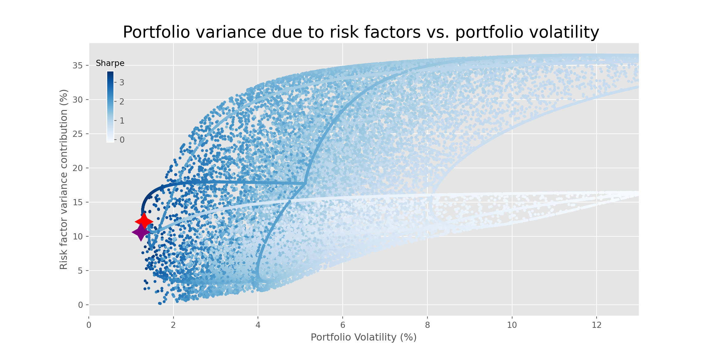
Who knew finance could be so artistic! What if we group the volatilities into deciles and graph the average explained variance with an annotation for the average volatility of each decile? We show the results below. Note that we’ve shortened the y-axis to highlight the differences in explained variance.
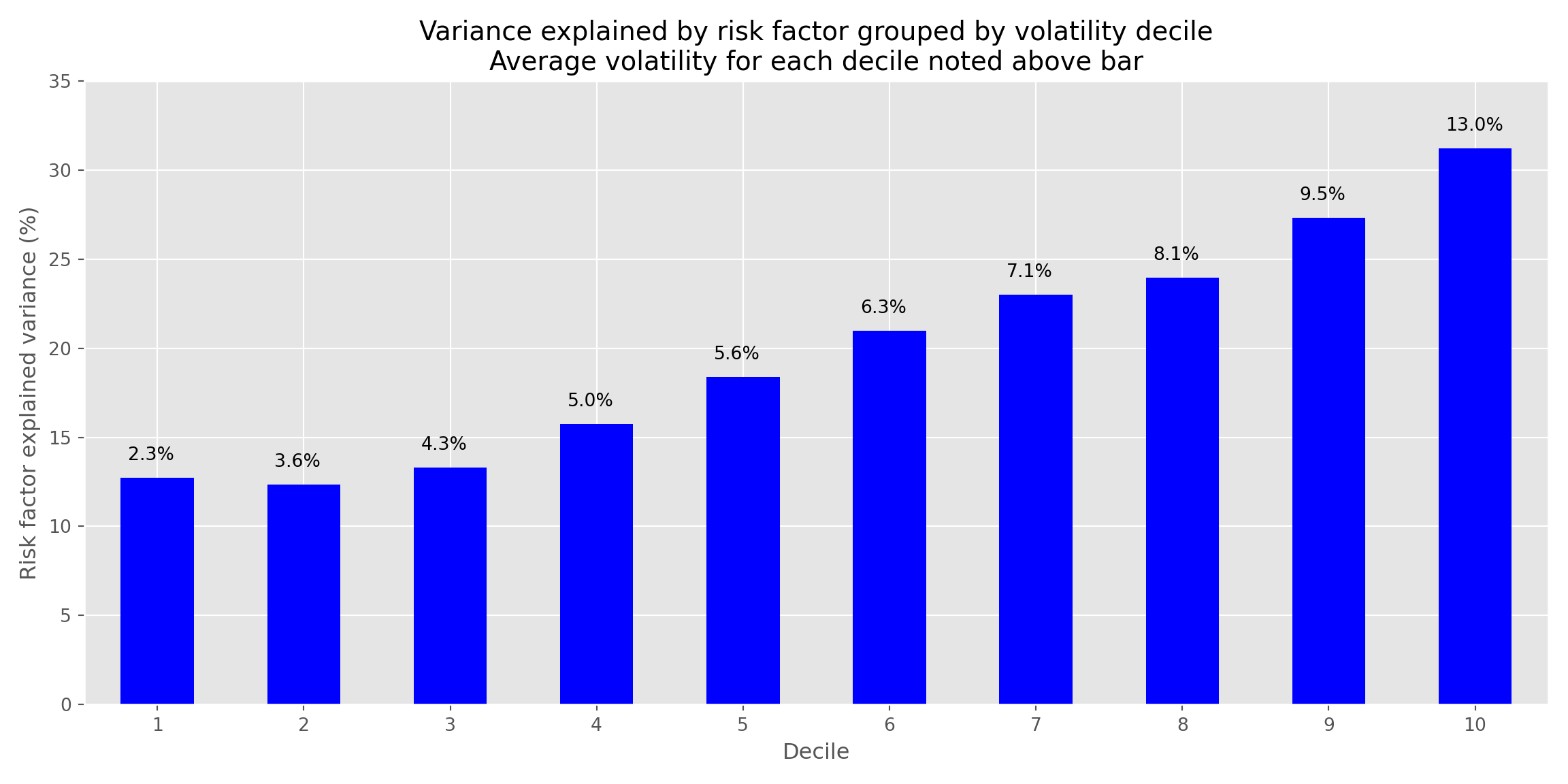
While portfolio volatility appears to increase monotonically with the amount of variance explained by the risk factor model, it’s not obvious that tells us much. There needn’t be a relationship between the two.
Now, we’ll group the portfolios by major asset class weighting as well as include a grouping of relatively equal-weighted portfolios. Using these groupings we’ll calculate the average variance explained by the factors. We select portfolios for the asset groups if the particular asset in that portfolio makes up a greater than 50% weighting. Hence, all portfolios in the stock grouping have a weighting to stocks in excess of 50%. For the relatively equal-weighted portfolios, we include only those portfolios that feature weightings no greater than 30% for any of the assets.
This total grouping only amounts to about half the portfolios, so we bucket the remainder into an eponymous group. We also calculate the average of the variance explained across all portfolios. We plot the bar chart below.
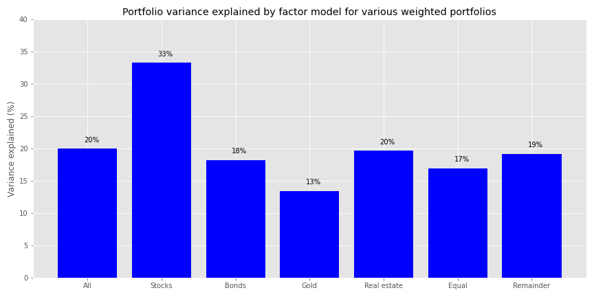
Predictably, the variance explained by the risk factors is relatively high for stocks, less so for the other over-weighted asset portfolios. The remaining portfolios see at most 20% of their variance explained.
Finally, we’ll look at our original four portfolios (Satisfactory, Naive, Max Sharpe, and Max Return) to see how much of their variance is explained by the factor models.
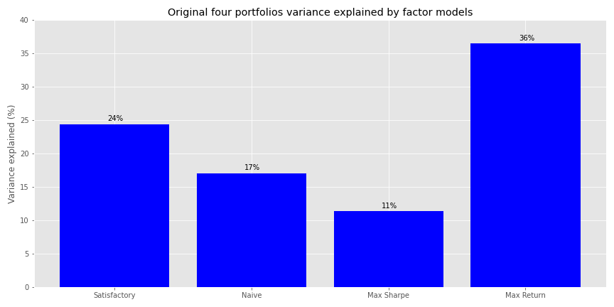 Here, the factor model explains Max Return’s portfolio variance the most and the Max Sharpe’s the least. The Satisfactory and Naive portfolios are middle of the road
Recall, both the Satisfactory and Naive portfolios had less than 40% allocation to stocks, so it’s not suprising that much less than that is explained by a primarily equity risk factor model. The other \(R^{2}\)s are above 10% and the beta-weighted factor covariance matrix is positive2, so overall explained variance is still higher than the stock weighthing in the portfolio times the explanatory power. There might also be some additional information captured by the factor returns beyond the stated exposure but that is beyond the scope of this post.3 The low stock exposure probably explains why the risk model explains so little of the Max Sharpe portfolio’s variance. While the model just about hits the bullseye for the Max Return portfolio, as it’s almost 100% stocks and model’s \(R^{2}\) for stocks was just about the same amount!
Where does this leave us? We’ve built a factor model that does an OK job explaining asset returns and a modestly better job explaining portfolio variance. Now that we’ve established the factor model process, we’ll look to see if we can identify factors that are actually good predictors of returns and variance. Note that the factor model we used here was entirely coincident with the asset returns. We want risk factors that predict future returns and variance. Until we find them, the code is below.
A few administrative notes. First, we’ve made changes to the blog behind the scenes, including purchasing a domain name. The DNS configuration might still be a little buggy, but we hope that this will solve the problem we were having with subscription delivery. Thanks for bearing with us on that one. If you wish to subscribe, you may do so above in the right hand corner. If you do subscribe, but notice you’re not getting any updates, please email us at content at optionstocksmachines dot com and we’ll try to sort it out.
Second, as much as we find providing the code to our posts in both R and Python worthwhile, they soak up a lot of time, which we have less and less of. Going forward, we’ll still try to provide both, but may, from time to time, only code in one language or the other. The tagging will indicate which it is. We’ll still provide the code below, of course. This post we cheated a bit since we coded in Python, but converted to R using the reticulate package.
Third, an earlier version of this post had a coding error which altered some of the graphs. The overall content and conclusions were unchanged, but detailing the individual changes would have led to an exceedingly complicated post. We apologize for any confusion this may have caused.
Fourth, you’ll find a rant here or there in the code below. Reticulate cannot seem to handle some of the flexibility of Python so we were getting a number of errors for code that we know works perfectly well in jupyter notebooks. If you know what went wrong, please let us know.
# Built using R 4.0.3 and Python 3.8.3

### R
## Load packages
suppressPackageStartupMessages({
  library(tidyquant) # Not really necessary, but force of habit
  library(tidyverse) # Not really necessary, but force of habit
  library(reticulate) # development version
})

# Allow variables in one python chunk to be used by other chunks.
knitr::knit_engines$set(python = reticulate::eng_python)

### Python from here on!
# Load libraries
import warnings
warnings.filterwarnings('ignore')

import numpy as np
import pandas as pd
import statsmodels.api as sm
import matplotlib
import matplotlib.pyplot as plt
import os

os.environ['QT_QPA_PLATFORM_PLUGIN_PATH'] = 'C:/Users/usr/Anaconda3/Library/plugins/platforms'
plt.style.use('ggplot')

## Load asset data
df = pd.read_pickle('port_const.pkl') # Check out http://www.optionstocksmachines.com/ for how we pulled in the data.
df.iloc[0,3] = 0.006 # Interpolation

## Load ff data
ff_url = "http://mba.tuck.dartmouth.edu/pages/faculty/ken.french/ftp/Developed_3_Factors_CSV.zip"
col_names = ['date', 'mkt-rfr', 'smb', 'hml', 'rfr']
ff = pd.read_csv(ff_url, skiprows=6, header=0, names = col_names)
ff = ff.iloc[:364,:]

from pandas.tseries.offsets import MonthEnd
ff['date'] = pd.to_datetime([str(x[:4]) + "/" + str.rstrip(x[4:]) for x in ff['date']], format = "%Y-%m") + MonthEnd(1)
ff.iloc[:,1:] = ff.iloc[:,1:].apply(pd.to_numeric)

momo_url = "http://mba.tuck.dartmouth.edu/pages/faculty/ken.french/ftp/F-F_Momentum_Factor_CSV.zip"
momo = pd.read_csv(momo_url, skiprows=13, header=0, names=['date', 'mom'])
momo = momo.iloc[:1125,:]

momo['date'] = pd.to_datetime([str(x[:4]) + "/" + str(x[4:]) for x in momo['date']], format = "%Y-%m") + MonthEnd(1)
momo['mom'] = pd.to_numeric(momo['mom'])

ff_mo = pd.merge(ff, momo, how = 'left', on='date')
col_ord = [x for x in ff_mo.columns.to_list() if x not in ['rfr']] + ['rfr']
ff_mo = ff_mo.loc[:,col_ord]
ff_mo = ff_mo[(ff_mo['date']>="1987-01-31") & (ff_mo['date']<="2019-12-31")].reset_index(drop=True)

## Plot ff
ff_factors =  ['Risk premium', 'SMB', 'HML', 'Momemtum']

fig, axes = plt.subplots(4,1, figsize=(10,8))
for idx, ax in enumerate(fig.axes):
    ax.plot(ff_mo.iloc[:60,0], ff_mo.iloc[:60,idx+1], linestyle = "dashed", color='blue')
    ax.set_title(ff_factors[idx], fontsize=10, loc='left')
    if idx % 2 != 0:
        ax.set_ylabel("Returns (%)")

fig.tight_layout(pad = 0.5)
plt.tight_layout()
plt.show()

## Abbreviated Simulation function
class Port_sim:
    import numpy as np
    import pandas as pd

    def calc_sim_lv(df, sims, cols):
        wts = np.zeros(((cols-1)*sims, cols))
        count=0

        for i in range(1,cols):
            for j in range(sims):
                a = np.random.uniform(0,1,(cols-i+1))
                b = a/np.sum(a)
                c = np.random.choice(np.concatenate((b, np.zeros(i-1))),cols, replace=False)
                wts[count,:] = c
                count+=1

        mean_ret = df.mean()
        port_cov = df.cov()

        rets=[]
        vols=[]
        for i in range((cols-1)*sims):
            rets.append(np.sum(wts[i,:]*mean_ret))
            vols.append(np.sqrt(np.dot(np.dot(wts[i,:].T,port_cov), wts[i,:])))

        port = np.c_[rets, vols]

        sharpe = port[:,0]/port[:,1]*np.sqrt(12)

        return port, wts, sharpe


## Simulate portfolios
port1, wts1, sharpe1  = Port_sim.calc_sim_lv(df.iloc[1:60, 0:4], 10000,4)

## Plot simulated portfolios
max_sharp1 = port1[np.argmax(sharpe1)]
min_vol1 = port1[np.argmin(port1[:,1])]

fig = plt.figure(figsize=(12,6))
ax = fig.add_subplot(1,1, 1)
sim = ax.scatter(port1[:,1]*np.sqrt(12)*100, port1[:,0]*1200, marker='.', c=sharpe1, cmap='Blues')
ax.scatter(max_sharp1[1]*np.sqrt(12)*100, max_sharp1[0]*1200,marker=(4,1,0),color='r',s=500)
ax.scatter(min_vol1[1]*np.sqrt(12)*100,min_vol1[0]*1200,marker=(4,1,0),color='purple',s=500)
ax.set_title('Simulated portfolios', fontsize=20)
ax.set_xlabel('Risk (%)')
ax.set_ylabel('Return (%)')

cbaxes = fig.add_axes([0.15, 0.6, 0.01, 0.2])
clb = fig.colorbar(sim, cax = cbaxes)
clb.ax.set_title(label='Sharpe', fontsize=10)

plt.tight_layout()
plt.show()

## Calculate betas for asset classes
X = sm.add_constant(ff_mo.iloc[:60,1:5])

rsq = []
for i in range(4):
    y = df.iloc[:60,i].values - ff_mo.loc[:59, 'rfr'].values
    mod = sm.OLS(y, X).fit().rsquared*100
    rsq.append(mod)

asset_names = ['Stocks', 'Bonds', 'Gold', 'Real estate']

fact_plot = pd.DataFrame(zip(asset_names,rsq), columns = ['asset_names', 'rsq'])

## Plot betas
ax = fact_plot['rsq'].plot(kind = "bar", color='blue', figsize=(12,6))
ax.set_xticklabels(asset_names, rotation=0)
ax.set_ylabel("$R^{2}$")
ax.set_title("$R^{2}$ for Fama-French Four Factor Model")
ax.set_ylim([0,45])

## Iterate through annotation
for i in range(4):
    plt.annotate(str(round(rsq[i]))+'%', xy = (fact_plot.index[i]-0.05, rsq[i]+1))

plt.tight_layout()
plt.show()

## Note: reticulate does not like plt.annotate() and throws errors left, right, and center if you
## don't ensure that the x ticks are numeric, which means you have to label the xticks separately
## through the axes setting. Very annoying!

# Find factor exposures
assets = df.iloc[:60,:4]
betas = pd.DataFrame(index=assets.columns)
error = pd.DataFrame(index=assets.index)

# Create betas and error
# Code derived from Quantopian
X = sm.add_constant(ff_mo.iloc[:60,1:5])

for i in assets.columns:
    y = assets.loc[:,i].values - ff_mo.loc[:59,'rfr'].values
    result = sm.OLS(y, X).fit()

    betas.loc[i,"mkt_beta"] = result.params[1]
    betas.loc[i,"smb_beta"] = result.params[2]
    betas.loc[i,"hml_beta"] = result.params[3]
    betas.loc[i,'momo_beta'] = result.params[4]

    # We don't show the p-values in the post, but did promise to show how we coded it.
    pvalues.loc[i,"mkt_p"] = result.pvalues[1]
    pvalues.loc[i,"smb_p"] = result.pvalues[2]
    pvalues.loc[i,"hml_p"] = result.pvalues[3]
    pvalues.loc[i,'momo_p'] = result.pvalues[4]

    error.loc[:,i] = (y - X.dot(result.params)).values

 # Plot the betas
(betas*100).plot(kind='bar', width = 0.75, color=['darkblue', 'blue', 'grey', 'darkgrey'], figsize=(12,6))
plt.legend(['Risk premium', 'SMB', 'HML', 'Momentum'], loc='upper right')
plt.xticks([0,1,2,3], ['Stock', 'Bond', 'Gold', 'Real estate'], rotation=0)
plt.ylabel(r'Factor $\beta$s ')
plt.title('')
plt.tight_layout()
plt.show()

# Create variance contribution function
def factor_port_var(betas, factors, weights, error):

        B = np.array(betas)
        F = np.array(factors.cov())
        S = np.diag(np.array(error.var()))

        factor_var = weights.dot(B.dot(F).dot(B.T)).dot(weights.T)
        specific_var = weights.dot(S).dot(weights.T)

        return factor_var, specific_var

# Iterate variance calculation through portfolios
facts = ff_mo.iloc[:60, 1:5]
fact_var = []
spec_var = []

for i in range(len(wts1)):
    out = factor_port_var(betas, facts, wts1[i], error)
    fact_var.append(out[0])
    spec_var.append(out[1])

vars = np.array([fact_var, spec_var])

## Find max sharpe and min vol portfolio
max_sharp_var = [exp_var[np.argmax(sharpe1)], port1[np.argmax(sharpe1)][1]]
min_vol_var = [exp_var[np.argmin(port1[:,1])], port1[np.argmin(port1[:,1])][1]]

## Plot variance explained vs. volatility
fig = plt.figure(figsize=(12,6))
ax = fig.add_subplot(1,1, 1)
sim = ax.scatter(port1[:,1]*np.sqrt(12)*100, exp_var, marker='.', c=sharpe1, cmap='Blues')
ax.scatter(max_sharp_var[1]*np.sqrt(12)*100, max_sharp_var[0],marker=(4,1,0),color='r',s=500)
ax.scatter(min_vol_var[1]*np.sqrt(12)*100,min_vol_var[0],marker=(4,1,0),color='purple',s=500)
ax.set_title('Portfolio variance due to risk factors vs. portfolio volatility ', fontsize=20)
ax.set_xlabel('Portfolio Volatility (%)')
ax.set_ylabel('Risk factor variance contribution (%)')
ax.set_xlim([0,13])

cbaxes = fig.add_axes([0.15, 0.6, 0.01, 0.2])
clb = fig.colorbar(sim, cax = cbaxes)
clb.ax.set_title(label='Sharpe', fontsize=10)

plt.tight_layout()
plt.show()

## Create ranking data frame
rank = pd.DataFrame(zip(port1[:,1], exp_var), columns=['vol', 'exp_var'])
rank = rank.sort_values('vol')
rank['decile'] = pd.qcut(rank['vol'], 10, labels = False)
vol_rank = rank.groupby('decile')[['vol','exp_var']].mean()

vols = (vol_rank['vol'] * np.sqrt(12)*100).values

## Plot explained variance vs. ranking
ax = vol_rank['exp_var'].plot(kind='bar', color='blue', figsize=(12,6))
ax.set_xticklabels([x for x in np.arange(1,11)], rotation=0)
ax.set_xlabel('Decile')
ax.set_ylabel('Risk factor explained variance (%)')
ax.set_title('Variance explained by risk factor grouped by volatility decile\nwith average volatility by bar')
ax.set_ylim([20,40])

for i in range(10):
    plt.annotate(str(round(vols[i],1))+'%', xy = (vol_rank.index[i]-0.2, vol_rank['exp_var'][i]+1))

plt.tight_layout()
plt.show()


## Show grouping of portfolios
## Note we could not get this to work within reticulate, so simply saved the graph as a png.
## This did work in jupyter, however.
wt_df = pd.DataFrame(wts1, columns = assets.columns)

indices = []

for asset in assets.columns:
    idx = np.array(wt_df[wt_df[asset] > 0.5].index)
    indices.append(idx)

eq_wt = []
for i, row in wt_df.iterrows():
    if row.max() < 0.3:
        eq_wt.append(i)

exp_var_asset = []

for i in range(4):
    out = np.mean(exp_var[indices[i]])
    exp_var_asset.append(out)

exp_var_asset.append(np.mean(exp_var[eq_wt]))

mask = np.concatenate((np.concatenate(indices), np.array(eq_wt)))
exp_var_asset.append(np.mean(exp_var[~mask]))

plt.figure(figsize=(12,6))
asset_names = ['Stocks', 'Bonds', 'Gold', 'Real estate']
plt.bar(['All'] + asset_names + ['Equal', 'Remainder'], exp_var_asset, color = "blue")

for i in range(len(exp_var_asset)):
    plt.annotate(str(round(exp_var_asset[i])) + '%', xy = (i-0.05, exp_var_asset[i]+1))

plt.title('Portfolio variance explained by factor model for asset and equal-weighted models')
plt.ylabel('Variance explained (%)')
plt.ylim([10,50])

plt.tight_layout()
plt.show()

# This is the error we'd get every time we ran the code in blogdown.
# Error in py_call_impl(callable, dots$args, dots$keywords) :
#   TypeError: only integer scalar arrays can be converted to a scalar index
#
# Detailed traceback:
#   File "<string>", line 2, in <module>
# Calls: local ... py_capture_output -> force -> <Anonymous> -> py_call_impl
# Execution halted
# Error in render_page(f) :
#   Failed to render 'content/post/2020-12-01-port-20/index.Rmd'

## Instantiate original four portfolio weights
satis_wt = np.array([0.32, 0.4, 0.2, 0.08])
equal_wt = np.repeat(0.25,4)
max_sharp_wt = wts1[np.argmax(sharpe1)]
max_ret_wt = wts1[pd.DataFrame(np.c_[port1,sharpe1], columns = ['ret', 'risk', 'sharpe']).sort_values(['ret', 'sharpe'], ascending=False).index[0]]

## Loop through weights to calculate explained variance
wt_list = [satis_wt, equal_wt, max_sharp_wt, max_ret_wt]
port_exp=[]

for wt in wt_list:
    out = factor_port_var(betas, facts, wt, error)
    port_exp.append(out[0]/(out[0] + out[1]))

port_exp = np.array(port_exp)

## Graph portfolio
## We didn't even bother trying to make this work in blogdown and just saved direct to a png.
port_names = ['Satisfactory', 'Naive', 'Max Sharpe', 'Max Return']
plt.figure(figsize=(12,6))
plt.bar(port_names, port_exp*100, color='blue')

for i in range(4):
    plt.annotate(str(round(port_exp[i]*100)) + '%', xy = (i-0.05, port_exp[i]*100+0.5))

plt.title('Original four portfolios variance explained by factor models')
plt.ylabel('Variance explained (%)')
plt.ylim([10,50])
plt.show()
You choose!↩︎
Never thought I would be writing such dense phrase!↩︎
Not to criticize Fama-French, but the portfolio sorts that generate the various factors may not perfectly isolate the exposure their trying to capture. That ‘unknown’ information could be driving some of the explanatory power. Remember this ‘unknown’ if and when we tackle principal component analysis in a later post.↩︎