Portfolio starter kit
Say you’ve built a little nest egg thanks to some discipline and frugality. And now you realize that you should probably invest that money so that you’ve got something to live off of in retirement. Or perhaps you simply want to earn a better return than stashing your cash underneath your bed, I mean your savings account. How do you choose the assets? What amount of money should you put into each asset? Should you keep the same relative weighting or should you change it? And if you do change it, how frequently?
These questions and more are part of a larger project that academics, institutional investors, investment advisers, endowments, and financial planners grapple with daily: the portfolio construction process. There are no laws to this process—despite Nobel prize winning literature, scores of research, and thousands of practitioners analyzing the best way to build, optimize, and allocate portfolios—only theory and rules-of-thumb. That’s to be expected. Humans construct portfolios based on the flow of capital into, out of, and across markets driven by what humans are doing in response, or oblivious to, that flow of capital. If there were immutable laws of human nature, then there might be immutable laws of portfolio construction.
In this post, we head back to basics; so if you’re an experienced investor, you might want to stop here. We’re headed in your direction. How we get there might be a bit different since data science will guide the way. Indeed, our plan is to build the intuition behind constructing satisfactory portfolios, so that as we move forward, to discuss more complicated issues, we have a solid foundation that can address the difficulties in that process. As usual, we’ll use R to facilitate and to inform the analysis, hoping to build a model portfolio that melds theory and behavior.1
Starting assumptions
First, we need to start with a few assumptions. Don’t put all of your eggs in one basket. And if you don’t have any insights on a good asset, might as well own everything. The first one is diversification at its simplest. The second assumption is more nuanced, but works as follows. If you’re not Warren Buffett or George Soros, begin by accepting that you don’t know what the market, or any asset will do tomorrow let alone next year. If you don’t know how assets will perform in the future, then might as well own all of them. Hopefully, you’ll be lucky enough to ride the winners and the losers won’t hurt too much.
But, owning one unit of every single asset outright is impossible. Nor is there a way to own a fractional share of all risky assets globally.2 What will have to suffice is owning reasonable proxies of the big asset classes. Those classes are stocks, bonds, and real assets.
Most folks know what stocks and bonds are. Real assets are bit more nebulous. Commodities, real estate, and timber are all included. If relative homogeneity is somewhat necessary to define an asset class, real assets seem to be the exception to the rule. Real estate is the odd one out. But let’s not get too nit-picky.
Let’s assume you decide to own a reasonable proxy for each class. In this case, we’ll use liquid ETFs with a relatively long history: SPY (for the S&P 500), SHY (for short-term US treasuries) and GLD (for gold). Having no idea how much to allocate to each asset you simply buy equal amounts. And away you go.
But then you speak to your cousin, who tells you that you should have most of your assets in stocks and only a little bit, maybe 10% in bonds. Meanwhile, your risk averse co-worker, tells you that commodities are way too risky and that he owns a portfolio of 50/50 stocks and bonds.
So which one is right? Maybe data science can provide some answers. First, we gather a full data set as far back in history as is available (2005 in this case). Then we construct the portfolios with the target allocations mentioned above at inception and with no rebalancing. Don’t worry about rebalancing now. We’ll discuss that in a later post. The graph below shows your portfolio (Equal), along with your cousin’s (Risky) and your co-worker’s (Naive). Note that the naive portfolio is not called so to cast aspersions. Rather, it’s a portfolio that some pundits use as a base or comparison case. It’s naive because it implicitly takes no view on asset attractiveness. Why it doesn’t usually include real assets is beyond the scope of this post. In any event, here’s the graph.
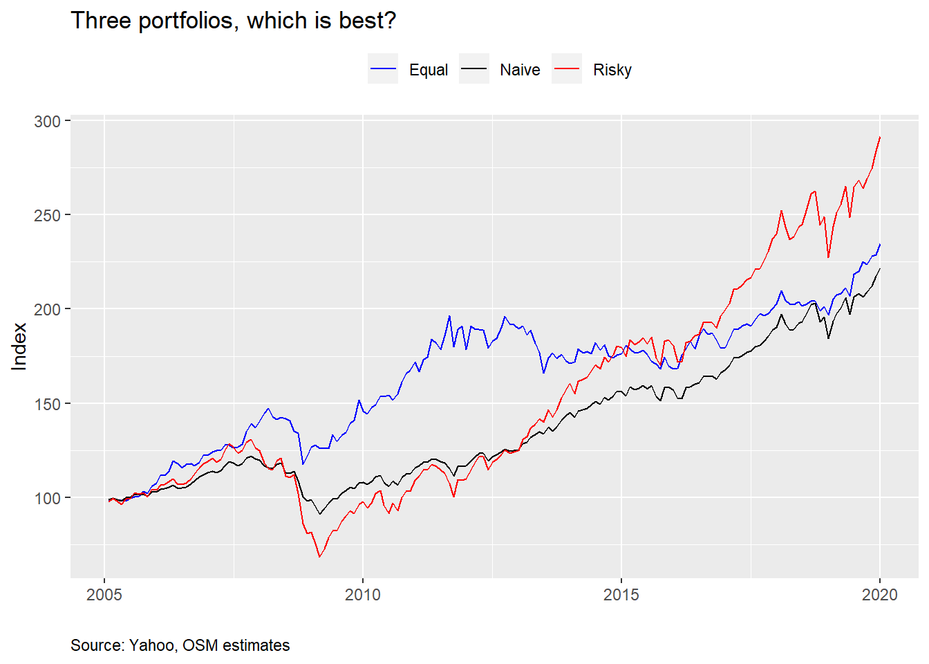
So your cousin looks like a genius. But, for a while, you were crushing it, and, at least you’ve performed better than your co-worker. Water-cooler bragging rights are not something to scoff at! Let’s look at the average returns, risk (i.e., volatility), and risk-adjusted returns for each portfolio.
| Asset | Mean (%) | Volatility (%) | Risk-adjusted (%) | Cumulative (%) |
|---|---|---|---|---|
| Equal | 6.0 | 9.2 | 66.5 | 234.5 |
| Naive | 6.0 | 6.9 | 80.6 | 222.0 |
| Risky | 8.4 | 12.4 | 63.8 | 291.6 |
Even though your overall performance was better than your co-worker, average annualized performance was about the same. However, your volatility was much higher leading to worse risk-adjusted performance. Here risk-adjusted performance is simply the mean return divided by the volatility. Think of it as how much you earn relative to how much you risk. Higher is obviously better. Your cousin’s portfolio performed much better on a cumulative and average basis. But his risk-adjusted performance was even worse than yours.
Notice some interesting takeaways. Even though the Equal portfolio had the same average return as the Naive one, but worse risk-adjusted performance, it still enjoyed a better cumulative return. Which return should you focus on—average, risk-adjusted, or cumulative? When you retire what matters most is your cumulative return. However, you can’t have a high cumulative return without also having a high average return. Still, cumulative return can be less than another portfolio with virtually the same average return due to volatility and path dependency. One way to show these two together is to calculate what’s called semi-deviation. In other words, we only look at the deviation above or below the mean. We show that in the table below.
| Asset | Down volatility (%) | Up volatility (%) |
|---|---|---|
| Equal | 9.6 | 8.8 |
| Naive | 8.1 | 5.7 |
| Risky | 15.0 | 10.1 |
From the preceding table we can see why the Equal portfolio outperformed the Naive portfolio. It’s upside volatility was much higher. The Risky portfolio’s volatility was too. We won’t want spend any more time on semi-deviation now; but we will come back to it.
Now that you’ve seen how the portfolios have performed, would you keep your current allocation or would you switch? If you’re conservative you might re-allocate to the Naive portfolio. But if you like a Vegas weekend every chance you get, you might favor the Risky portfolio instead. Or you could toss a coin. How can we answer that question by applying some data science? Simulation! Note that rigorous finance would recommend optimization. But we want to build the intuition first before launching into the math.
Let’s simulate a thousand random weights for the three assets and graph a scatter plot to visualize the range of outcomes. Here we assume the same return, volatility, and correlation as occurred historically. While correlation is important, we don’t want to get into the nuances of that just yet. For a more detailed discussion see our previous post Detour: correlation.
When we graph the range of possible portfolios we see a wide spread of outcomes. The points at the top are said to “dominate” the points below because they offer a higher return for the same level of risk. The shape might seem a bit odd for folks used to looking at the “efficient frontier”. See the footnote for a more detailed discussion on this .3 Don’t worry if you don’t know what an efficient frontier is. Just appreciate the spread of outcomes.
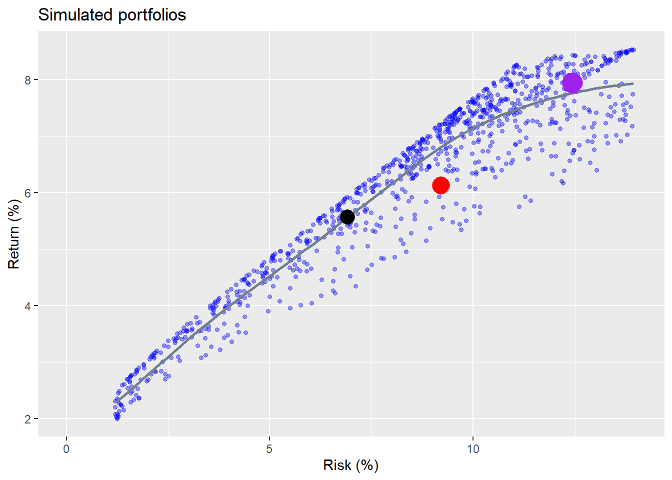
The different colored dots represent the original three portfolios. We can see that none of the portfolios “dominate” each other. That is, none is directly above the other. But each portfolio is dominated by other simulated portfolios. For example, for the Naive portfolio (black dot), the maximum return for that level of risk is about 0.38 percentage points higher than the portfolio. For the Equal (red dot) and Risky (purple dot) portfolios, the maximum returns are 1.2 and 0.5 percentage points higher. A half a percentage point greater return on average might seem small, but over a ten-year period leads to slightly over a 5% higher cumulative return. Still, most people are not likely to worry about half a percent. A full percent, as in the Equal portfolio, might be worth considering.
What the graph shows is that there is a trade-off between risk and return. As returns go up, risk does too, as delineated by the smooth grey line, but the dispersion of returns also widens. If you accept more risk, you should generally enjoy a higher return, but the chance that you won’t also increases. Additionally, the graph allows you to dial in the range of outcomes for different slices of risk or return. If you want a certain level of return, you can find a portfolio that offers that for the least amount of risk. Or you can find a range of portfolios that get you close for a range of risk levels. Alternatively, if you want to accept only a certain level of risk, you can find the portfolio that offers you the greatest return. Of course, you’d have to chug through some calculations to get to the appropriate weights, but there’s nothing mysterious about the process.
For argument’s sake, suppose you’re happy with the current riskiness of your portfolio, but you’d clearly like to get a better return, what would you do? You find the maximum return for that level of risk, and then back into the implied weight. What would that be? We show the results in the graph below.
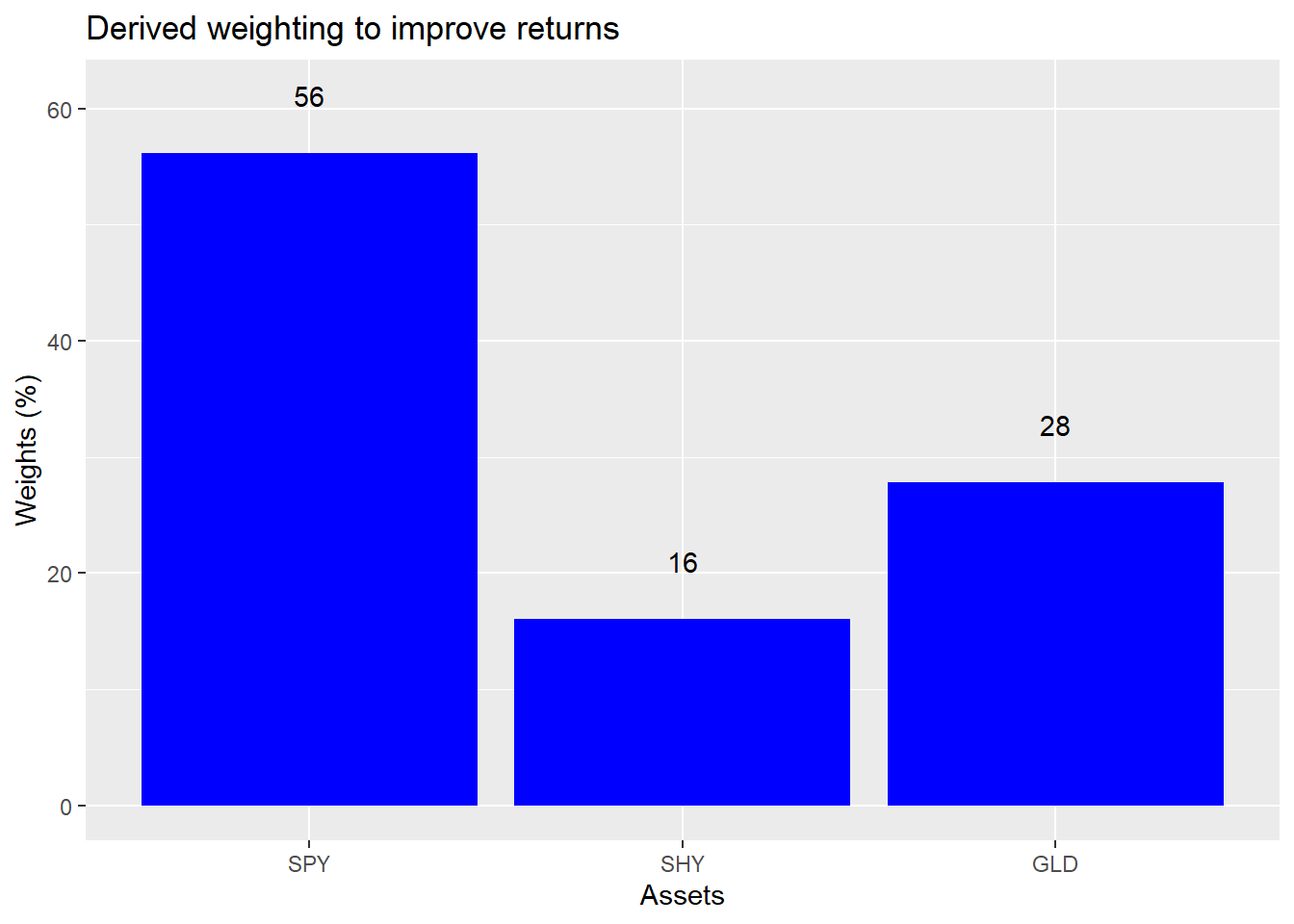
The dominant portfolio for the same level of risk as the Equal portfolio has a 56% weight to the SPY ETF, a 16% weight in SHY and a 28% weight in GLD. To achieve a higher return you swap out of bonds and into stocks and add a little to gold.
Let’s think about this for a moment. Even if you don’t know anything about where stocks or bonds or other assets are going to go in the next year, you can probably assume that stocks are riskier than bonds, and gold is riskier than both. Moreover, even if you don’t know the direction of stocks, bonds, or gold, you probably could guess that it’s easier to understand why stocks might increase in price than why gold might. Stock price direction might be a coin flip, but gold? That’s probably an unfair coin.
Given that, would you be comfortable increasing your allocation to stocks or commodities? Think about raising your exposure to stocks by 26 percentage points for a modest one-to-two percentage point increase in average returns? Seems like a lot for a little. This brings us to what we call the first problem of portfolio construction: sometimes what appears to be the optimal weighting is not the most palatable.
Now this was an artificial case in the sense that we had only three assets, one of which was gold. And while these assets were meant to be reasonable proxies for their asset classes, it wouldn’t be hard to argue there are better proxies. And what is the right proxy for real assets? Nonetheless, the point is that even with some simplistic, and superficially reasonable assumptions, it is possible to produce recommendations that would be uncomfortable to implement or not particularly intuitive. Portfolio construction isn’t simply about complex models and fancy code, it’s also about common sense.
We’ll leave you with that thought. In successive posts, we’ll look at picking portfolios out of a range of inputs, which will hopefully be more intuitive. Additionally, we’ll look at constructing portfolios using semi-deviation or accounting for rebalancing, two topics we mentioned above. After that, we’ll focus on setting asset class expectations. If you’d like to see us touch on another topic or disagree with our analysis, send us an email at the address after the code. Speaking of which, here’s the code underlying all of the analysis, graphs, and tables.
# Load package
library(tidyquant)
library(tidyverse)

# Get data
symbols <- c("SPY", "EEM", "SHY", "IYR", "GLD")
symbols_low <- tolower(symbols)

prices <- getSymbols(symbols, src = "yahoo",
                     from = "1990-01-01",
                     auto.assign = TRUE) %>%
  map(~Ad(get(.))) %>%
  reduce(merge) %>%
  `colnames<-`(symbols_low)

prices_monthly <- to.monthly(prices, indexAt = "last", OHLC = FALSE)
ret <- ROC(prices_monthly)["2005/2019"]
naive <- ret[,c("spy", "shy")]
basic <- ret[,c("spy", "shy", "gld")]

# Create different weights and portflios
wt1 <- rep(1/(ncol(basic)), ncol(basic))
port1 <- Return.portfolio(basic, wt1) %>%
  `colnames<-`("ret")

wt2 <- c(0.9, 0.10, 0)
port2 <- Return.portfolio(basic, weights = wt2) %>%
  `colnames<-`("ret")

wtn <- c(0.5, 0.5)
portn <- Return.portfolio(naive, wtn)

port_comp <- data.frame(date = index(port1), equal = as.numeric(port1),
                        wtd = as.numeric(port2),
                        naive = as.numeric(portn))

port_comp %>%
  gather(key,value, -date) %>%
  group_by(key) %>%
  mutate(value = cumprod(value+1)) %>%
  ggplot(aes(date, value*100, color = key)) +
  geom_line() +
  scale_color_manual("", labels = c("Equal", "Naive", "Risky"),
                     values = c("blue", "black", "red")) +
  labs(x = "",
       y = "Index",
       title = "Three portfolios, which is best?",
       caption = "Source: Yahoo, OSM estimates") +
  theme(legend.position = "top",
        plot.caption = element_text(hjust = 0))

# Portfolio summary table
port_comp %>%
  rename("Equal" = equal,
         "Naive" = naive,
         "Risky" = wtd) %>%
  gather(Asset, value, -date) %>%
  group_by(Asset) %>%
  summarise(`Mean (%)` = round(mean(value, na.rm = TRUE),3)*1200,
            `Volatility (%)` = round(sd(value, na.rm = TRUE)*sqrt(12),3)*100,
            `Risk-adjusted (%)` = round(mean(value, na.rm = TRUE)/sd(value, na.rm=TRUE)*sqrt(12),3)*100,
            `Cumulative (%)` = round(prod(1+value, na.rm = TRUE),3)*100) %>%
  knitr::kable(caption = "Annualized performance metrics")

# Semi-deviation functions
down_dev <- function(vec){
  mean_vec <- mean(vec, na.rm = TRUE)
  down_vec <- vec[vec < mean_vec]
  dev <- sqrt(mean((down_vec - mean_vec)^2))
  dev
}

up_dev <- function(vec){
  mean_vec <- mean(vec, na.rm = TRUE)
  up_vec <- vec[vec > mean_vec]
  dev <- sqrt(mean((up_vec - mean_vec)^2))
  dev
}

# Semi-deviation table
port_comp %>%
  rename("Equal" = equal,
         "Naive" = naive,
         "Risky" = wtd) %>%
  gather(Asset, value, -date) %>%
  group_by(Asset) %>%
  summarise(`Down volatility (%)` = round(down_dev(value)*sqrt(12),3)*100,
            `Up volatility(%)` = round(up_dev(value)*sqrt(12),3)*100) %>%
  knitr::kable(caption = "Annualized performance metrics")

## Portfolio simulations

# Portfolio
mean_ret <- apply(ret[,c("spy", "shy", "gld")],2,mean)
cov_port <- cov(ret[,c("spy", "shy", "gld")])
port_exam <- data.frame(ports = colnames(port_comp)[-1],
                        ret = as.numeric(apply(port_comp[,-1],2, mean)),
                        vol = as.numeric(apply(port_comp[,-1], 2, sd)))


# Weighting that ensures more variation and random weighthing to stocks
set.seed(123)
wts <- matrix(nrow = 1000, ncol = 3)

for(i in 1:1000){
  a <- runif(1,0,1)
  b <- c()
  for(j in 1:2){
    b[j] <- runif(1,0,1-sum(a,b))
  }
  if(sum(a,b) < 1){
    inc <- (1-sum(a,b))/3
    vec <- c(a+inc, b+inc)
  }else{
    vec <- c(a,b)
  }
  wts[i,] <- sample(vec,replace = FALSE)
}

# Calculate random portfolios
port <- matrix(nrow = 1000, ncol = 2)
for(i in 1:1000){
  port[i,1] <- as.numeric(sum(wts[i,] * mean_ret))
  port[i,2] <- as.numeric(sqrt(t(wts[i,] %*% cov_port %*% wts[i,])))
}

colnames(port) <- c("returns", "risk")
port <- as.data.frame(port)

# Graph with points
port %>%
  ggplot(aes(risk*sqrt(12)*100, returns*1200)) +
  geom_point(color = "blue", size = 1.2, alpha = 0.4) +
  geom_smooth(method = "loess", formula = y ~ log(x), se = FALSE, color = "slategrey") +
  geom_point(data = port_exam, aes(port_exam[1,3]*sqrt(12)*100,
                            port_exam[1,2]*1200),
             color = "red", size = 6) +
  geom_point(data = port_exam, aes(port_exam[2,3]*sqrt(12)*100,
                                   port_exam[2,2]*1200),
             color = "purple", size = 7) +
  geom_point(data = port_exam, aes(port_exam[3,3]*sqrt(12)*100,
                                   port_exam[3,2]*1200),
             color = "black", size = 5) +
  scale_x_continuous(limits = c(0,14)) +
  labs(x = "Risk (%)",
       y = "Return (%)",
       title = "Simulated portfolios")

# Dominated portfolios
naive_dom <- port %>%
  filter(risk < port_exam[3,3]+0.0005,
         risk > port_exam[3,3]-0.0005) %>%
  summarise(round(max(returns) - port_exam[3,2],4)*1200+.02) %>%
  as.numeric()

equal_dom <- port %>%
  filter(risk < port_exam[1,3]+0.0005,
         risk > port_exam[1,3]-0.0005) %>%
  summarise(round(max(returns) - port_exam[1,2],3)*1200) %>%
  as.numeric()

risky_dom <- port %>%
  filter(risk < port_exam[2,3]+0.0005,
         risk > port_exam[2,3]-0.0005) %>%
  summarise(round(max(returns) - port_exam[2,2],4)*1200+.02) %>%
  as.numeric()

# Finad max and equivalent risk for Equal risk slice
equal_max <- port %>%
  filter(risk < port_exam[1,3]+0.0005,
         risk > port_exam[1,3]-0.0005) %>%
  mutate(returns = returns*1200,
         risk = risk * sqrt(12)*100) %>%
  arrange(desc(returns)) %>%
  slice(1)

# Find wieghts for dominant portfolio
eq_wt <- port %>%
  mutate(spy_wt = wts[,1],
         shy_wt = wts[,2],
         gld_wt = wts[,3],
         returns = returns * 1200,
         risk = risk * sqrt(12) *100) %>%
  filter(returns == equal_max$returns,
         risk == equal_max$risk) %>%
  select(spy_wt, shy_wt, gld_wt)

# Graph weights
eq_wt %>%
  rename("SPY" = spy_wt,
         "SHY" = shy_wt,
         "GLD" = gld_wt) %>%
  gather(key,value) %>%
  ggplot(aes(factor(key, level = c("SPY", "SHY", "GLD")), value*100)) +
  geom_bar(stat = 'identity', fill = "blue") +
  geom_text(aes(label = round(value,2)*100), nudge_y = 5) +
  labs(x = "Assets",
       y = "Weights (%)",
       title = "Derived weighting to improve returns")
Ultimately, our goal will be to yield a framework for building satisficing, not opitmal portfolios. There’s no guarantee we’ll succeed!↩
If there were, then we’d be able to conduct a complete test of the Capital Asset Pricing Model!↩
Many simulations that we’ve seen generate a vector of random uniform numbers between 0 and 1 and then force them to sum to one by dividing each element by the sum of the vector. But this does two things: forces the randomness to cluster closer to 1/n weights, removing extreme values; and prevents extreme values from occurring randomly across the choice of assets. Our random weight algorithm attempts to adjust for that, but probably isn’t perfect. Let us know if you think it can be improved!↩