Weighting on a friend
Our last few posts on portfolio construction have simulated various weighting schemes to create a range of possible portfolios. We’ve then chosen portfolios whose average weights yield the type of risk and return we’d like to achieve. However, we’ve noted there is more to portfolio construction than simulating portfolio weights. We also need to simulate return outcomes given that our use of historical averages to set return expectations is likely to be biased. It only accounts for one possible outcome.
Why did we bother to simulate weights in the first place? Finance theory posits that it is possible to find an optimal allocation of assets that achieves the highest return for a given level of risk or the lowest risk for a given level of return through a process known as mean-variance optimization. Explaining such concepts are all well and good if one understands the math, but aren’t so great at developing the intuition if one doesn’t. Additionally, simulating portfolio weights has the added benefit of approximating the range of different portfolios, different investors might hold if they had a view on asset attractiveness.
Of course, as we pointed out two posts ago, our initial weighting scheme was relatively simple as it assumed all assets were held. We then showed that if we excluded some of the assets, the range of outcomes would increase significantly. In our last post, we showed that when we simulated many potential return paths, based on the historical averages along with some noise, and then simulated a range of portfolio weights, the range of outcomes also increased.
Unfortunately, the probability of achieving our desired risk-return constraints decreased. The main reason: a broader range of outcomes implies an increase in volatility, which means the likelihood of achieving our risk constraint declines. Now this would be great time to note how in this case (as in much of finance theory), volatility is standing in for risk, which begs the question as to whether volatility captures risk accurately.1 Warren Buffett claims he prefers a choppy 15% return to a smooth 12%, a view finance theory might abhor. But the volatility vs. risk discussion is a huge can of worms we don’t want to open just yet. So like a good economist, after first assuming a can opener, we’ll assume a screw top jar in which to toss this discussion to unscrew at a later date.
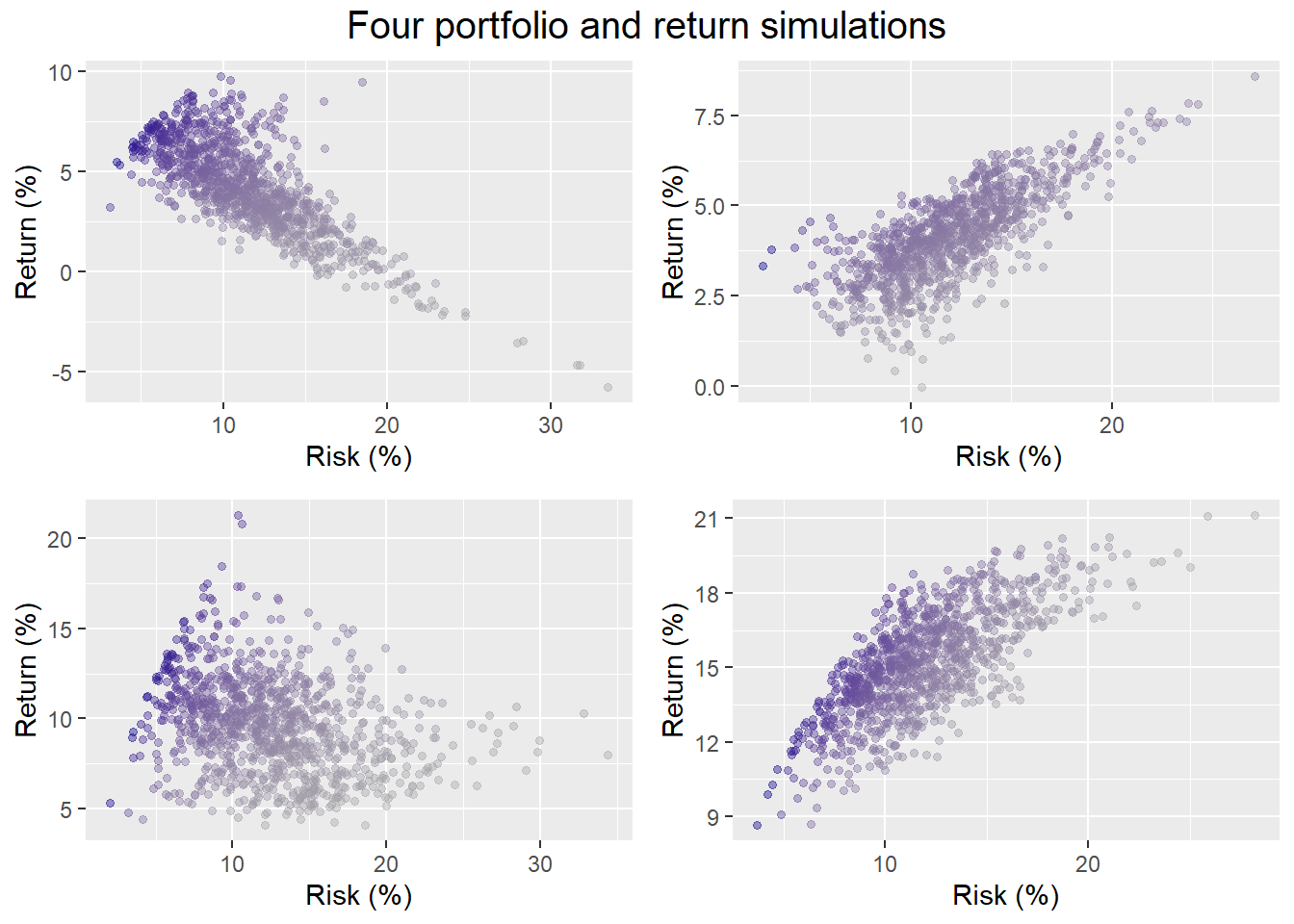
For now, we’ll run our simulations again but allowing for more extreme outcomes. Recall we generate 1,000 possible return scenarios over a 60-month (5-year) period for the set of assets. In other words, each simulation features randomly generated returns for each of the assets along with some noise, all of which hopefully accounts for random asset correlations too. As in our previous post, we then randomly select four of the possible return profiles and run our portfolio weighting algorithm to produce 1,000 different portfolios. Here are four samples below.
Now here’s the same simulations using the algorithm that allows one to exclude up to any two of the four assets. (A portfolio of a single asset isn’t really a portfolio.)
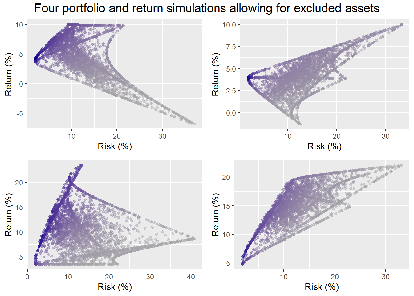
Who knew portfolio simulations could be so artistic. For the portfolios in which all assets are held, the probability of hitting our not less than 7% return and not more than 10% risk constraint, is 8%, 0%, 29%, and 29%. For the portfolios that allow assets to be excluded, the probabtility of achieving our risk-return constraints is 12%, 0%, 25%, and 25%.
We shouldn’t read too much into four samples. Still, allowing a broader range of allocations sometimes yields an improved probability of success, and sometimes it doesn’t. So much for more choice is better! The point is that a weighting scheme is only as good as the potential returns available. Extreme weights (99% in gold, 1% is bonds, and 0% in everything else, for example), will yield even more extreme performance, eroding the benefits of diversification. In essence, by excluding assets we’re increasing the likelihood of achieving dramatically awesome or dramatically awful returns. Portfolios with extreme returns tend to have higher volatility. So we are in effect filling in outcomes in the “tails” of the distribution. All things being equal, more tail events (2x more in fact), generally yield more outcomes where we’re likely to miss our modest risk constraint.
We’ll now extend the weighting simulation to the 1,000 return simulations from above, yielding three million different portfolios. We graph a random selection of 10,000 of those portfolios below.
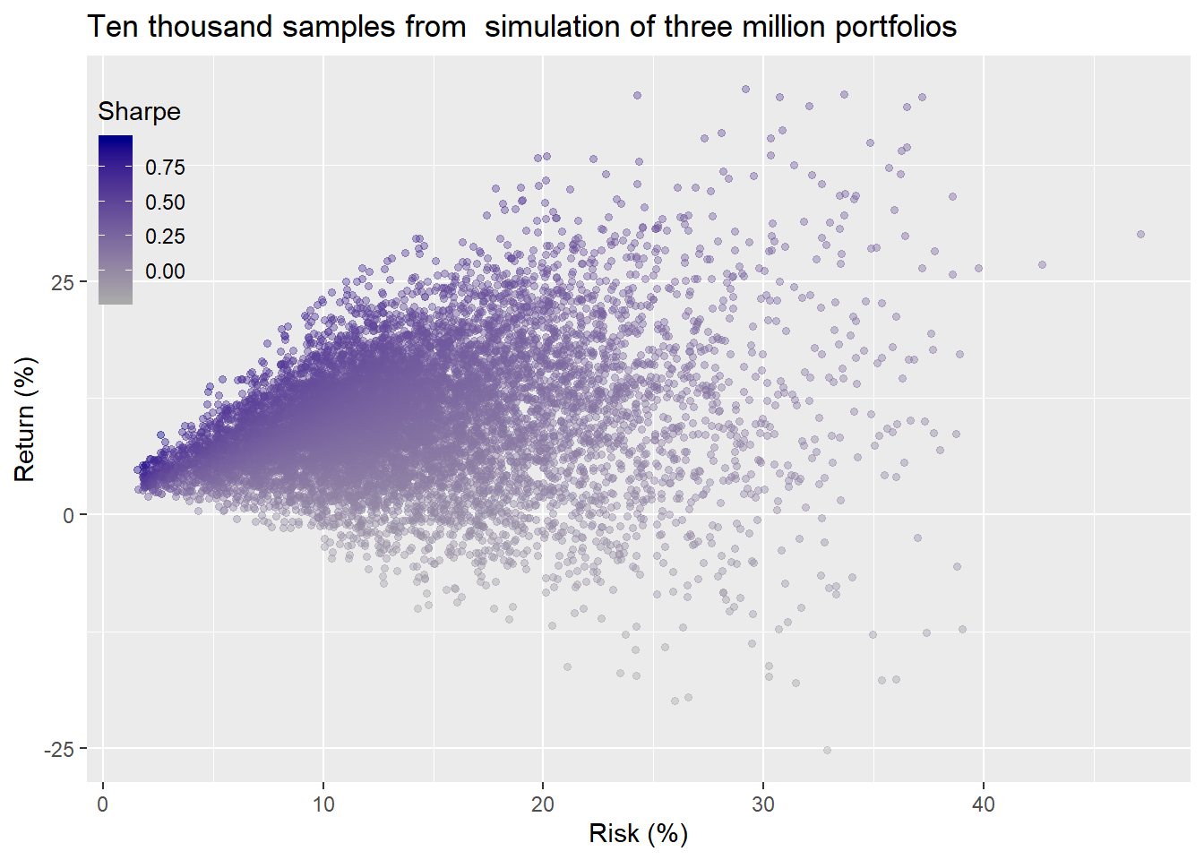
what a blast! Now here’s the histograms of the entire datasheet for returns and risk.
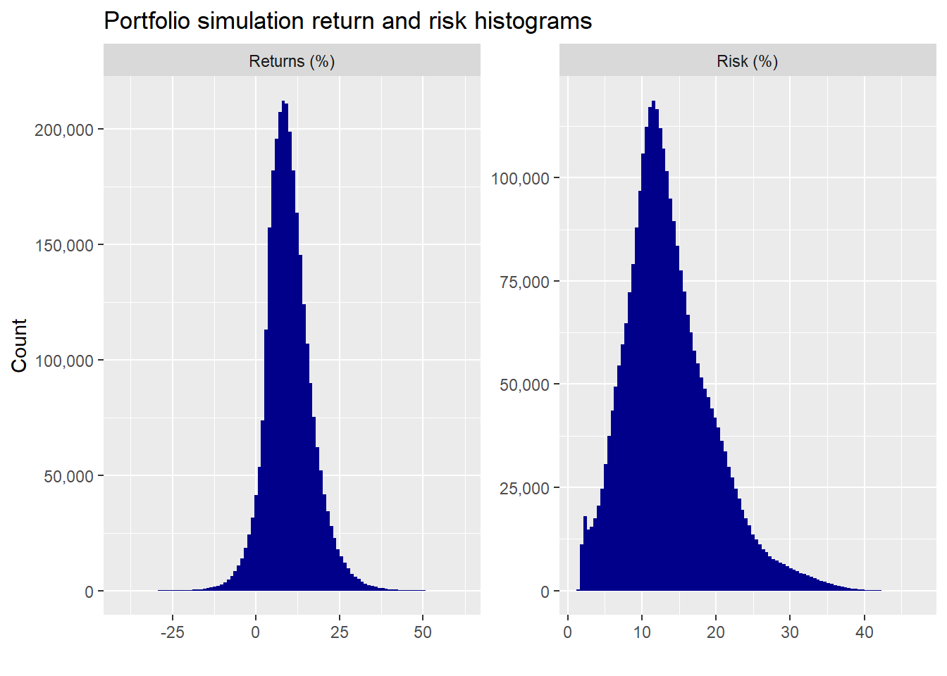
Returns are relatively normal. Volatility, predictably, is less than normal and positively skewed. We could theoretically transform volatility if we needed a more normal shape, but we’ll leave it as is for now. Still, this is something to keep in the back of our mind—namely, once we start excluding assets, we’re no longer in an easy to fit normal world, so should be wary of the probabilities we calculate.
Given these results, let’s think about what we want our portfolio to achieve. Greater than 7% returns matches the nominal returns of the stocks over the long term. Less than 10% risk does not. But, recall, we were “hoping” to generate equity-like returns with lower risk. We’re not trying to generate 10% or 20% average annual returns. If we were, we’d need to take on a lot more risk, at least theoretically.
Thus the question is, how much volatility are we willing to endure for a given return? While we could phrase this question in reverse (return for a given level of risk), we don’t think that is intuitive for most non-professional investors. If we bucket the range of returns and then calculate the volatility for each bucket, we can shrink our analysis to get a more managenable estimate of the magnitude of the risk-return trade-off.
We have three choices for how to bucket the returns: by interval, number, or width. We could have equal intervals of returns, with a different the number of observations for each interval. We could have an equal number of observations, with the return spread for each bucket sporting a different width. Or we could choose an equal width for the cut-off between returns, resulting in different number of observations for each bucket. We’ll choose the last scheme.
While there are returns that far exceed negative 15% and positive 45% on average annual basis, the frequency of occurrence is de minimis. So we’ll exclude those outcomes and only show the most frequent ranges in the graph below.
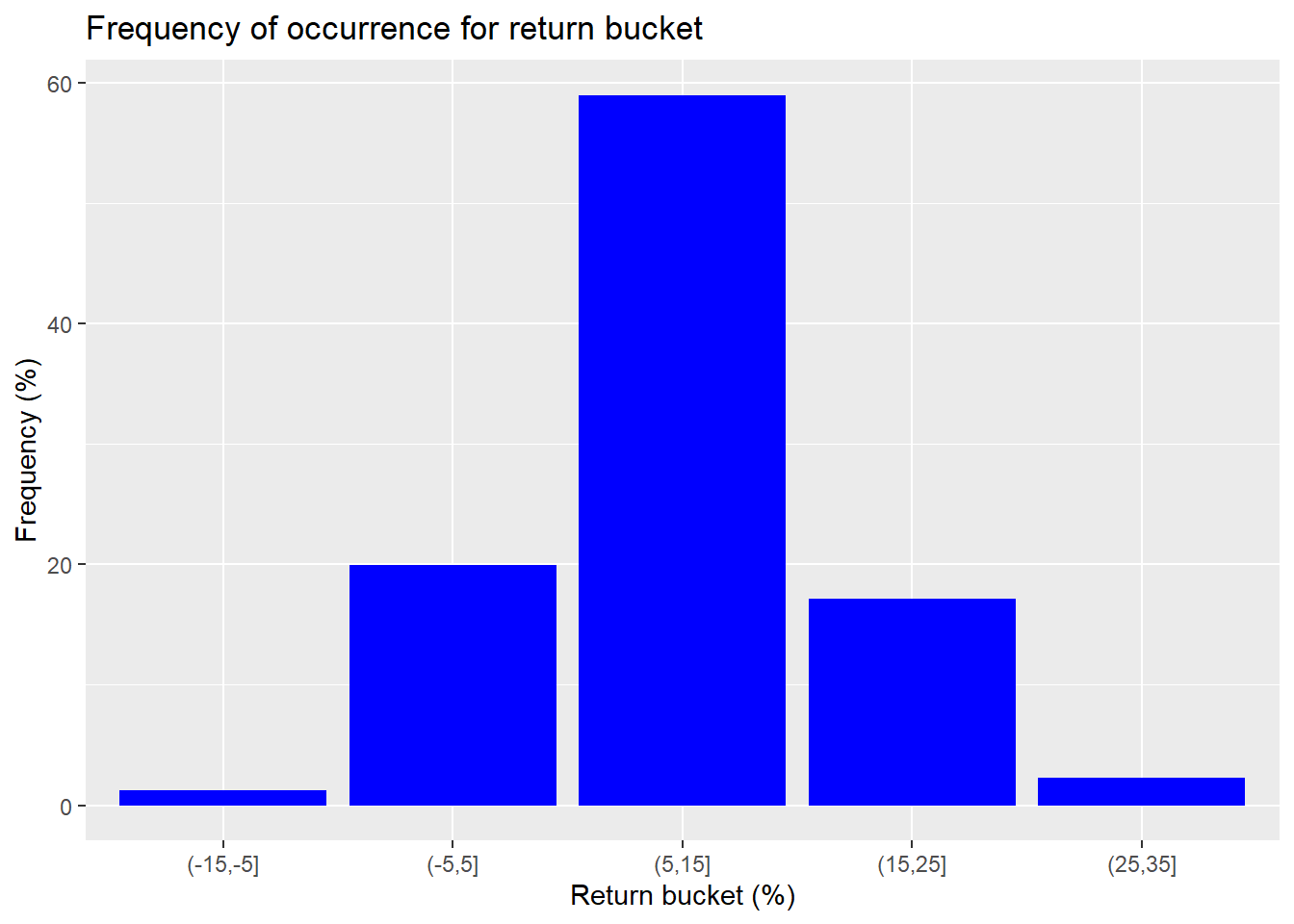
We see that around 59% of the occurrences are within the return range of 5% to 15%. Around 76% are between 5% to 25%. That’s a good start. A majority of the time we’ll be close to or above our return constraint. If we alter the buckets so most of the outlier returns are in one bucket (anything below -5% or above 35%) and then calculate the median return and risk for those buckets, we’ll have a manageable data set, as shown below.
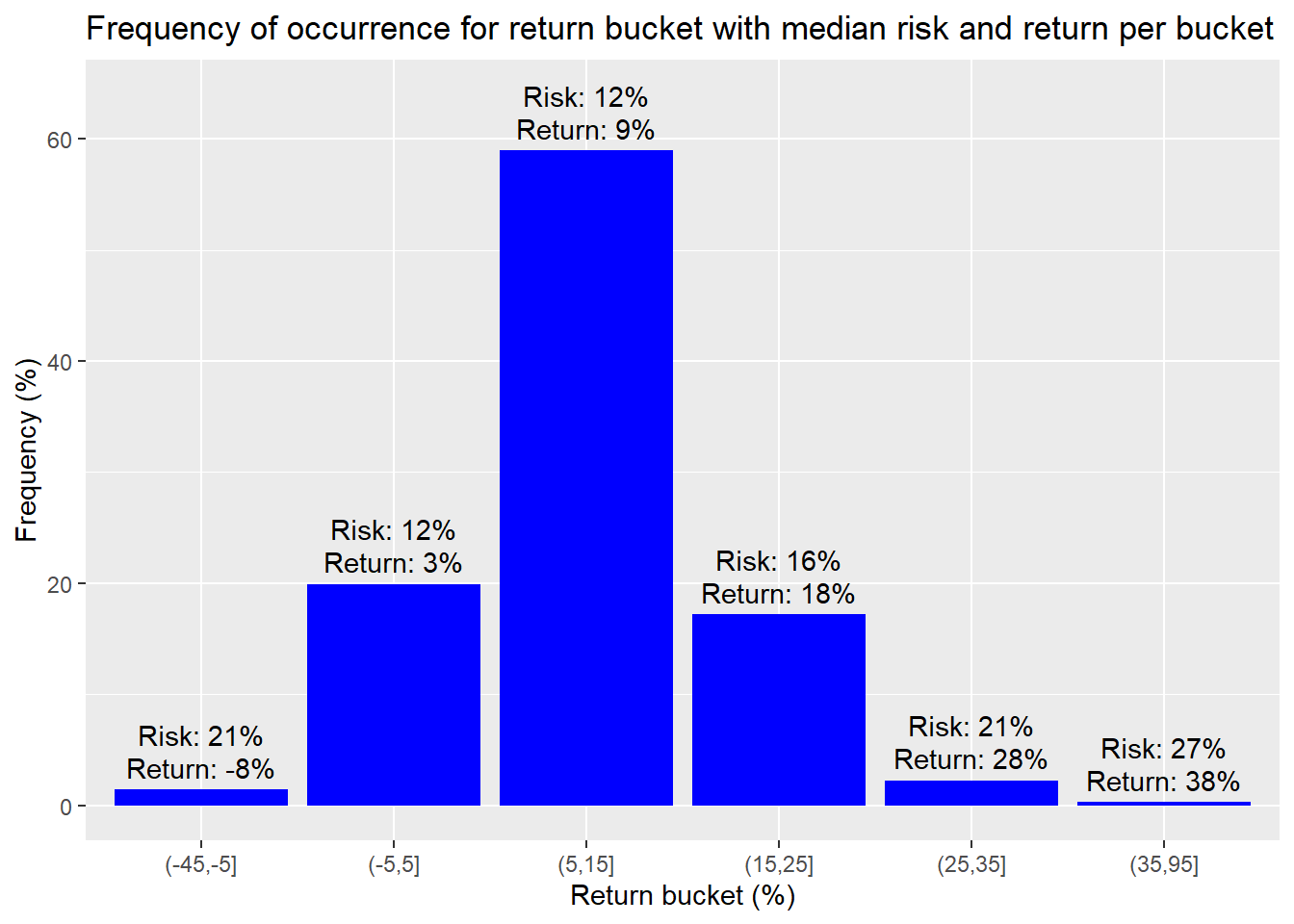
The bucket that includes are our greater than 7% return constraint has a median return of about 9% with median risk of about 12%. That equates to a Sharpe ratio of about 0.75, which is better than our implied target of 0.7. The next bucket with a median return and risk of 18% and 16% is better. But buckets above that have even better risk to reward ratios. However, only 3% of the portfolios reach that stratosphere.
Given that around 76% of the portfolios have a better risk-reward than our target, we could easily achieve our goal by only investing a portion of our assets in the risky portfolios and putting the remainder in risk-free assets if one believes such things exist.2 But we’d still need to figure out our allocations.
Let’s look at the weighting for these different portfolios. First, we bracket 76% or so of the portfolios that are in the sweet spot and take the average of the weights.
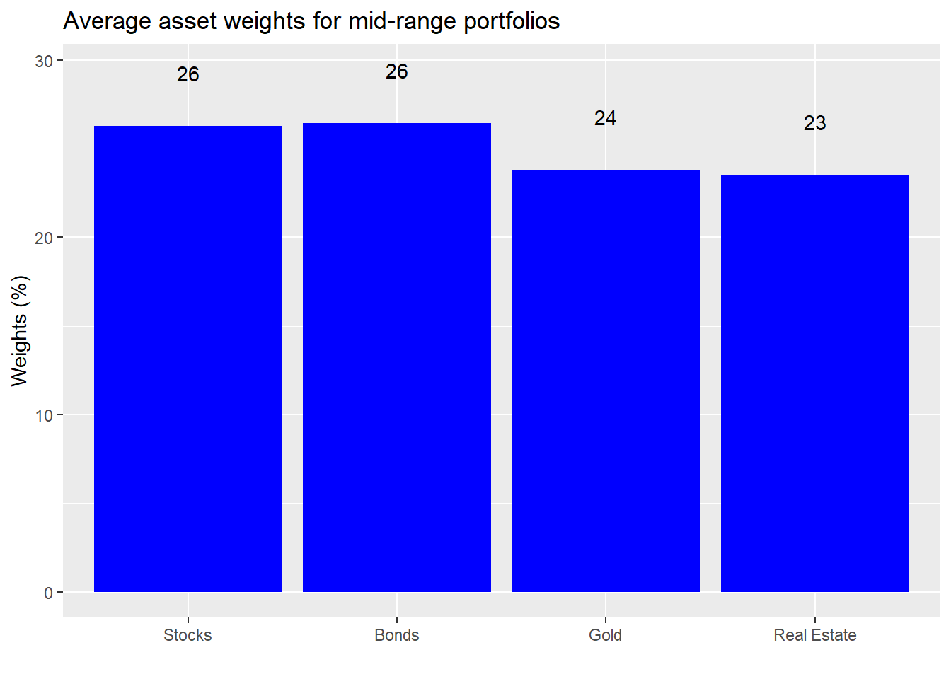
We see that average weights are roughly equal if slightly biased toward stocks and bonds. Now let’s calculate the average weights for the returns above the mid-range.
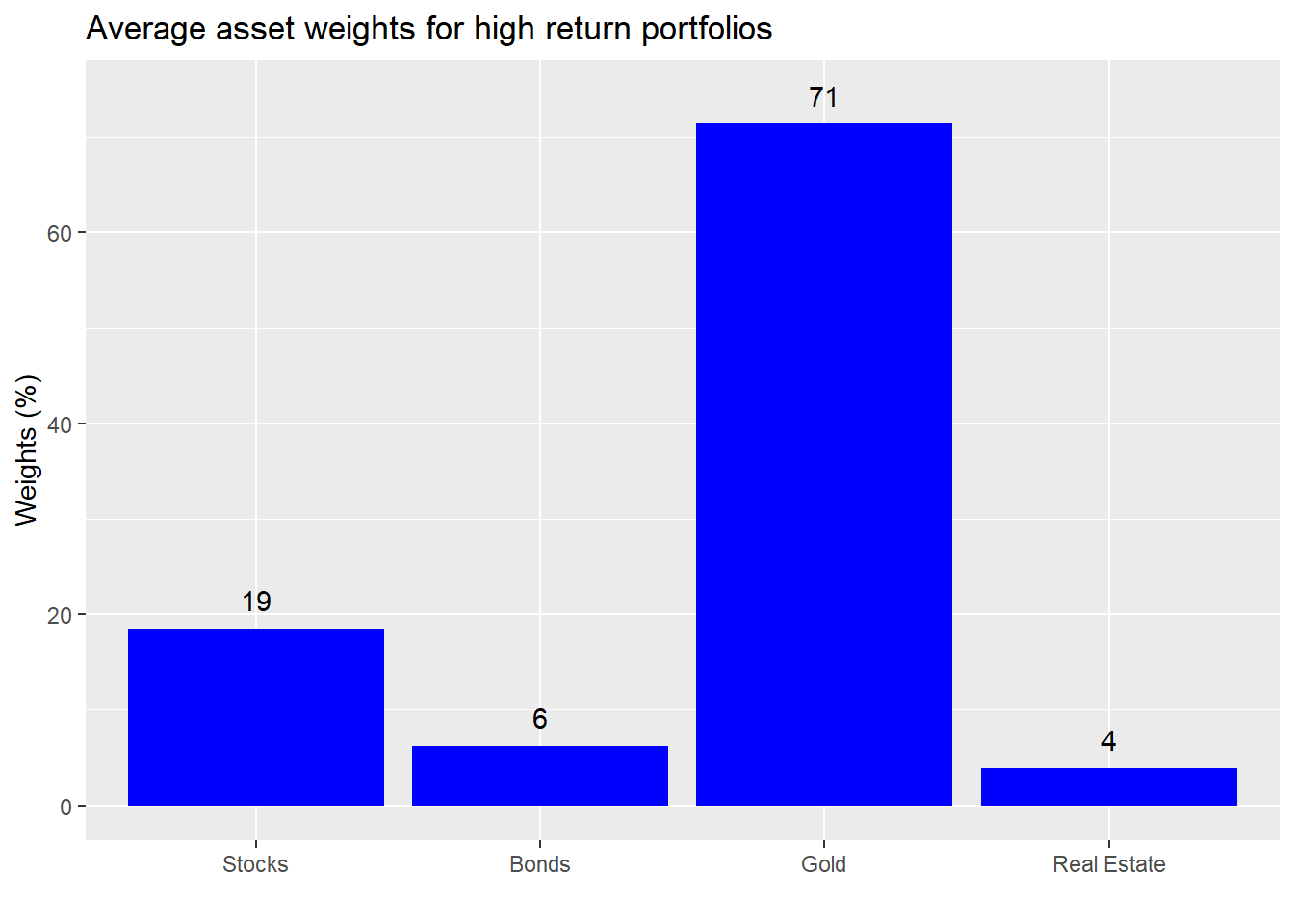
Instructive. Those portfolios that saw very high returns had a very high exposure to gold. What about the low return portfolios?
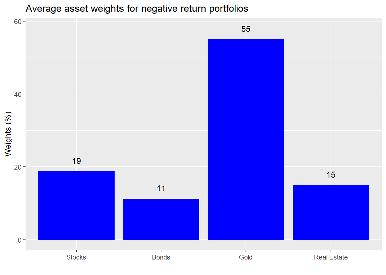
Also a high exposure to gold. We’re not picking on the yellow metal, but this a great illustration of the perils of overweighting a highly volatile asset. Sometimes you knock it out of the park and sometimes you crash and burn. Recall our return simulations took each asset’s historical return and risk and added in some noise3 similar to the asset’s underlying risk. Hence, by randomness alone it was possible to generate spectacular or abysmal returns. That massive outperformance your friend is enjoying could entirely be due to luck.
But, before you begin to think we’ve drunk the Efficient Market Hypothesis kool-aid, let’s look at the weights for the portfolios that meet or exceed our risk-return constraints.
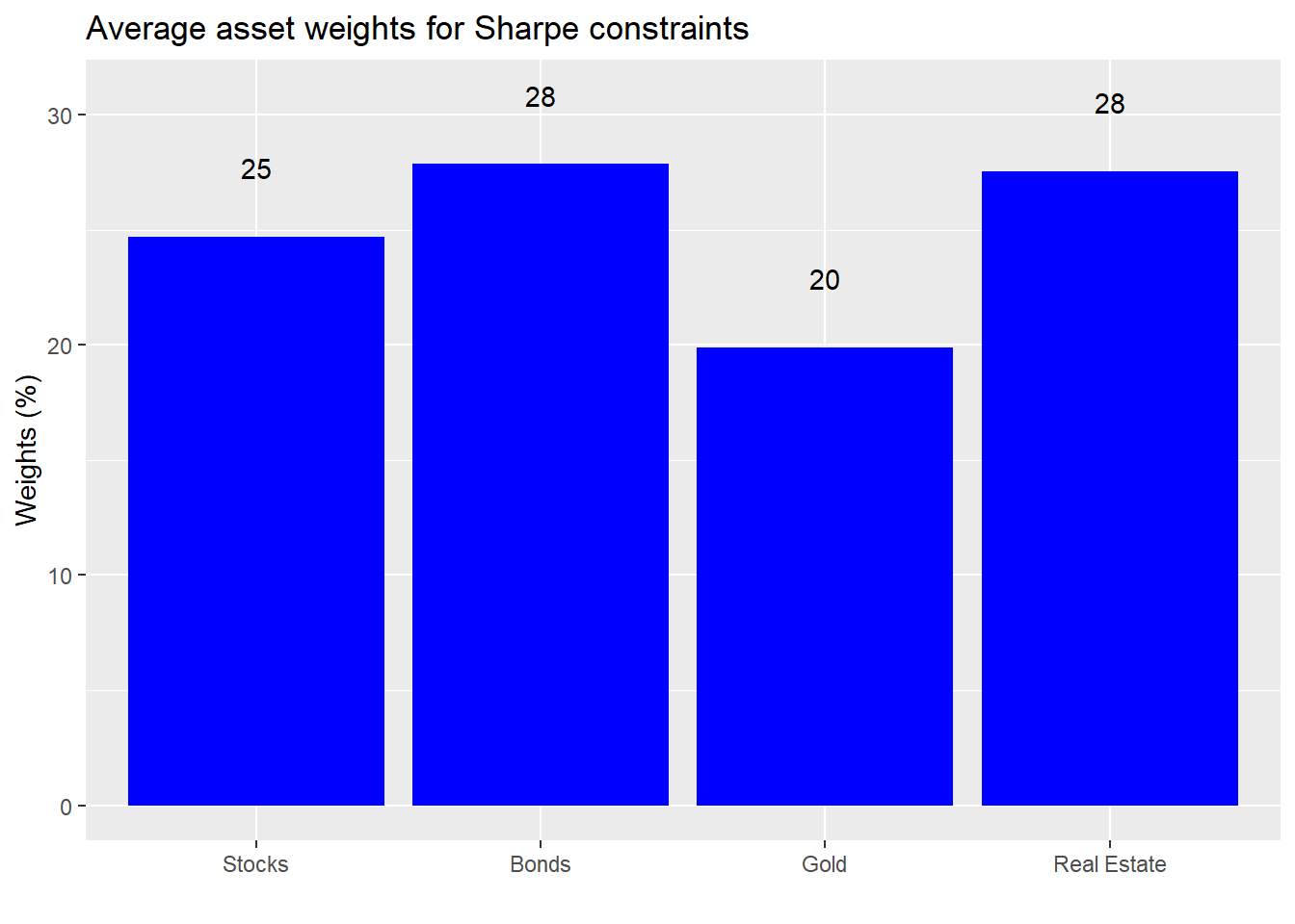
An interesting result. While the weights are still relatively equal, the higher risk assets have a lower exposure overall.
Let’s summarize. When we simulated multiple return outcomes and relaxed the allocation constraints to allow us to exclude assets, the range of return and risk results increased significantly. But the likelihood of achieving our risk and return targets decreased. So we decided to bucket the portfolios to make it easier to assess how much risk we’d have to accept for the type of return we wanted. Doing so, we calculated the median returns and risk for each bucket and found that some buckets achieved Sharpe ratios close to or better than that implied by our original risk-return constraint. We then looked at the average asset allocations for some of the different buckets, ultimately, cutting the data again to calculate the average weights for the better Sharpe ratio portfolios. The takeaway: relatively equal-weighting tended to produce a better risk-reward outcome than significant overweighting. Remember this takeaway because we’ll come back to it in later posts.
In the end, we could have a bypassed some of this data wrangling and just calculated the optimal portfolio weights for various risk profiles. But that will have to wait until we introduce our friend, mean-variance optimization. Until then, the Python and R code that can produce the foregoing analysis and charts are below.
For the Pythonistas:
# Built using Python 3.7.4

# Load libraries
import pandas as pd
import pandas_datareader.data as web
import numpy as np
import matplotlib.pyplot as plt
%matplotlib inline

import seaborn as sns
plt.style.use('ggplot')
sns.set()

# SKIP IF ALREADY HAVE DATA
# Load data
start_date = '1970-01-01'
end_date = '2019-12-31'
symbols = ["WILL5000INDFC", "BAMLCC0A0CMTRIV", "GOLDPMGBD228NLBM", "CSUSHPINSA", "DGS5"]
sym_names = ["stock", "bond", "gold", "realt", 'rfr']
filename = 'data_port_const.pkl'

try:
    df = pd.read_pickle(filename)
    print('Data loaded')
except FileNotFoundError:
    print("File not found")
    print("Loading data", 30*"-")
    data = web.DataReader(symbols, 'fred', start_date, end_date)
    data.columns = sym_names

data_mon = data.resample('M').last()
df = data_mon.pct_change()['1987':'2019']
dat = data_mon.pct_change()['1971':'2019']

## Simulation function
class Port_sim:
    def calc_sim(df, sims, cols):
        wts = np.zeros((sims, cols))

        for i in range(sims):
            a = np.random.uniform(0,1,cols)
            b = a/np.sum(a)
            wts[i,] = b

        mean_ret = df.mean()
        port_cov = df.cov()

        port = np.zeros((sims, 2))
        for i in range(sims):
            port[i,0] =  np.sum(wts[i,]*mean_ret)
            port[i,1] = np.sqrt(np.dot(np.dot(wts[i,].T,port_cov), wts[i,]))

        sharpe = port[:,0]/port[:,1]*np.sqrt(12)
        best_port = port[np.where(sharpe == max(sharpe))]
        max_sharpe = max(sharpe)

        return port, wts, best_port, sharpe, max_sharpe

    def calc_sim_lv(df, sims, cols):
        wts = np.zeros(((cols-1)*sims, cols))
        count=0

        for i in range(1,cols):
            for j in range(sims):
                a = np.random.uniform(0,1,(cols-i+1))
                b = a/np.sum(a)
                c = np.random.choice(np.concatenate((b, np.zeros(i))),cols, replace=False)
                wts[count,] = c
                count+=1

        mean_ret = df.mean()
        port_cov = df.cov()

        port = np.zeros(((cols-1)*sims, 2))
        for i in range(sims):
            port[i,0] =  np.sum(wts[i,]*mean_ret)
            port[i,1] = np.sqrt(np.dot(np.dot(wts[i,].T,port_cov), wts[i,]))

        sharpe = port[:,0]/port[:,1]*np.sqrt(12)
        best_port = port[np.where(sharpe == max(sharpe))]
        max_sharpe = max(sharpe)

        return port, wts, best_port, sharpe, max_sharpe

    def graph_sim(port, sharpe):
        plt.figure(figsize=(14,6))
        plt.scatter(port[:,1]*np.sqrt(12)*100, port[:,0]*1200, marker='.', c=sharpe, cmap='Blues')
        plt.colorbar(label='Sharpe ratio', orientation = 'vertical', shrink = 0.25)
        plt.title('Simulated portfolios', fontsize=20)
        plt.xlabel('Risk (%)')
        plt.ylabel('Return (%)')
        plt.show()

# Calculate returns and risk for longer period
hist_mu = dat['1971':'1991'].mean(axis=0)
hist_sigma = dat['1971':'1991'].std(axis=0)


# Run simulation based on historical figures
np.random.seed(123)
sim1 = []

for i in range(1000):
    #np.random.normal(mu, sigma, obs)
    a = np.random.normal(hist_mu[0], hist_sigma[0], 60) + np.random.normal(0, hist_sigma[0], 60)
    b = np.random.normal(hist_mu[1], hist_sigma[1], 60) + np.random.normal(0, hist_sigma[1], 60)
    c = np.random.normal(hist_mu[2], hist_sigma[2], 60) + np.random.normal(0, hist_sigma[2], 60)
    d = np.random.normal(hist_mu[3], hist_sigma[3], 60) + np.random.normal(0, hist_sigma[3], 60)

    df1 = pd.DataFrame(np.array([a, b, c, d]).T)

    cov_df1 = df1.cov()

    sim1.append([df1, cov_df1])

# create graph objects
np.random.seed(123)
samp = np.random.randint(1, 1000, 4)
graphs1 = []
for i in range(4):
    port, _, _, sharpe, _ = Port_sim.calc_sim(sim1[samp[i]][0], 1000, 4)
    graf = [port,sharpe]
    graphs1.append(graf)

# Graph sample portfolios
fig, axes = plt.subplots(2, 2, figsize=(12,6))

for i, ax in enumerate(fig.axes):
    ax.scatter(graphs1[i][0][:,1]*np.sqrt(12)*100, graphs1[i][0][:,0]*1200, marker='.', c=graphs1[i][1], cmap='Blues')

plt.show()

# create graph objects
np.random.seed(123)
graphs2 = []
for i in range(4):
    port, _, _, sharpe, _ = Port_sim.calc_sim_lv(sim1[samp[i]][0], 1000, 4)
    graf = [port,sharpe]
    graphs2.append(graf)

# Graph sample portfolios
fig, axes = plt.subplots(2, 2, figsize=(12,6))

for i, ax in enumerate(fig.axes):
    ax.scatter(graphs2[i][0][:,1]*np.sqrt(12)*100, graphs2[i][0][:,0]*1200, marker='.', c=graphs2[i][1], cmap='Blues')

plt.show()

# Calculate probability of hitting risk-return constraints based on sample portfolos
probs = []
for i in range(8):
    if i <= 3:
        out = round(np.mean((graphs1[i][0][:,0] >= 0.07/12) & (graphs1[i][0][:,1] <= 0.1/np.sqrt(12))),2)*100
        probs.append(out)
    else:
        out = round(np.mean((graphs2[i-4][0][:,0] >= 0.07/12) & (graphs2[i-4][0][:,1] <= 0.1/np.sqrt(12))),2)*100
        probs.append(out)

print(probs)

# Simulate portfolios from reteurn simulations
def wt_func(sims, cols):
    wts = np.zeros(((cols-1)*sims, cols))
    count=0

    for i in range(1,cols):
        for j in range(sims):
            a = np.random.uniform(0,1,(cols-i+1))
            b = a/np.sum(a)
            c = np.random.choice(np.concatenate((b, np.zeros(i))),cols, replace=False)
            wts[count,] = c
            count+=1

    return wts

# Note this takes over 4min to run, substantially worse than the R version, which runs in under a minute. Not sure what I'm missng.

np.random.seed(123)
portfolios = np.zeros((1000, 3000, 2))
weights = np.zeros((1000,3000,4))
for i in range(1000):
    wt_mat = wt_func(1000,4)
    port_ret = sim1[i][0].mean(axis=0)
    cov_dat = sim1[i][0].cov()
    returns = np.dot(wt_mat, port_ret)
    risk = [np.sqrt(np.dot(np.dot(wt.T,cov_dat), wt)) for wt in wt_mat]
    portfolios[i][:,0] = returns
    portfolios[i][:,1] = risk
    weights[i][:,:] = wt_mat

port_1m = portfolios.reshape((3000000,2))
wt_1m = weights.reshape((3000000,4))

# Find probability of hitting risk-return constraints on simulated portfolios
port_1m_prob = round(np.mean((port_1m[:][:,0] > 0.07/12) & (port_1m[:][:,1] <= 0.1/np.sqrt(12))),2)*100
print(f"The probability of meeting our portfolio constraints is:{port_1m_prob: 0.0f}%")

# Plot sample portfolios
np.random.seed(123)
port_samp = port_1m[np.random.choice(1000000, 10000),:]
sharpe = port_samp[:,0]/port_samp[:,1]

plt.figure(figsize=(14,6))
plt.scatter(port_samp[:,1]*np.sqrt(12)*100, port_samp[:,0]*1200, marker='.', c=sharpe, cmap='Blues')
plt.colorbar(label='Sharpe ratio', orientation = 'vertical', shrink = 0.25)
plt.title('Ten thousand samples from three million simulated portfolios', fontsize=20)
plt.xlabel('Risk (%)')
plt.ylabel('Return (%)')
plt.show()

# Graph histograms
fig, axes = plt.subplots(1,2, figsize = (12,6))

for idx,ax in enumerate(fig.axes):
    if idx == 1:
        ax.hist(port_1m[:][:,1], bins = 100)
    else:
        ax.hist(port_1m[:][:,0], bins = 100)

plt.show()

## Create buckets for analysis and graphin
df_port = pd.DataFrame(port_1m, columns = ['returns', 'risk'])
port_bins = np.arange(-35,65,10)
df_port['dig_ret'] = pd.cut(df_port['returns']*1200, port_bins)

xs = ["(-35, -25]", "(-25, -15]", "(-15, -5]","(-5, 5]", "(5, 15]", "(15, 25]", "(25, 35]", "(35, 45]", "(45, 55]"]
ys = df_port.groupby('dig_ret').size().values/len(df_port)*100

# Graph buckets with frequency
fig,ax = plt.subplots(figsize = (12,6))
ax.bar(xs[2:7], ys[2:7])
ax.set(xlabel = "Return bucket (%)",
       ylabel = "Frequency (%)",
       title = "Frequency of occurrrence for return bucket ")
plt.show()

# Calculate frequency of occurence for mid range of returns
good_range = np.sum(df_port.groupby('dig_ret').size()[4:6])/len(df_port)
good_range

## Graph buckets with median return and risk
med_ret = df_port.groupby('dig_ret').agg({'returns':'median'})*1200
med_risk = df_port.groupby('dig_ret').agg({'risk':'median'})*np.sqrt(12)*100

labs_ret = np.round(med_ret['returns'].to_list()[2:7])
labs_risk = np.round(med_risk['risk'].to_list()[2:7])

fig, ax = plt.subplots(figsize = (12,6))
ax.bar(xs[2:7], ys[2:7])

for i in range(len(xs[2:7])):
    ax.annotate(str('Returns: ' + str(labs_ret[i])), xy = (xs[2:7][i], ys[2:7][i]+2), xycoords = 'data')
    ax.annotate(str('Risk: ' + str(labs_risk[i])), xy = (xs[2:7][i], ys[2:7][i]+5), xycoords = 'data')

ax.set(xlabel = "Return bucket (%)",
       ylabel = "Frequency (%)",
       title = "Frequency of occurrrence for return bucket ",
      ylim = (0,60))


plt.show()

# Find frequency of high return buckets
hi_range = np.sum(df_port.groupby('dig_ret').size()[6:])/len(df_port)
hi_range

## Identify weights for different buckets for graphing

wt_1m = pd.DataFrame(wt_1m, columns = ['Stocks', 'Bonds', 'Gold', 'Real estate'])

port_ids_mid = df_port.loc[(df_port['returns'] >= 0.05/12) & (df_port['returns'] <= 0.25/12)].index
mid_ports = wt_1m.loc[port_ids_mid,:].mean(axis=0)

port_ids_hi = df_port.loc[(df_port['returns'] >= 0.35/12)].index
hi_ports = wt_1m.loc[port_ids_hi,:].mean(axis=0)

port_ids_lo = df_port.loc[(df_port['returns'] <= -0.05/12)].index
lo_ports = wt_1m.loc[port_ids_lo,:].mean(axis=0)

# Sharpe portfolios
df_port['sharpe'] = df_port['returns']/df_port['risk']*np.sqrt(12)
port_ids_sharpe = df_port[(df_port['sharpe'] > 0.7)].index
sharpe_ports = wt_1m.loc[port_ids_sharpe,:].mean(axis=0)

# Create graph function
def wt_graph(ports, title):
    fig, ax = plt.subplots(figsize=(12,6))
    ax.bar(ports.index.values, ports*100)
    for i in range(len(mid_ports)):
        ax.annotate(str(np.round(ports[i],2)*100), xy=(ports.index.values[i], ports[i]*100+2), xycoords = 'data')

    ax.set(xlabel = '', ylabel = 'Weigths (%)', title = title, ylim = (0,max(ports)*100+5))
    plt.show()

# Graph weights
wt_graph(mid_ports, "Average asset weights for mid-range portfolios")
wt_graph(mid_ports, "Average asset weights for high return portfolios")
wt_graph(mid_ports, "Average asset weights for negative return portfolios")
wt_graph(mid_ports, "Average asset weights for Sharpe portfolios")
For the Rtists:
# Built using R 3.6.2

## Load packages
suppressPackageStartupMessages({
  library(tidyquant)
  library(tidyverse)
  library(gtools)
  library(grid)
})

## Load data
df <- readRDS("port_const.rds")
dat <- readRDS("port_const_long.rds")
sym_names <- c("stock", "bond", "gold", "realt", "rfr")

## Call simuation functions
source("Portfolio_simulation_functions.R")

## Prepare sample
hist_avg <- dat %>%
  filter(date <= "1991-12-31") %>%
  summarise_at(vars(-date), list(mean = function(x) mean(x, na.rm=TRUE),
                                 sd = function(x) sd(x, na.rm = TRUE))) %>%
  gather(key, value) %>%
  mutate(key = str_remove(key, "_.*"),
         key = factor(key, levels =sym_names)) %>%
  mutate(calc = c(rep("mean",5), rep("sd",5))) %>%
  spread(calc, value)

# Run simulation
set.seed(123)
sim1 <- list()
for(i in 1:1000){
  a <- rnorm(60, hist_avg[1,2], hist_avg[1,3]) + rnorm(60, 0, hist_avg[1,3])
  b <- rnorm(60, hist_avg[2,2], hist_avg[2,3]) + rnorm(60, 0, hist_avg[2,3])
  c <- rnorm(60, hist_avg[3,2], hist_avg[3,3]) + rnorm(60, 0, hist_avg[3,3])
  d <- rnorm(60, hist_avg[4,2], hist_avg[4,3]) + rnorm(60, 0, hist_avg[4,3])

  df1 <- data.frame(a, b, c, d)

  cov_df1 <- cov(df1)

  sim1[[i]] <- list(df1, cov_df1)

  names(sim1[[i]]) <- c("df", "cov_df")

}

# Plot random four portfolios
## Sample four return paths
## Note this sampling does not realize in the same way in Rmarkdown/blogdown as in the console. NOt sure why.

set.seed(123)
samp <- sample(1000,4)
graphs <- list()
for(i in 1:8){
  if(i <= 4){
    graphs[[i]] <- port_sim(sim1[[samp[i]]]$df,1000,4)
  }else{
    graphs[[i]] <- port_sim_lv(sim1[[samp[i-4]]]$df,1000,4)
  }

}

library(grid)
gridExtra::grid.arrange(graphs[[1]]$graph +
                          theme(legend.position = "none") +
                          labs(title = NULL),
                        graphs[[2]]$graph +
                          theme(legend.position = "none") +
                          labs(title = NULL),
                        graphs[[3]]$graph +
                          theme(legend.position = "none") +
                          labs(title = NULL),
                        graphs[[4]]$graph +
                          theme(legend.position = "none") +
                          labs(title = NULL),
                        ncol=2, nrow=2,
                        top = textGrob("Four portfolio and return simulations",gp=gpar(fontsize=15)))


# Graph second set
gridExtra::grid.arrange(graphs[[5]]$graph +
                          theme(legend.position = "none") +
                          labs(title = NULL),
                        graphs[[6]]$graph +
                          theme(legend.position = "none") +
                          labs(title = NULL),
                        graphs[[7]]$graph +
                          theme(legend.position = "none") +
                          labs(title = NULL),
                        graphs[[8]]$graph +
                          theme(legend.position = "none") +
                          labs(title = NULL),
                        ncol=2, nrow=2,
                        top = textGrob("Four portfolio and return simulations allowing for excluded assets",gp=gpar(fontsize=15)))

# Calculate probability of hitting risk-return constraint
probs <- c()
for(i in 1:8){
  probs[i] <- round(mean(graphs[[i]]$port$returns >= 0.07/12 &
                           graphs[[i]]$port$risk <=0.1/sqrt(12)),2)*100
}

## Load data
port_1m <- readRDS("port_3m_sim.rds")

## Graph sample of port_1m
set.seed(123)
port_samp = port_1m[sample(1e6, 1e4),]

port_samp %>%
  mutate(Sharpe = returns/risk) %>%
  ggplot(aes(risk*sqrt(12)*100, returns*1200, color = Sharpe)) +
  geom_point(size = 1.2, alpha = 0.4) +
  scale_color_gradient(low = "darkgrey", high = "darkblue") +
  labs(x = "Risk (%)",
       y = "Return (%)",
       title = "Ten thousand samples from  simulation of three million portfolios") +
  theme(legend.position = c(0.05,0.8), legend.key.size = unit(.5, "cm"),
        legend.background = element_rect(fill = NA))

## Graph histogram
port_1m %>%
  mutate(returns = returns*1200,
         risk = risk*sqrt(12)*100) %>%
  gather(key, value) %>%
  ggplot(aes(value)) +
  geom_histogram(bins=100, fill = 'darkblue') +
  facet_wrap(~key, scales = "free",
             labeller = as_labeller(c(returns = "Returns (%)",
                                      risk = "Risk (%)"))) +
  scale_y_continuous(labels = scales::comma) +
  labs(x = "",
       y = "Count",
       title = "Portfolio simulation return and risk histograms")

## Graph quantile returns for total series
x_lim = c("(-15,-5]",
            "(-5,5]", "(5,15]",
            "(15,25]", "(25,35]")

port_1m %>%
  mutate(returns = cut_width(returns*1200, 10)) %>%
  group_by(returns) %>%
  summarise(risk = median(risk*sqrt(12)*100),
            count = n()/nrow(port_1m)) %>%
  ggplot(aes(returns, count*100)) +
  geom_bar(stat = "identity", fill = "blue") +
  xlim(x_lim) +
  labs(x = "Return bucket (%)",
       y = "Frequency (%)",
       title = "Frequency of occurrrence for return bucket ")

## Occurrences
mid_range <- port_1m %>%
  mutate(returns = cut_width(returns*1200, 10)) %>%
  group_by(returns) %>%
  summarise(risk = median(risk*sqrt(12)*100),
            count = n()/nrow(port_1m)) %>%
  filter(as.character(returns) %in% c("(5,15]")) %>%
  summarise(sum = round(sum(count),2)) %>%
  as.numeric()*100


good_range <- port_1m %>%
  mutate(returns = cut_width(returns*1200, 10)) %>%
  group_by(returns) %>%
  summarise(risk = median(risk*sqrt(12)*100),
            count = n()/nrow(port_1m)) %>%
  filter(as.character(returns) %in% c("(5,15]" , "(15,25]")) %>%
  summarise(sum = round(sum(count),2)) %>%
  as.numeric()*100

# Set quantiles for graph and labels
quants <- port_1m %>%
  mutate(returns = cut(returns*1200, breaks=c(-Inf, -5, 5, 15, 25, 35, Inf))) %>%
  group_by(returns) %>%
  summarise(prop = n()/nrow(port_1m)) %>%
  select(prop) %>%
  mutate(prop = cumsum(prop))

# Calculate quantile
x_labs <- quantile(port_1m$returns, probs = unlist(quants))*1200

x_labs_median <- tapply(port_1m$returns*1200,
                        findInterval(port_1m$returns*1200, x_labs), median) %>%
  round()

x_labs_median_risk <- tapply(port_1m$risk*sqrt(12)*100, findInterval(port_1m$risk*sqrt(12)*100, x_labs), median) %>% round()


# Graph frequency of occurrence for equal width returns
port_1m %>%
  mutate(returns = cut(returns*1200, breaks=c(-45, -5,5,15,25,35,95))) %>%
  group_by(returns) %>%
  summarise(risk = median(risk*sqrt(12)*100),
            count = n()/nrow(port_1m)) %>%
  ggplot(aes(returns, count*100)) +
  geom_bar(stat = "identity", fill = "blue") +
  geom_text(aes(returns, count*100+5, label = paste("Risk: ", round(risk), "%", sep=""))) +
  geom_text(aes(returns, count*100+2,
                label = paste("Return: ", x_labs_median[-7], "%", sep=""))) +
  labs(x = "Return bucket (%)",
       y = "Frequency (%)",
       title = "Frequency of occurrrence for return bucket with median risk and return per bucket")

# High range probability
high_range <- port_1m %>%
  mutate(returns = cut(returns*1200, breaks=c(-45, -5,5,15,25,35,95))) %>%
  group_by(returns) %>%
  summarise(risk = median(risk*sqrt(12)*100),
            count = n()/nrow(port_1m)) %>%
  filter(as.character(returns) %in% c("(25,35]", "(35,95]")) %>%
  summarise(sum = round(sum(count),2)) %>%
  as.numeric()*100


## Identify weights for target portfolios

wt_1m <- readRDS('wt_3m.rds')

## Portfolio ids
# Mid-range portfolis
port_ids_mid <- port_1m %>%
  mutate(row_ids = row_number()) %>%
  filter(returns >= 0.05/12, returns < 0.25/12) %>%
  select(row_ids) %>%
  unlist() %>%
  as.numeric()

mid_ports <- colMeans(wt_1m[port_ids_mid,])

# Hi return portfolio
port_ids_hi <- port_1m %>%
  mutate(row_ids = row_number()) %>%
  filter(returns >= 0.35/12) %>%
  select(row_ids) %>%
  unlist()

hi_ports <- colMeans(wt_1m[port_ids_hi,])

# Low return portfolios
port_ids_lo <- port_1m %>%
  mutate(row_ids = row_number()) %>%
  filter(returns <= -0.05/12) %>%
  select(row_ids) %>%
  unlist()

lo_ports <- colMeans(wt_1m[port_ids_lo,])

# Sharpe porfolios
port_ids_sharpe <- port_1m %>%
  mutate(sharpe = returns/risk*sqrt(12),
         row_ids = row_number()) %>%
  filter(sharpe > 0.7) %>%
  select(row_ids) %>%
  unlist()

sharpe_ports <- colMeans(wt_1m[port_ids_sharpe,])

## Graph portfolio weights

# Function
wt_graf <- function(assets, weights, title){
  data.frame(assets = factor(assets, levels = assets),
             weights = weights) %>%
    ggplot(aes(assets, weights*100)) +
    geom_bar(stat = "identity", fill="blue") +
    geom_text(aes(assets ,weights*100+3, label = round(weights,2)*100)) +
    labs(x='',
         y = "Weights (%)",
         title = title)
}

assets = c("Stocks", "Bonds", "Gold", "Real Estate")

# Graph diferent weights
wt_graf(assets, mid_ports, "Average asset weights for mid-range portfolios")
wt_graf(assets, hi_ports, "Average asset weights for high return portfolios")
wt_graf(assets, lo_ports, "Average asset weights for negative return portfolios")
wt_graf(assets, sharpe_ports, "Average asset weights for Sharpe constraints")
What is risk anyway? There are plenty of definitions out there. In the case of investing, a working definition might be that risk is the chance that one won’t achieve his or her return objectives. Volatility, on the other hand, describes the likely range of returns. So volatility captures the probability of failure; but it also captures success and every other occurrence along the continuum of outcomes.↩
Is a demand deposit or a government bond who’s yield is below inflation, or worse, is negative, risk-free?↩
A normally distributed error term whose mean was zero and whose standard deviation was the same as the asset’s.↩