Tens and twos
Only three months ago, market pundits were getting lathered up about the potential for an inverted yield curve. We discussed that in our post Fed up. But a lot has changed since then.
- One oft-used measure of the yield curve, the time spread (10-year Treasury yields less 3-month yields), has inverted (gone negative).
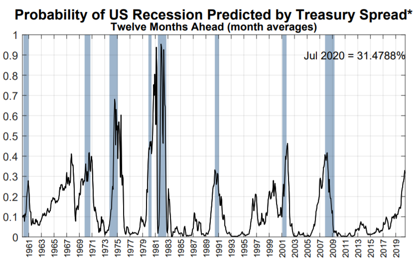
- The NY Fed’s yield curve model sets the probability of recession 12-months hence above 31%, up from over 27% in May.
- The US/China trade war escalated.
- And now another yield curve recession predictor — the ten-year yield minus the two-year yield (ten-twos) — is close to inverting.
The potential ten-twos inversion has received plenty of attention in the financial press. Interestingly, one well-known quantitative investor is arguing that 10-year Treasuries are expensive based, in part, on the inverted yield curve. We can’t do justice to this argument here, but we wanted to flag it since it is a countervailing view.
Is it time to be worried? Sell all your stocks and use your cash to buy gold, crossbows, and tons of Dinty Moore stew? Let the data answer that one.
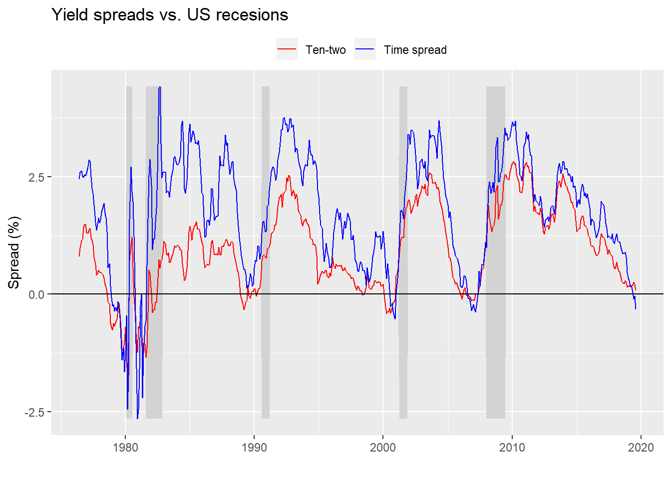
First, we’ll look at a graph of both the time spread (in red) and ten-twos (in blue). Note the data on the ten-twos doesn’t go as far back due the shorter two-year yield time series.

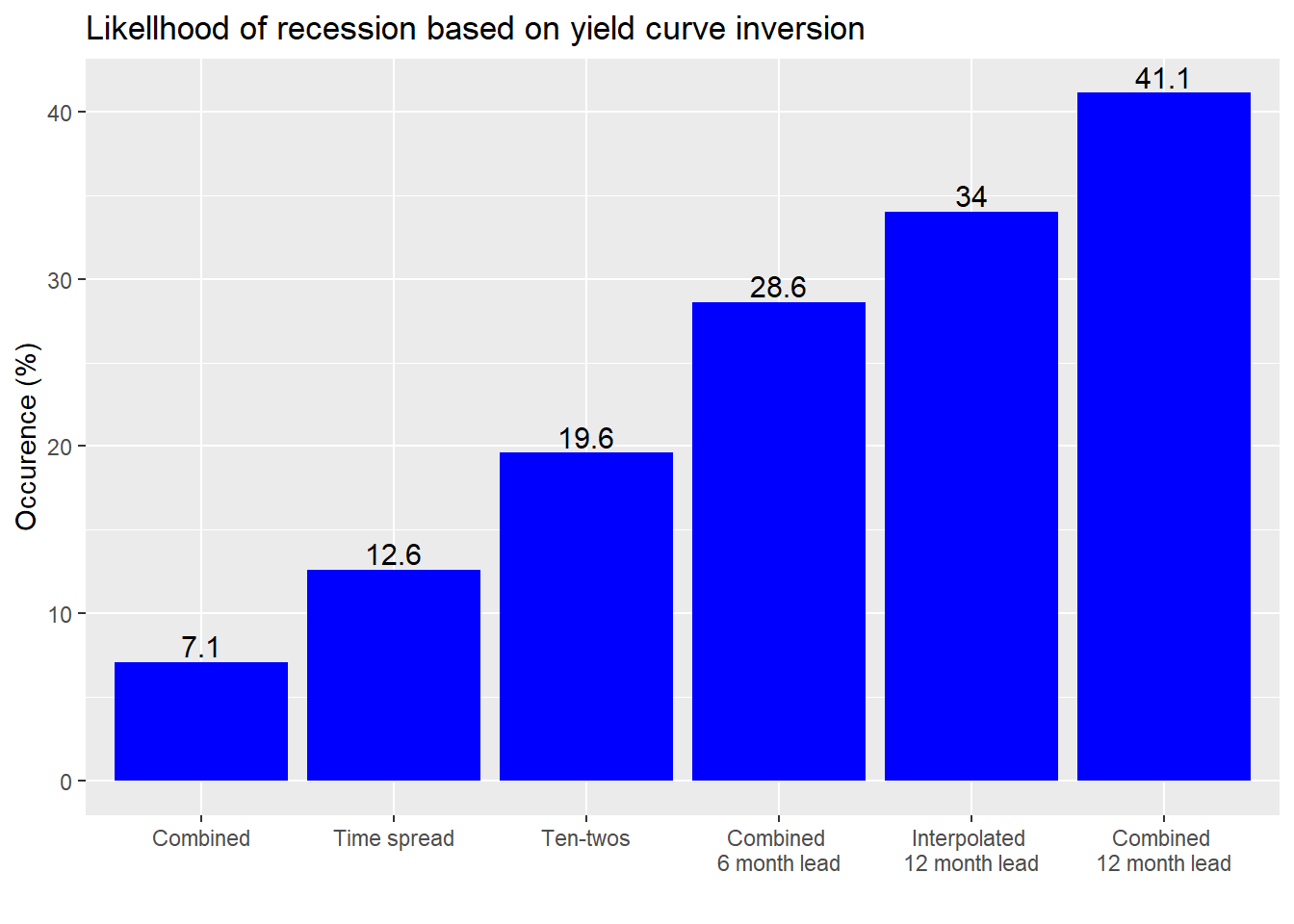
As in the past, let’s ask how frequently an inverted yield curve presages a recession. Instead of showing the contingency tables, as we have done previously, we’ll just show a graph of how often a recession occurs based on a yield curve inversion. This is also known as specificity and in effect measures how many times the economy is in recession and the yield curve is inverted divided by total number of recessions. If an inverted yield curve always coincided (or preceded) a recession, then that number would be 100%.
Before we show the graph, we need to explain the data we collected. The first is the time spread as a reference, then ten-twos. In other words, the percentages we calculate are how often a recession occurs when either the time spread or the ten-tows are inverted. We then look at the likelihood of a recession when both the time spread and ten-twos are inverted, known as “combined”. Then we calculate the likelihood of recession six and twelve months later. Finally, we interpolate the ten-twos for the period prior 1976 to see if the likelihood increases.1 Finally, we order the likelihoods for ease of analysis.

Interestingly, the likelihood the economy is in recession is the lowest when both curves are inverted. That’s good and to be expected. Yield curve inversion is meant to be a leading indicator. Still, that the economy is in recession 7.1% of the time when both curves are inverted should at least tell you that inversion can sometimes be a coincident indicator.
Moving on, the economy is a bit more likely to be in recession when the ten-twos are inverted than the time spread. That makes sense because if we hit a recession, over time the Fed is likely to lower rates so the time spread will revert faster than the ten-twos as short-term rates react faster to Fed policies than the longer-term rates.
If both curves are inverted there’s almost a 30% chance of recession in 6 months and over a 40% chance in twelve months. But when we include the interpolated data, that likelihood decreases to just under 35%. The main reason for this is while the number of months in recessions increases by 84% the number of months of inverted yield curves only increases 52%.
What if one curve is inverted and other is not, as is now the case? The chance of recession in 12 months based on the interpolate data is 2.9%. The chance of a recession in 6 or 12 months is 4.9%.
Such a low rate of occurrence does not mean that there’s only a small chance of a recession in the future. It also doesn’t mean that the probability of a recession in 6 to 12 months can’t rise to better than 50/50. It does suggest, however, that if we believe the probability is higher than the historical rate plus some fudge factor2 for the potential of being wrong, we’d need to have a good reason why it is otherwise.
To do that, we could look at additional variables such as industrial production, unemployment, or consumer sentiment. We could also look at overall yield levels. Perhaps a negative yield curve is more meaningful when 10-year yields are closer to the historical average of 5.8% vs. the average of the last 8 months of 2.4%, which is 1.5 standard deviations below the historical average prior to the global financial crisis.
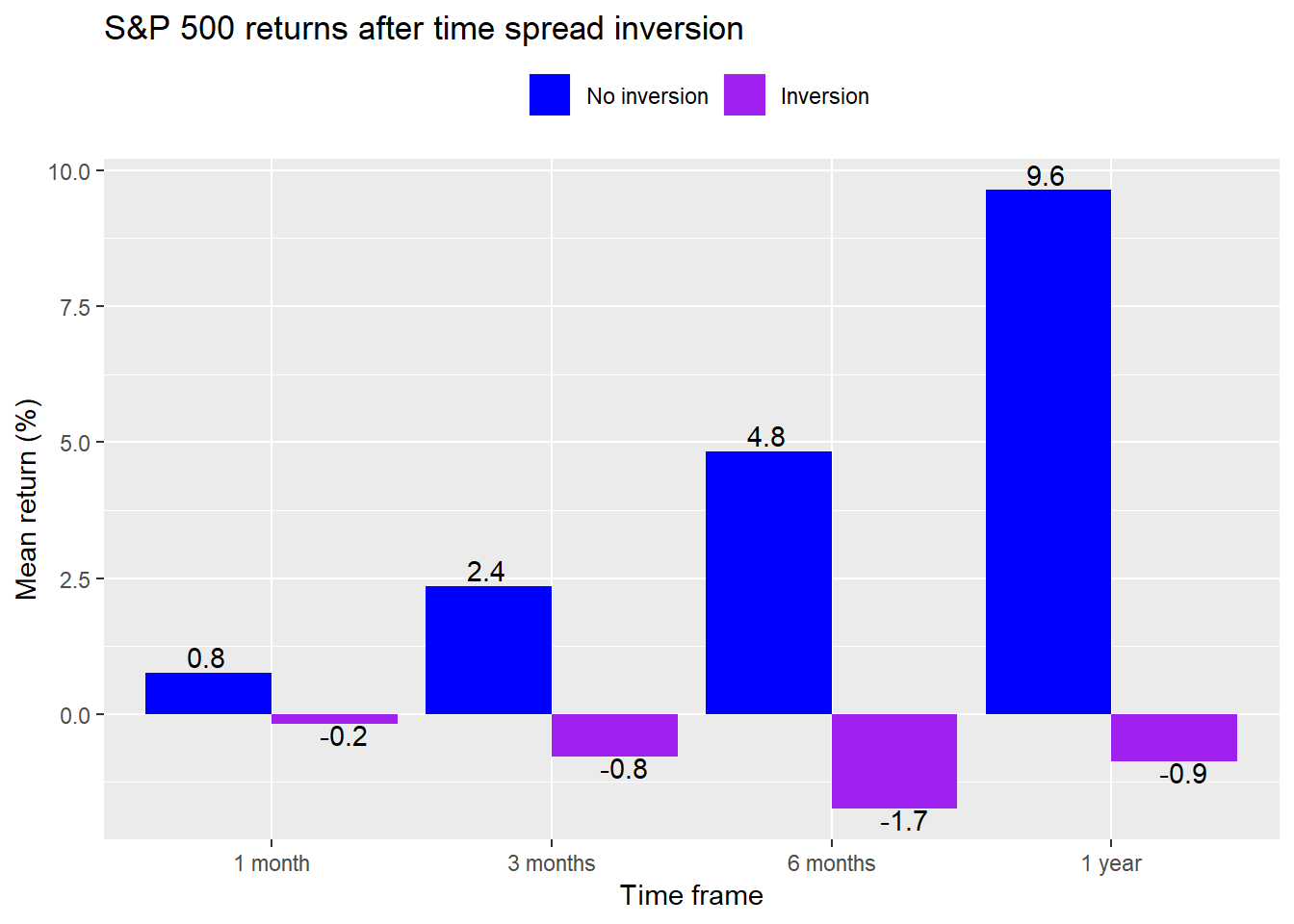
Alternatively, instead of trying to decide if the likelihood of recession is greater than the historical record, we could look at whether other data support a notion that it’s different this time. For example, we could analyze the stock market, which is forward-looking and thus one such barometer of whether a recession is looming. If the market believes a recession is likely to occur in the next few months, then prices would likely fall. For example, we could ask how the market trended after the yield curve inverted. Once we answer that question we can then look at how the present aligns with the past to note any major differences. For example, here is a graph of the range of average returns in the S&P500 on succeeding periods once time spread has inverted.

Since the time spread first inverted in June, the returns to the S&P 500 are a bit worse than the historical record easing about -1%. But these averages take into account any month with yield curve inversion as opposed to starting only at the inception of the inverted curve. Still this suggests a potential analytical point-of-departure. But that will have to wait for another post.
The takeaway for now is that it’s okay to keep calm so long as the ten-twos don’t go negative. Until then, and our next post, here is the code underlying the previous analysis and graphical display.
# Load packages
library(tidyquant)
library(printr)

# Load data
df <- readRDS("~/Data Science/Blog_3/yield_curve.rds")

# Get daily data
symbols <- c("T10Y2Y", "T10Y3M", "GS1", "GS2", "GS10")
for(symbol in symbols){
 x <- getSymbols(symbol, src = "FRED", from = "2019-01-01", auto.assign = FALSE)
 names(x) <- tolower(symbol)
 assign(tolower(symbol), x)
}

# Add updated data
last_row <- data.frame(date = as.Date("2019-08-01"),
                       usrec = 0,
                       time_spread = as.numeric(mean(t10y3m["2019-08"])),
                       ten_one = 0.1,
                       ten_two = as.numeric(mean(t10y2y["2019-08"])))

df_1 <- df %>%
  bind_rows(last_row)

# Plot data
df_1 %>%
  filter(!is.na(ten_two)) %>%
  ggplot(aes(x = date)) +
  geom_ribbon(aes(ymin = usrec*min(time_spread), ymax = usrec*max(time_spread)), fill = "lightgrey") +
  geom_line(aes(y = ten_two, color = "Ten-two")) +
  geom_line(aes(y = time_spread, color = "Time spread")) +
  scale_colour_manual("",
                      breaks = c("Ten-two", "Time spread"),
                      values = c("red", "blue")) +
  geom_hline(yintercept = 0, color = "black") +
  theme(legend.position = "top", legend.box.spacing = unit(0.05, "cm")) +
  labs(y = "Spread (%)",
       x = "",
       title = "Yield spreads vs. US recesions") +
  ylim(c(min(df$time_spread), max(df$time_spread)))

# Old table
tab_old <- table(Inversions = ifelse(df$time_spread < 0, 1, 0), Recessions = df$usrec)
tab_old_spec <- round(tab_old[2,2]/(tab_old[2,2] + tab_old[1,2]),3)*100 # specificity

# Basic table
tab <- table(Inversions = ifelse(df$ten_two < 0, 1, 0), Recessions = df$usrec)
tab_spec <- round(tab[2,2]/(tab[2,2] + tab[1,2]),3)*100 # specificity

# New table
df_tab <- df_1 %>% na.omit()
tab_new <- table(Inversions = ifelse(df_tab$time_spread < 0 & df_tab$ten_two < 0, 1, 0),
                 Recessions = df_tab$usrec)
tab_new_spec <- round(tab_new[2,2]/(tab_new[2,2] + tab_new[1,2]),3)*100 # specificity

# Forward 12 months

# Table 6 months
df_6 <- df_1 %>%
  mutate(usrec = lead(usrec, 6, default = 0))
df_tab_6 <- df_6 %>% na.omit()
tab_6 <- table(Inversions = ifelse(df_tab_6$time_spread < 0 & df_tab_6$ten_two < 0, 1, 0),
                 Recessions = df_tab_6$usrec)
tab_6_spec <- round(tab_6[2,2]/(tab_6[2,2] + tab_6[1,2]),3)*100 # specificity

# Table 12 months
df_12 <- df_1 %>%
  mutate(usrec = lead(usrec, 12, default = 0))
df_tab_12 <- df_12 %>% na.omit()
tab_12 <- table(Inversions = ifelse(df_tab_12$time_spread < 0 & df_tab_12$ten_two < 0, 1, 0),
               Recessions = df_tab_12$usrec)
tab_12_spec <- round(tab_12[2,2]/(tab_12[2,2] + tab_12[1,2]),3)*100 # specificity

# Table 12 months interploated
prem_2y <- mean(gs2-gs1)

df_tab_12i <-  df_12 %>%
  mutate(ten_two = ifelse(is.na(ten_two), ten_one + prem_2y, ten_two))

tab_12i <- table(Inversion = ifelse(df_tab_12i$ten_two < 0 & df_tab_12i$time_spread <0, 1, 0),
                 Recessions = df_tab_12i$usrec)
tab_12i_spec <- round(tab_12i[2,2]/(tab_12i[2,2] + tab_12i[1,2]),3)*100 # specificity

# Table 12 time spread negative time spread positive ten-twos in 12 months
tab_12ia <- table(Inversions = ifelse(df_tab_12i$time_spread < 0 & df_tab_12i$ten_two > 0, 1, 0),
                Recessions = df_tab_12i$usrec)
tab_12ia_spec <- round(tab_12ia[2,2]/(tab_12ia[2,2] + tab_12ia[1,2]),3)*100 # specificity

# Recession in 6 or 12 months
df_tab_6_12i <- df_1 %>%
  mutate(usrec_6 = lead(usrec, 6, default = 0),
         usrec_12 = lead(usrec, 12, default = 0),
         usrec_6_12 = ifelse(usrec_6 > 0 | usrec_12 > 0, 1, 0),
         ten_two = ifelse(is.na(ten_two), ten_one + prem_2y, 0))
tab_6_12i <- table(Inversions = ifelse(df_tab_6_12i$time_spread > 0 & df_tab_6_12i$ten_two < 0, 1, 0),
                   Recessions = df_tab_6_12i$usrec_6_12)
tab_6_12i_spec <- round(tab_6_12i[2,2]/(tab_6_12i[2,2] + tab_6_12i[1,2]),3)*100 # specificity

## Specificity for all tests

# Create data frame
specs <- data.frame(tab_old_spec, tab_spec,
                    tab_new_spec, tab_6_spec,
                    tab_12_spec, tab_12i_spec)
# Graph
specs %>%
  gather(key, value) %>%
    mutate(key = case_when(key == "tab_new_spec" ~ "Combined",
                         key == "tab_old_spec" ~ "Time spread",
                         key == "tab_spec" ~ "Ten-twos",
                         key == "tab_6_spec" ~ "Combined \n6 month lead",
                         key == "tab_12i_spec" ~ "Interpolated \n12 month lead",
                         key == "tab_12_spec" ~ "Combined \n12 month lead")) %>%
  ggplot(aes(reorder(key, value), value)) +
  geom_bar(stat = 'identity', position = "dodge", fill = "blue") +
  labs(x = "",
       y = "Occurence (%)",
       title = "Likellhood of recession based on yield curve inversion") +
  geom_text(aes(label = value), vjust = -0.25, size = 4)

# Data change
rec_inc <- round(as.numeric(colSums(tab_12i)[2])/as.numeric(colSums(tab_12)[2])-1,2)*100
inv_inc <- round(tab_12i[2,2]/tab_12[2,2]-1,2)*100

## Add stocks
# Adjust dates
date_adj <- c(df_tab_6_12i$date-1, as.Date("2019-08-31"))
df_eq <- df_tab_6_12i %>%
  mutate(date = date_adj[-1])

# Add S&P
sp <- getSymbols("^GSPC", from = "1953-04-01", auto.assign = FALSE)
sp_m <- to.monthly(Cl(sp), indexAt = "lastof", OHLC = FALSE)
df_eq <- df_eq %>%
  mutate(sp = as.numeric(sp_m))

df_eq <- df_eq %>%
  mutate(sp_1m = lead(sp, 1, default = 0)/sp-1,
         sp_3m = lead(sp, 3, default = 0)/sp-1,
         sp_6m = lead(sp, 6, default = 0)/sp-1,
         sp_1y = lead(sp, 12, default = 0)/sp-1)

# Graph of average return after time_spread goes negative
df_eq %>%
  mutate(time_spread = ifelse(time_spread < 0, 1, 0)) %>%
  group_by(time_spread) %>%
  filter(date < "2019-01-01") %>%
  mutate(sp_1y = ifelse(sp_1y == -1, NA, sp_1y)) %>%
  select(time_spread, contains("sp_")) %>%
  summarise_all(mean, na.rm = TRUE) %>%
  gather(key, value, -time_spread) %>%
  mutate(key = factor(key, levels = c("sp_1m", "sp_3m", "sp_6m", "sp_1y"))) %>%
  ggplot(aes(key, value*100,
             fill = as.factor(time_spread),
             label = format(round(value,3)*100, nsmall = 1))) +
  geom_bar(stat = 'identity', position = "dodge") +
  scale_fill_manual("", labels = c("No inversion", "Inversion"),
                    values = c("blue", "purple")) +
  scale_x_discrete(labels = c("1 month", "3 months", "6 months", "1 year")) +
  labs(x = "Time frame",
       y = "Mean return (%)",
       title = "S&P 500 returns after time spread inversion") +
  theme(legend.position = "top" ) +
  geom_text(aes(hjust = ifelse(value < 0, -2, 2),
                vjust = ifelse(value < 0, 1, -.25)))
For the interpolation we add the historical average premium of two-year over one-year yields to the ten-year minus one-year yield spread. This isn’t the most accurate method. But it would be more involved (and beyond the scope of the post) to bootstrap (or use some other method) to interpolate the historical two-year yield.↩
Or error rate or randomness distribution↩
