A weighty matter
When we were testing random correlations and weighthings in our last post on diversification, we discovered that randomizing correlations often increased portfolio risk. Then, when we randomized stock weightings on top of our random correlations, we began to see more cases in which one would have better off not being diversified. In other words, the percentage of portfolios whose risk exceeded the least risky stock began to rise. By chance, the least risky stock (in terms of the lowest volatility), also happened to enjoy the highest risk-adjusted return, so our random selection of stock returns might be a bit anomalous. Nevertheless, in about 27% of the cases, one would have been better off investing in the least risky stock than being diversified.
What we didn’t show in the last post was what the distribution of risk across portfolios given the random sample of correlations and weightings. We also didn’t show the distribution of risk-adjusted returns. First, let’s look at the distribution of risk across these random portfolios.
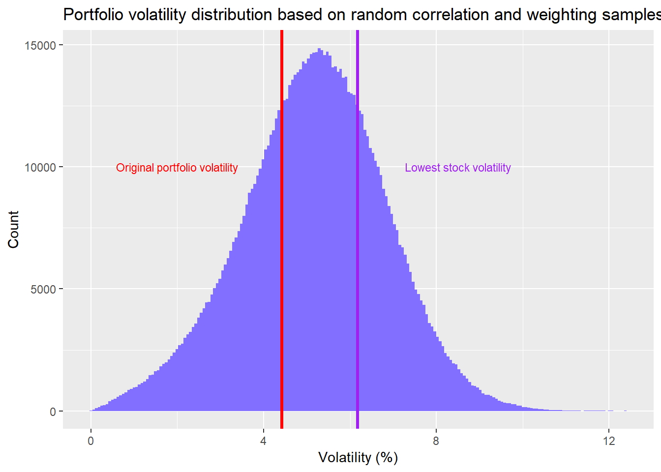
When we have random correlations and and random weightings, the range of portfolio volatility tends to increase. There are more occurrences when the portfolio’s risk exceeds the least risky stock. As noted above, about 27% of the portfolios exceed the risk of the least risky stock vs. only 13% when we only randomized correlations. Of course, only 9% of the portfolios exeed the 20% least risky stocks. So it’s not quite as bad as cherry-picking the least risky stock. But as one can see, from the red line, which represents the equal weighted portfolio volatility, about 68% of the random portfolios are riskier than the original portfolio.
Let’s move on to look at what this actually looks like in terms of risk-adjusted returns.
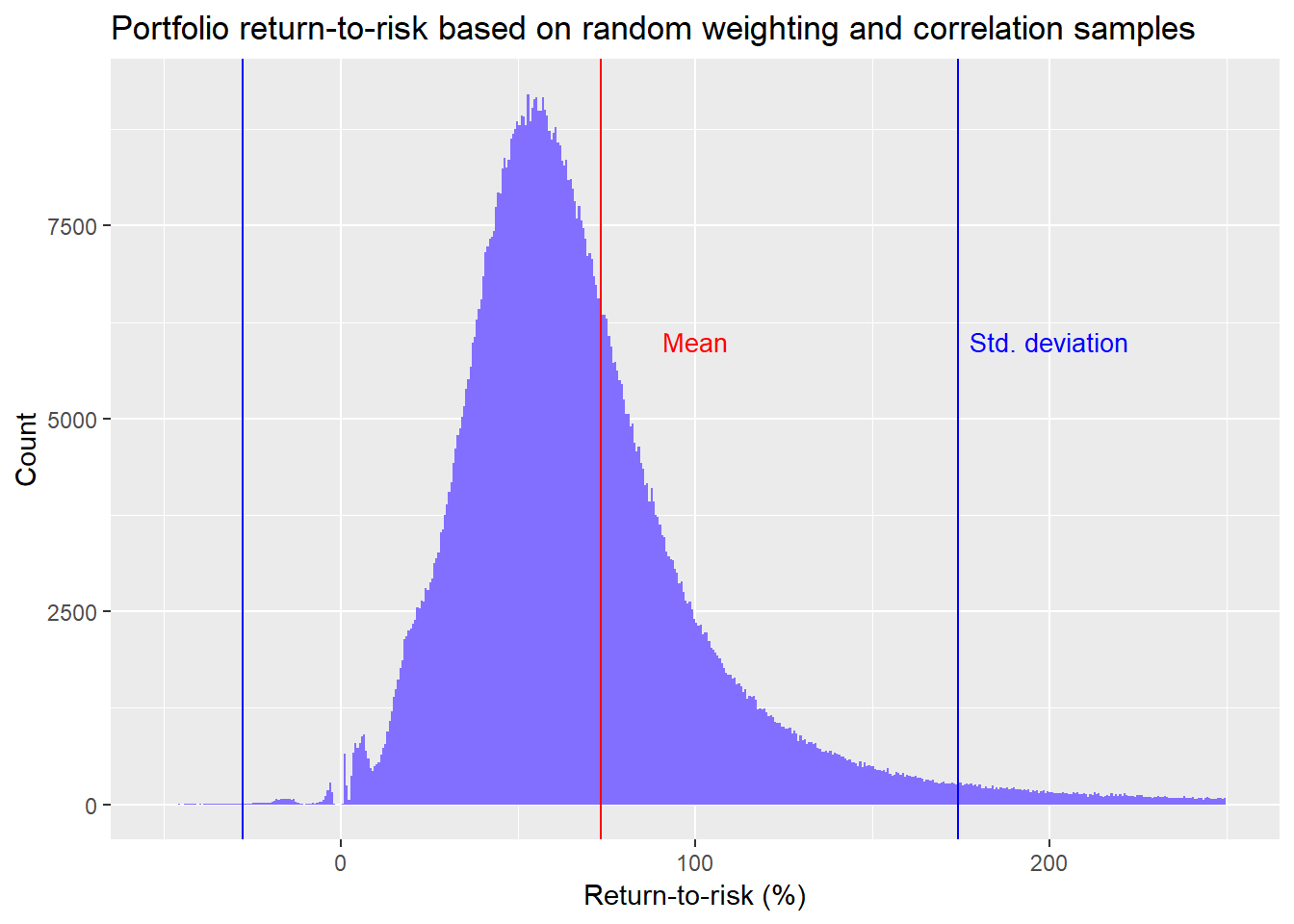
We see that the average risk-adjusted return for the random portfolios is about 73%. In other words, for every dollar you risk, you’re likely to get back almost three quarters. This compares with the original portfolio’s risk-adjusted return of 72%. That these risk-adjusted returns are so similar is most likely coincidental. Remember, we’re dealing with a toy example of only ten stocks.
What about the random portfolios vs. the individual stocks? The random portfolios beat the median stock risk-adjusted return about 98% of the time! But that doesn’t say all that much since the range of risk-adjusted returns is wide from -60% to 139%. Perhaps it’s better to look at the quartiles. In this case, the random portfolios exceed the top 25% of stock risk-adjusted returns about 42% of the time.
Let’s step back and think about what this means apart from all the statistical jargon. In this case, when you don’t know what the outlook for the individual stocks will be, how risky they’ll be, or how closely they’ll move together, you’ll generally do better than middling performance if you’re diversified, and you’ll do better than three-quarters of the stocks almost half of the time. Not bad.
What does this actually look like vs. the individual stock risk-adjusted returns? We show this below.
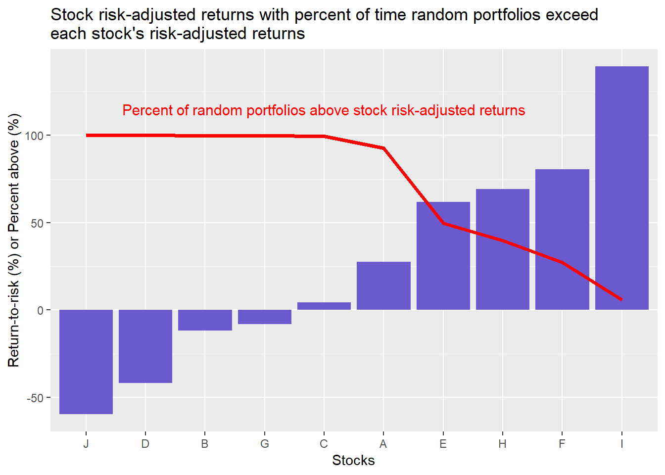
Interpreting the graph is not immediately straightforward. The bars represent an individual stock’s risk-adjusted return. The red line represents the percent of time the random portfolios’s risk-adjusted returns exceed that particular stock. In other words, the random portfolios exceed the risk-adjusted returns of six of the ten stocks, 98% of the time. But the random portfolios only exceed stock F, equivalent to better than 90% of the stocks, around 27% of the time.
Does this get us any closer to answering our original question as to whether you’re always better off being diversified when you don’t know how a group of stocks will perform? We believe it does though it might not seem apparent. Recall, in our first post we showed that an equal-weighted portfolio of our randomly generated stocks had better risk-adjusted returns than 80% of the stocks. Then in our previous post we showed that if we randomized correlations, about 87% of the portfolios still enjoyed volatility lower than even the least risky stock. However, when we randomized volatility and weightings, the random portfolios only beat the stocks six out of ten times.
Seems that the likelihood we can answer “Yes!” to our question is going down. However, we would argue that our confidence in the answer is going up. What?
If our starting point is that we don’t have a high conviction answer to our question, then there is a 50/50 chance its yes or no. Each time we run some analyses to answer the question, the results of those analyses tell us whether yes or no is more likely. In our first analyses, we were more inclined to answer yes. Yet, even though the analyses suggested diversified portfolios beat individual stocks 80% of the time, our likelihood of answering “yes” didn’t increase to 80% from 50%. It might have increased to 55%. Maybe less. Now, our most recent analysis suggests diversified portfolios beat individual stocks 60% of the time. On this result, we’re probably more likely to say the probability of answering “yes” is closer to 60% given our more robust results.
But we’re still not done. We should analyze those portfolios in which we only own some of the stocks available. Could the chance of randomly picking good or bad stocks improve or worsen risk-adjusted portfolio returns? That will have to wait for another post.
In the meantime, the code that generated that analysis and graphs is below. Feel free to let us know if you can’t reproduce our results.
# Load package
library(tidyquant)

# Create toy portfolio
set.seed(123)
mu <- seq(-.03/12,.08/12,.001)
sigma <- seq(0.02, 0.065, .005)

mat <- matrix(nrow = 60, ncol = 10)
for(i in 1:ncol(mat)){
  mu_samp <- sample(mu, 1, replace = FALSE)
  sig_samp <- sample(sigma, 1, replace = FALSE)
  mat[,i] <- rnorm(nrow(mat), mu_samp, sig_samp)
}

df <- as.data.frame(mat)
asset_names <- toupper(letters[1:10])
colnames(df) <- asset_names

# Cumulative returns
df_comp <- rbind(rep(1,10), cumprod(df+1))

# Create volatility date frame
vol <- df %>% summarise_all(., sd) %>% t() %>% as.numeric()
vol <- data.frame(asset = asset_names, vol = vol)

# Create mean return data frame
mean_ret <- df %>% summarise_all(., mean) %>% as.numeric()
mean_ret <- data.frame(asset = asset_names, returns = mean_ret)

# Calculate portfolio returns and volatility
weights <- rep(0.1, 10)
port_ret <- sum(weights*mean_ret$returns)
port_vol <- sqrt(t(weights) %*% cov(df) %*% weights)


# Create smaller sample of random correlations
set.seed(123)
sml_corr_list <- list()
combo <- expand.grid(vol$vol, vol$vol)
combo <- combo %>% mutate(Var3 = Var1 * Var2)
for(i in 1:1000){
  test_mat <- matrix(nrow = 10, ncol = 10)
  rand_cor <- runif(45, -1, 1)
  test_mat[upper.tri(test_mat, diag = FALSE)] <- rand_cor
  test_mat[lower.tri(test_mat, diag = FALSE)] <- rand_cor
  test_mat[is.na(test_mat)] <- 1
  cov_mat <- test_mat * combo$Var3
  sml_corr_list[[i]] <- cov_mat
}

# Run correlation samples with alternate weightings
set.seed(123)
port_wt <- matrix(nrow = 1000, ncol = 10)
for(i in 1:nrow(port_wt)){
  a <- runif(10, 0, 1)
  b <- a/sum(a)
  port_wt[i,] <- b
}


# Calculate portfolio volatility
rand_vol_1 <- c()
for(i in 1:1000){
  wt <- port_wt[i,]
  for(j in 1:1000){
    rand_vol_1[i+j-1] <- sqrt(t(wt) %*% sml_corr_list[[j]] %*% wt)
    # rand_ret_risk[i+j-1] <- (sum(wt*mean_ret$returns)/rand_vol_1[i+j-1])*12/sqrt(12)
  }
}

# Create data frame
rand_vol_1_df <- data.frame(vol = na.omit(rand_vol_1))

# occurences
low_vol <- as.numeric(quantile(vol$vol, probs = .2))
prob_above_low_vol_1 <- round(mean(rand_vol_1_df$vol > low_vol), 2)*100
prob_above_port_1 <- round(mean(rand_vol_1_df$vol > as.numeric(port_vol)), 2) *100
prob_below_min_1 <- round(mean(rand_vol_1_df$vol < min(vol$vol)), 2) * 100

# Graph distribution of volatility
rand_vol_1_df %>%
  ggplot(aes(vol*sqrt(12)*100)) +
  geom_histogram(bins = 200, fill = "slateblue1") +
  geom_vline(xintercept = port_vol*sqrt(12)*100, color = "red", lwd = 1.5) +
  geom_vline(xintercept = min(vol$vol) * sqrt(12) * 100, color = "purple", lwd = 1.2) +
  # geom_vline(xintercept = mean_vol_port, lwd = 1.2) +
  labs(x = "Volatility (%)", y = "Count",
       title = "Portfolio volatility distribution based on random correlation and weighting samples") +
  annotate("text", x = 3, y = 30,
           label = "Original portfolio volatility",
           color = "red", size = 3.5) +
  annotate("text", x = 8.5, y = 30,
           label = "Lowest stock volatility",
           color = "purple", size = 3.5)

## Calculate return-to-risk for random samples

# Cacluate weighted returns
wt_ret <- sum(weights*mean_ret$returns)

# Create data frame
rand_vol_ret_df <- data.frame(ret_risk = wt_ret/rand_vol_1_df$vol)
mean_ret_risk <- mean(rand_vol_ret_df$ret_risk)
sd_ret_risk <- sd(rand_vol_ret_df$ret_risk)

# Graph data frame
rand_vol_ret_df %>%
  ggplot(aes(ret_risk*sqrt(12)*100)) +
  geom_histogram(bins = 200, fill = "slateblue1") +
  xlim(c(25,150)) +
  ylim(c(0,60)) +
  geom_vline(xintercept = mean_ret_risk*sqrt(12)*100, color = "red") +
  geom_vline(xintercept = (mean_ret_risk + sd_ret_risk)*sqrt(12)*100, color = "blue") +
  geom_vline(xintercept = (mean_ret_risk - sd_ret_risk)*sqrt(12)*100, color = "blue") +
  annotate("text", x = 65, y = 50,
           label = "Mean",
           color = "red", size = 3.5) +
  annotate("text", x = 100, y = 50,
           label = "Std. deviation",
           color = "blue", size = 3.5) +
  labs(x = "Return-to-risk (%)",
       y = "Count",
       title = "Portfolio return-to-risk based on random weighting and correlation samples")

# Comparisons
port_ret_risk <- as.numeric(wt_ret/port_vol)
prob_above_port_ret_risk <- round(mean(rand_vol_ret_df$ret_risk > port_ret_risk), 2)*100

# Create data frame of individual stock returns, volatility, and sharpes
stock_ret_risk <- mean_ret %>%
  left_join(vol, by = "asset") %>%
  mutate(ret_risk = returns/vol)

ret_risk_median <- round(mean(rand_vol_ret_df$ret_risk > median(stock_ret_risk$ret_risk)),2)*100
ret_risk_quartile <- round(mean(rand_vol_ret_df$ret_risk >
                                  as.numeric(quantile(stock_ret_risk$ret_risk, probs = 0.75))),2)*100

# Graph stock risk-adjusted returns vs. portfolios
stock_ret_risk %>%
  group_by(asset) %>%
  mutate(probs = mean(rand_vol_ret_df$ret_risk > ret_risk)*100) %>%
  arrange(desc(probs)) %>%
  ungroup() %>%
  ggplot(aes(reorder(asset, ret_risk), ret_risk*sqrt(12)*100)) +
  geom_bar(stat = "identity", fill = "slateblue") +
  geom_line(aes(asset, probs, group = 1),
            color = "red",
            size = 1.25) +
  labs(x = "Stocks",
       y = "Return-to-risk (%) or Percent above",
       title =
         "Stock risk-adjusted returns with percent of time random portfolios exceed \neach stock's risk-adjusted returns") +
  annotate("text", x = "C", y = 115,
           label = "Percent of random portfolios above stock risk-adjusted returns",
           color = "red",
           size = 4)

# Above 90th percentile
ninety <- stock_ret_risk %>%
  filter(asset == "F") %>%
  summarise(probs = round(mean(ret_risk < rand_vol_ret_df$ret_risk),2)*100)