Benchmarking the portfolio
In our last post, we looked at one measure of risk-adjusted returns, the Sharpe ratio, to help our hero decide whether he wanted to alter his portfolio allocations. Then, as opposed to finding the maximum return for our hero’s initial level of risk, we broadened the risk parameters and searched for portfolios that would at least offer the same return or better as his current portfolio and would also allow him to find a “comfortable” asset allocation. While we couldn’t confirm that we ended up with a portfolio our hero found satisfactory (this is fictional after all!), we did show how we might come close. If the first iteration failed, further iterations were possible.
While this held out hope that we might find a portfolio that could potentially satisfice the risk/return question, there was a problem with this process: trying to choose appropriate levels of risk-adjusted returns lacked a basis for comparison. True, if one were working directly with our hero to develop a full-fledged financial plan, the first part would be to establish the investment goals and then from there establish acceptable risk/return parameters to achieve those goals. For example, perhaps our hero wants to retire at age “x” and believes he can lead a reasonably comfortable life by spending “y” per year. Then, based on his current age, and his life expectancy, it is relatively straightforward to calculate the required return to fulfill his goal. Figuring out his risk tolerance (i.e., the amount of volatility he’s willing to sustain) is more difficult and is a combination of art and science. However, assuming you can establish a range, which is more reasonable that a single risk level, it is possible to find a combination of assets that are likely to yield a reasonably good ex ante expectation of achieving our hero’s goals.
But what if it’s not possible to define such goals succinctly or what if our hero only cares about achieving “good” returns. In the first post, he was happy because his total return beat his co-worker’s but not ecstatic because he underperformed his cousin. Were either of these results reasonable yardsticks? Not really. What’s the alternative? Establish a benchmark against which to judge results.
What is an appropriate benchmark? At the most general, it would be one that includes all risk assets. But, as we noted in our first post, it’s next to impossible to find such a beast. And that is why we chose a very simple portfolio of three ETFs: SPY, SHY, and GLD. However, there are ETFs that encompass more assets than these three. Indeed, there are total stock and bond market ETFs. Total real asset ETFs are relatively rare, however, and the ones that do exist come with a hefty expense ratio or track an index even many professionals have never heard of. Of course, there are some commodity ETFs, but they too track indices that only a professional could analyze.
Even if we could find a good ETF for real assets, it is unclear how much we should allocate to them as a percent of the total. Good luck finding a rigorous answer too! While we don’t want to punt on this issue, we also don’t want to dive down a rabbit hole just yet. So we’ll shelve the real asset for now.
Most “recommended” allocation strategies assume some sort of stock/bond mix. So we’ll go with that, not because we want to appeal to the lowest common denominator, but because that data is more readily available. What should be a good benchmark then? To our mind, one that includes all stocks and all bonds. Four ETFs that encapsulate the total US and ex-US stock and bond markets are VTI, VXUS, BND, BNDX. We’ll start with those.
Next we should figure out the allocations. According to one source, the US stock market makes up about 53% of the global stock market; the US bond market is about 39% of global bonds, according to this site. The global stock market relative to the global bond market? A quick Google search reveals it’s about 45/55. While this is a bit rough, let’s construct a benchmark that is 24% US and 21% ex-US stocks, and 22% and 33% US and ex-US bonds. This should be relatively close to a benchmark that tracks the returns to the majority of risk assets.
The only problem with this data is that we don’t have a full set until the beginning of 2014. Whatever the case, we’ll build the benchmark and graph it along with the other portfolios.
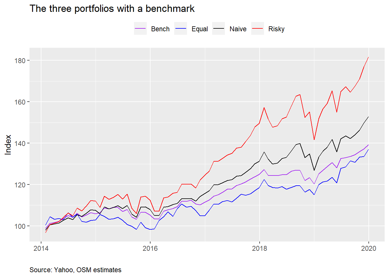
Our hero will be disappointed. His portfolio underperforms all others based on cumulative returns since 2014. Let’s look at the standard performance metrics including the benchmark.
| Asset | Mean (%) | Volatility (%) | Sharpe | Cumulative (%) |
|---|---|---|---|---|
| Bench | 6.0 | 5.1 | 1.10 | 139.3 |
| Equal | 6.0 | 6.7 | 0.82 | 137.1 |
| Naive | 7.2 | 7.1 | 1.03 | 152.9 |
| Risky | 10.8 | 10.7 | 0.99 | 181.8 |
We see that even though our hero’s portfolio enjoyed the same average return as the benchmark, its volatility was higher, and, presumably, suffered greater downside deviation than the benchmark based on the slightly worse cumulative return. While we won’t delve into it now, recall that over the 2005-2019 period our hero’s portfolio outperformed the naive portfolio. Given the time slice we’re looking at now, that suggests that the 2005-2014 period was when the major outperformance occurred. That highlights the impact of starting point, or, as we’ll call it “time dependence”, on portfolio returns. We’ll come back to this topic later.
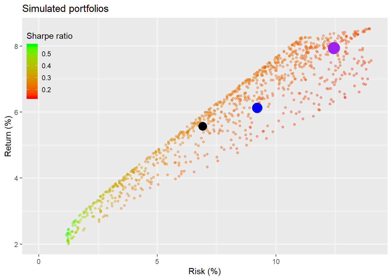
Now we’ll run the simulations for a 1000 portfolios. First, we’ll show the simulations for the full period data to refresh the reader’s memory. The dots represent the equal-weighted (blue for our hero), naive (black), and risky (purple) portfolios. We color the points by Sharpe ratio with green being the higher and red being the lower.
Now let’s run the simulations again but based on data since 2014.
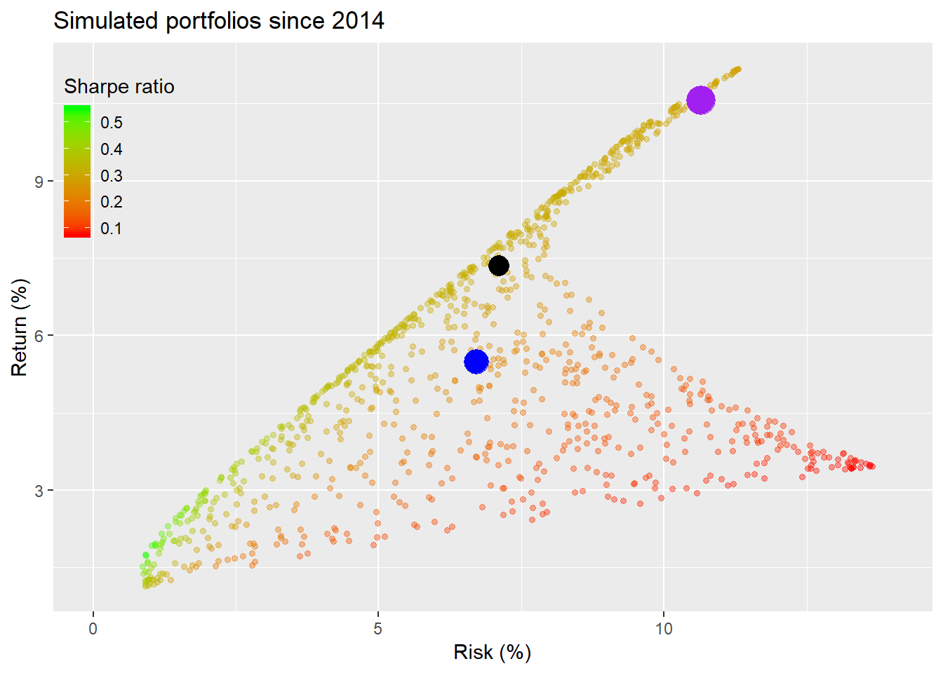
The resulting scatter plot has an unusual shape for those accustomed to looking these sorts of things. We won’t spend a lot of time on it, but the main reason for this is that the points at the bottom end of the plot have a majority of their weighting in gold, which generated only about 3.5% annualized returns vs. over 11% for the S&P in the period. Because we’ve only included three assets, and SHY’s returns were modest, there wasn’t a mid-level return that would fill in the empty space. In any event, we see our hero’s portfolio underperforms the naive and risky portfolios in the context of all the simulated portfolios. The highest Sharpe ratios remain at the low end of the plot.
Next we’ll graph the simulated portfolios in relation to the benchmark. Here we use an adjusted Sharpe ratio, where we calculate how much the portfolio exceeds the benchmark return divided by the portfolio risk (i.e., volatility of returns).
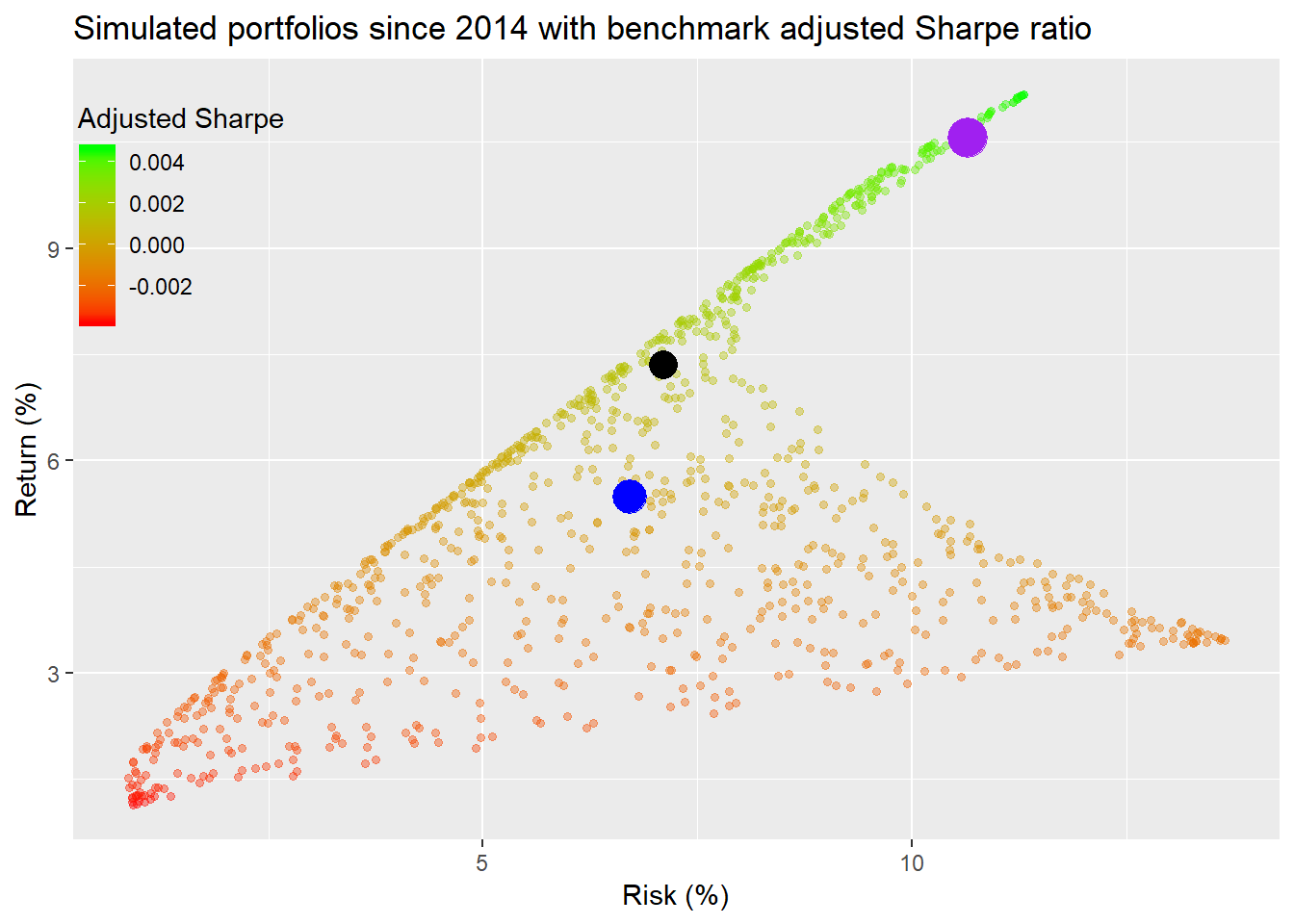
This is an interesting graph in contrast to the previous one. Here, many of the portfolios that showed up with a lower Sharpe ratio are the exact opposite relative to the benchmark. While it’s a pretty graph, all the color makes it tough to distinguish under vs. outperformance. We’ll segment ratios according to whether they’re positive (green for outperformance) or negative (red for underperformance).
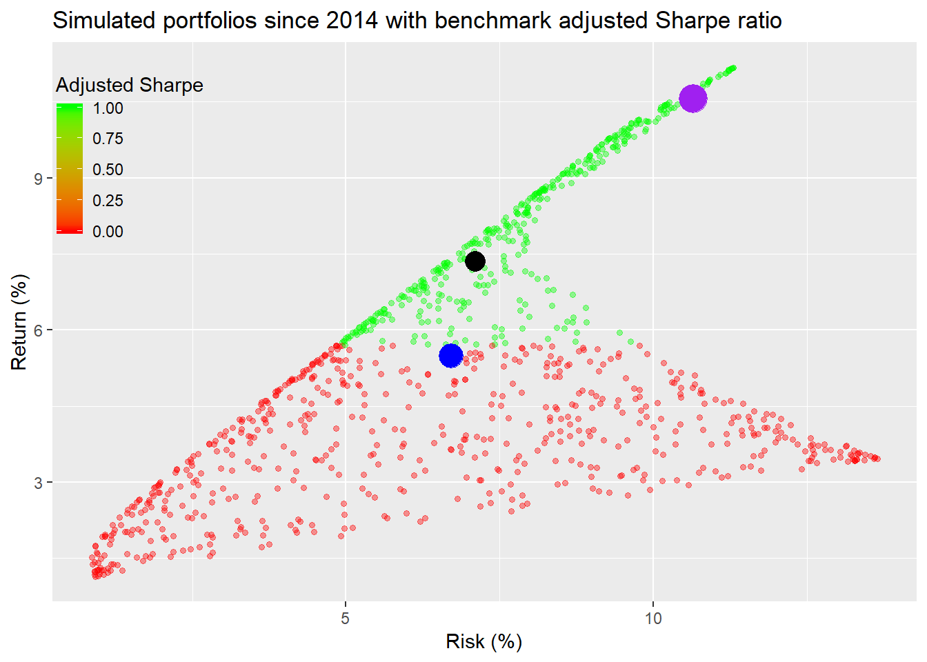
Now we see that most of the portfolios failed to exceed the benchmark’s return. In fact, only 39% of the portfolios outperformed. Whether the ratio is scaled by volatility or not does not affect the sign.
Does this mean that those portfolios that underperform are “bad”? Not necessarily. It ultimately depends on the risk/return parameters. If you don’t want to expose yourself to the same level of risk as the benchmark, then you’ll have to accept lower returns. If we scale the return over the benchmark by the sensitivity to the benchmark the results don’t differ that much when viewed graphically.1 Hence, we’ll save some space and not graph that raio.
One might be wondering if there were a quick to way to discover the source of portfolio performance relative to the benchmark. One way is to calculate how much the portfolios exceed the benchmark relative to how much they deviate from it. This is called the information ratio, which is the average excess return over the benchmark divided by the standard deviation of that excess return, often referred to as tracking error. While it won’t tell you what were the sources of relative performance, it will tell you how much deviation from the benchmark played a role. We show a graph of the simulations colored by the information ratio.
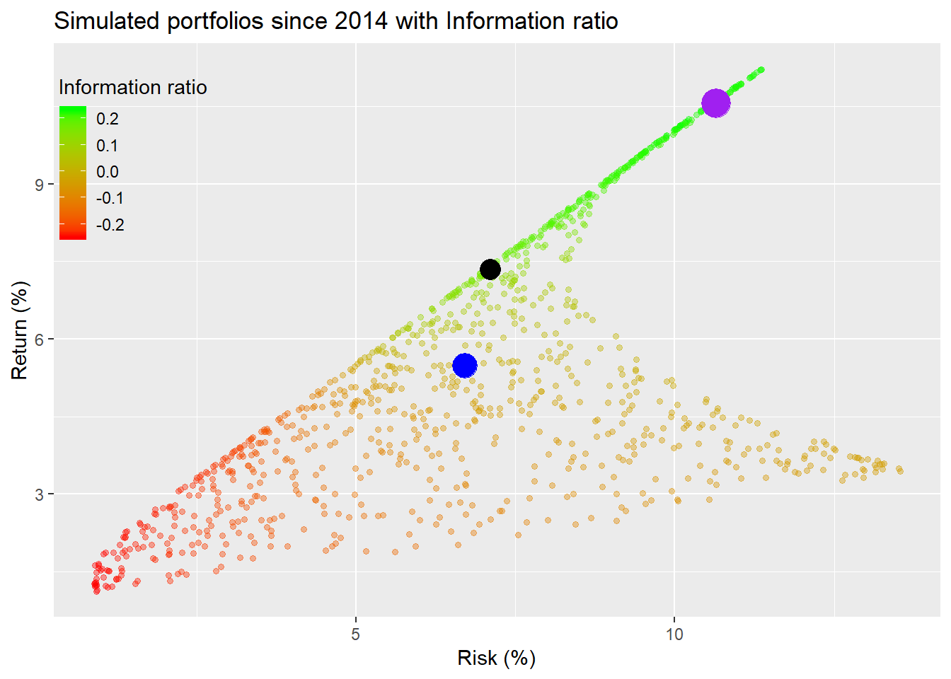
This graph doesn’t appear too much different from the adjusted Sharpe graph. However, there does appear to be a greater number of bright green dots. What does that actually tell you? In the context of different portfolios, the brighter green represents a higher information ratio, which means it generates higher returns for its incremental deviation from the benchmark. While the information ratio has often been used to analyze investment managers’ performance, it can offer some insights into whether deviating from the benchmark is worth it. The graph shows our hero that the equal-weighted portfolio is not getting compensated for it’s deviation since it falls in the zero range area. Hence, a reasonable conclusion is that our hero would do better if he moved his allocation closer to the benchmark or simply switched out his current portfolio into the benchmark, given how broad-based it is. Of course, these conclusions are based on historical data. If we had benchmark data from 2005, we might very well make a different conclusion.
The problem with the information ratio is that it isn’t as informative as you might like! If a portfolio beats the index, but also strays a lot from it too, the information ratio might be worse than a portfolio that deviates very little. However, if the outperformance is sufficient, it will generally outweigh the tracking error. Alternatively a portfolio could have a higher ratio than a closet benchmark hugger, but have a lower cumulative return due to time dependence. Another problem is that the ratio focuses exclusively on benchmark risk. If the portfolio includes assets not in the benchmark, then you’d have to examine returns from those excluded risk exposures to get a more accurate picture. Even in our broad-based example, our hero’s information ratio didn’t look that great due to his gold exposure. But what if we had included commodities in the benchmark?
Let’s summarise? Looking at different portfolio allocations to achieve a desired risk/return parameter is all well good if you have well defined constraints. If you don’t, then it is helpful to incorporate a benchmark which is broad enough to encompass as many of the investable risk assets as possible. Such a yardstick helps frame and measure performance. Using an adjusted Sharpe ratio where you look at the excess return over the benchmark was useful, but was not able to distinguish performance strongly without segmenting the data rather crudely. The information ratio revealed important insights on whether a portfolio that contains mostly similar assets is getting compensated for deviating from benchmark allocations. In this case, our hero’s portfolio wasn’t, but that was probably due to the gold exposure.
In our upcoming posts, we’ll follow our hero as he investigates rebalancing, semi-deviation, capital market expectations, and time dependence. If you think we’re missing something, let us know. We’re also thinking of instituting some shorter, semi-regular posts that incorporate more of the the “machines” component of OSM. Let us know if there’s a model or signal you’d like us to investigage. Stay tuned. Until then, here’s the code that underpins all the previous analysis and graphics.
# Load package
library(tidyquant)
library(broom)

# Load data for portfolios
symbols <- c("SPY", "SHY", "GLD")
symbols_low <- tolower(symbols)

prices <- getSymbols(symbols, src = "yahoo",
                     from = "1990-01-01",
                     auto.assign = TRUE) %>%
  map(~Ad(get(.))) %>%
  reduce(merge) %>%
  `colnames<-`(symbols_low)

prices_monthly <- to.monthly(prices, indexAt = "last", OHLC = FALSE)
ret <- ROC(prices_monthly)["2005/2019"]

# Load benchmark data
bench_sym <- c("VTI", "VXUS", "BND", "BNDX")
bench <- getSymbols(bench_sym, src = "yahoo",
                    from = "1990-01-01",
                    auto.assign = TRUE) %>%
  map(~Ad(get(.))) %>%
  reduce(merge) %>%
  `colnames<-`(tolower(bench_sym))
bench <- to.monthly(bench, indexAt = "last", OHLC = FALSE)
bench_ret <- ROC(bench)["2014/2019"]

# Create different weights and portflios
# Equal weigthed
wt1 <- rep(1/(ncol(ret)), ncol(ret))
port1 <- Return.portfolio(ret, wt1) %>%
  `colnames<-`("ret")

# Risk portfolio
wt2 <- c(0.9, 0.1, 0)
port2 <- Return.portfolio(ret, weights = wt2) %>%
  `colnames<-`("ret")

# Naive portfolio
wtn <- c(0.5, 0.5, 0)
portn <- Return.portfolio(ret, wtn)

# Data frame of portfolios
port_comp <- data.frame(date = index(port1), equal = as.numeric(port1),
                        risky = as.numeric(port2),
                        naive = as.numeric(portn))

# Benchmark portfolio
wtb <- c(0.24, 0.21, 0.22, 0.33)
portb <- Return.portfolio(bench_ret, wtb, rebalance_on = "quarters") %>%
  `colnames<-`("bench")

# Graph of portfolios vs. benchmark
port_comp %>%
  filter(date >= "2014-01-01") %>%
  mutate(bench = portb) %>%
  gather(key,value, -date) %>%
  group_by(key) %>%
  mutate(value = cumprod(value+1)) %>%
  ggplot(aes(date, value*100, color = key)) +
  geom_line() +
  scale_color_manual("", labels = c("Bench", "Equal", "Naive", "Risky"),
                     values = c("purple", "blue", "black", "red")) +
  labs(x = "",
       y = "Index",
       title = "The three portfolios with a benchmark",
       caption = "Source: Yahoo, OSM estimates") +
  theme(legend.position = "top",
        plot.caption = element_text(hjust = 0))

# summary
port_comp %>%
  filter(date >= "2014-01-01") %>%
  mutate(bench = as.numeric(portb)) %>%
  rename("Equal" = equal,
         "Naive" = naive,
         "Risky" = risky,
         "Bench" = bench) %>%
  gather(Asset, value, -date) %>%
  group_by(Asset) %>%
  summarise(`Mean (%)` = round(mean(value, na.rm = TRUE),3)*1200,
            `Volatility (%)` = round(sd(value, na.rm = TRUE)*sqrt(12),3)*100,
            `Sharpe` = round(mean(value, na.rm = TRUE)/sd(value, na.rm=TRUE)*sqrt(12),2),
            `Cumulative (%)` = round(prod(1+value, na.rm = TRUE),3)*100) %>%
  knitr::kable(caption = "Annualized performance metrics")

# Portfolio
mean_ret <- apply(ret[,c("spy", "shy", "gld")],2,mean)
cov_port <- cov(ret[,c("spy", "shy", "gld")])

port_exam <- data.frame(ports = colnames(port_comp)[-1],
                        ret = as.numeric(apply(port_comp[,-1],2, mean)),
                        vol = as.numeric(apply(port_comp[,-1], 2, sd)))

bench_exam <- data.frame(ports = "bench",
                         ret = mean(bench_ret),
                         vol = sd(bench_ret))

bench_spy <- data.frame(ports = "sp",
                        ret = mean(ret$spy),
                        vol = sd(ret$spy))

bench_spy_14 <- data.frame(ports = "sp",
                        ret = mean(ret$spy["2014/2019"]),
                        vol = sd(ret$spy["2014/2019"]))

mean_ret_14 <- apply(ret[,c("spy", "shy", "gld")]["2014/2019"],2,mean)

cov_port_14 <- cov(ret[,c("spy", "shy", "gld")]["2014/2019"])

port_exam_14 <- port_comp %>%
  filter(date >= "2014-01-01") %>%
  select(-date) %>%
  gather(ports, value) %>%
  group_by(ports) %>%
  summarise_all(list(ret = mean, vol = sd)) %>%
  data.frame()


### Random weighting
# wts for full period
wts <- matrix(nrow = 1000, ncol = 3)
set.seed(123)
for(i in 1:1000){
  a <- runif(1,0,1)
  b <- c()
  for(j in 1:2){
    b[j] <- runif(1,0,1-sum(a,b))
  }
  if(sum(a,b) < 1){
    inc <- (1-sum(a,b))/3
    vec <- c(a+inc, b+inc)
  }else{
    vec <- c(a,b)
  }
  wts[i,] <- sample(vec,replace = FALSE)
}

# wts for 2014
wts1 <- matrix(nrow = 1000, ncol = 3)
set.seed(123)
for(i in 1:1000){
  a <- runif(1,0,1)
  b <- c()
  for(j in 1:2){
    if(j == 2){
      b[j] <- 1 - sum(a,b)
    }
    else {
      b[j] <- runif(1,0,1-sum(a,b))
    }
  vec <- c(a,b)
  }
  wts1[i,] <- sample(vec,replace = FALSE)
}

# Calculate random portfolios
# Weighting: wts
port <- matrix(nrow = 1000, ncol = 2)
for(i in 1:1000){
  port[i,1] <- as.numeric(sum(wts[i,] * mean_ret))
  port[i,2] <- as.numeric(sqrt(t(wts[i,] %*% cov_port %*% wts[i,])))
}

colnames(port) <- c("returns", "risk")
port <- as.data.frame(port)
port <- port %>%
  mutate(sharpe = returns/risk)

# Calculate random portfolios since 2014
# Weighting: wts1
port_14 <- matrix(nrow = 1000, ncol = 2)
for(i in 1:1000){
  port_14[i,1] <- as.numeric(sum(wts1[i,] * mean_ret_14))
  port_14[i,2] <- as.numeric(sqrt(t(wts1[i,] %*% cov_port_14 %*% wts1[i,])))
}

colnames(port_14) <- c("returns", "risk")
port_14 <- as.data.frame(port_14)
port_14 <- port_14 %>%
  mutate(sharpe = returns/risk)

# Grraph with Sharpe ratio
port %>%
  ggplot(aes(risk*sqrt(12)*100, returns*1200, color = sharpe)) +
  geom_point(size = 1.2, alpha = 0.4) +
  geom_point(data = port_exam, aes(port_exam[1,3]*sqrt(12)*100,
                                   port_exam[1,2]*1200),
             color = "red", size = 6) +
  geom_point(data = port_exam, aes(port_exam[2,3]*sqrt(12)*100,
                                   port_exam[2,2]*1200),
             color = "purple", size = 7) +
  geom_point(data = port_exam, aes(port_exam[3,3]*sqrt(12)*100,
                                   port_exam[3,2]*1200),
             color = "black", size = 5) +
  scale_x_continuous(limits = c(0,14)) +
  labs(x = "Risk (%)",
       y = "Return (%)",
       title = "Simulated portfolios",
       color = "Sharpe ratio") +
  scale_color_gradient(low = "red", high = "green") +
  theme(legend.position = c(0.075,.8),
        legend.key.size = unit(.5, "cm"),
        legend.background = element_rect(fill = NA))

# Graph since 2014
port_14 %>%
  ggplot(aes(risk*sqrt(12)*100, returns*1200, color = sharpe)) +
  geom_point(size = 1.2, alpha = 0.4) +
  geom_point(data = port_exam_14, aes(port_exam_14[1,3]*sqrt(12)*100,
                                   port_exam_14[1,2]*1200),
             color = "blue", size = 6) +
  geom_point(data = port_exam_14, aes(port_exam_14[3,3]*sqrt(12)*100,
                                   port_exam_14[3, 2]*1200),
             color = "purple", size = 7) +
  geom_point(data = port_exam_14, aes(port_exam_14[2,3]*sqrt(12)*100,
                                   port_exam_14[2,2]*1200),
             color = "black", size = 5) +
  scale_x_continuous(limits = c(0,14)) +
  labs(x = "Risk (%)",
       y = "Return (%)",
       title = "Simulated portfolios since 2014",
       color = "Sharpe ratio") +
  scale_color_gradient(low = "red", high = "green") +
  theme(legend.position = c(0.075,0.8),
        legend.background = element_rect(fill = NA),
        legend.key.size = unit(.5, "cm"))

# Portfolios benchmarked vs Vanguard
port_14 %>%
  mutate(Bench = returns - bench_exam$ret) %>%
  # mutate(Bench = ifelse(Bench > 0, 1, 0)) %>%
  ggplot(aes(risk*sqrt(12)*100, returns*1200, color = Bench)) +
  geom_point(size = 1.2, alpha = 0.4) +
  scale_color_gradient(low = "red", high = "green") +
  geom_point(data = port_exam_14, aes(port_exam_14[1,3]*sqrt(12)*100,
                                   port_exam_14[1,2]*1200),
             color = "blue", size = 6) +
  geom_point(data = port_exam_14, aes(port_exam_14[3,3]*sqrt(12)*100,
                                   port_exam_14[3,2]*1200),
             color = "purple", size = 7) +
  geom_point(data = port_exam_14, aes(port_exam_14[2,3]*sqrt(12)*100,
                                   port_exam_14[2,2]*1200),
             color = "black", size = 5) +
  labs(x = "Risk (%)",
       y = "Return (%)",
       title = "Simulated portfolios since 2014") +
  theme(legend.position = c(0.06,0.8),
        legend.background = element_rect(fill = NA),
        legend.key.size = unit(.5, "cm"))

# Portfolios benchmarked vs Vanguard
port_14 %>%
  mutate(Bench = returns - bench_exam$ret) %>%
  mutate(Bench = ifelse(Bench > 0, 1, 0)) %>%
  ggplot(aes(risk*sqrt(12)*100, returns*1200, color = Bench)) +
  geom_point(size = 1.2, alpha = 0.4) +
  scale_color_gradient(low = "red", high = "green") +
  geom_point(data = port_exam_14, aes(port_exam_14[1,3]*sqrt(12)*100,
                                   port_exam_14[1,2]*1200),
             color = "blue", size = 6) +
  geom_point(data = port_exam_14, aes(port_exam_14[3,3]*sqrt(12)*100,
                                   port_exam_14[3,2]*1200),
             color = "purple", size = 7) +
  geom_point(data = port_exam_14, aes(port_exam_14[2,3]*sqrt(12)*100,
                                   port_exam_14[2,2]*1200),
             color = "black", size = 5) +
  labs(x = "Risk (%)",
       y = "Return (%)",
       title = "Simulated portfolios") +
  theme(legend.position = c(0.05,0.8),
        legend.background = element_rect(fill = NA),
        legend.key.size = unit(.5, "cm"))

# Count how many portfolios are negative
pos_b <- port_14 %>%
  mutate(Bench = returns - bench_exam$ret) %>%
  mutate(Bench = ifelse(Bench > 0, 1, 0)) %>%
  summarise(bench = round(mean(Bench),2)*100) %>%
  as.numeric()

port_list_14 <- list()
for(i in 1:1000){
  port_list_14[[i]] <- Return.portfolio(ret["2014/2019"], wts[i,]) %>%
    data.frame() %>%
    summarise(returns = mean(portfolio.returns),
              excess_ret = mean(portfolio.returns) - mean(portb$bench),
              track_err = sd(portfolio.returns - portb$bench),
              risk = sd(portfolio.returns))
}


port_info <- port_list_14 %>% bind_rows
rfr <- mean(ret$shy)

# Graph info
port_info %>%
  mutate(info_ratio = excess_ret/track_err) %>%
  ggplot(aes(risk*sqrt(12)*100, returns*1200, color = info_ratio)) +
  geom_point(size = 1.2, alpha = 0.4) +
  geom_point(data = port_exam_14, aes(port_exam_14[1,3]*sqrt(12)*100,
                                      port_exam_14[1,2]*1200),
             color = "blue", size = 6) +
  geom_point(data = port_exam_14, aes(port_exam_14[3,3]*sqrt(12)*100,
                                      port_exam_14[3,2]*1200),
             color = "purple", size = 7) +
  geom_point(data = port_exam_14, aes(port_exam_14[2,3]*sqrt(12)*100,
                                      port_exam_14[2,2]*1200),
             color = "black", size = 5) +
  labs(x = "Risk (%)",
       y = "Return (%)",
       title = "Simulated portfolios") +
  theme(legend.position = c(0.075,0.8),
        legend.background = element_rect(fill = NA),
        legend.key.size = unit(.5, "cm")) +
  scale_color_gradient("Information ratio", low = "red", high = "green")
This is an adjusted Treynor ratio in which the mean excess return of the portfolio over the benchmark is divided by the portfolio’s beta with the benchmark.↩