Round about the kernel
In our last post, we took our analysis of rolling average pairwise correlations on the constituents of the XLI ETF one step further by applying kernel regressions to the data and comparing those results with linear regressions. Using a cross-validation approach to analyze prediction error and overfitting potential, we found that kernel regressions saw average error increase between training and validation sets, while the linear models saw it decrease. We reasoned that the decrease was due to the idiosyncrasies of the time series data: models trained on volatile markets, validating on less choppy ones. Indeed, we felt we should trust the kernel regression results more than the linear ones precisely because those results followed the common expectation that error increases when exposing models to cross-validation. But such trust could be misplaced! However, we weren’t trying to pit kernel regressions against linear ones. Rather we were introducing the concept of kernel regressions prior to our examination of generalized correlations.
In this post, we’ll look at such correlations using the generalCorr package written by Prof. H. Vinod of Fordham University, NY.1 Our plan is to tease out any potential causality we can find between the constituents and the index. From there we’ll be able to test that causality on out-of-sample results using a kernel regression. Strap in, we’re in for a bumpy ride!
What is generalized correlation? While we can’t do justice to the nuances or the package, we’ll try to give you the 10,000 foot view. Any errors in interpretation are ours of course. Standard correlation measures assume a linear relationship between two variables. Yet many data series do not exhibit such a relationship and so using this measure fails to capture a whole host of interesting dependencies. Add in times series data, and one finds assessing causality based on linear dependence becomes even more thorny. Economists sometimes use a work around that relies on time lags2. Employing a less common “instantaneous” version of this work around, by including non-lagged data, may yield a better estimate.
Using the instantaneous version with a generalized measure of correlation, one can estimate whether one variable causes another. That is, does X cause Y or Y cause X? What’s this generalized measure? Using a more sophisticated version of kernel regression than we discussed in our last post, one regresses Y on X and then X on Y. After taking the difference of the two \(R^{2}\)s of X on Y and Y on X, if that difference, call it \(delta\), is less than zero, then X predicts Y rather than the other way around.
Obviously, it’s way more complicated than this, but the intuition is kind of neat if you remember that the squared correlation of Y and X is equivalent to the \(R^{2}\) of the linear regression of Y on X. Recall too that the \(R^{2}\) of Y on X should be the same as X on Y for linear functions. Hence, the \(delta\) mentioned above should be (roughly) zero if there is a linear relationship or limited causality. If not, there’s probably some non-linear dependence and causality too, depending on the sign of \(delta\).
Okay, so how the heck does this relate to pairwise correlations and predictive ability? If we can establish the return of the index is causally determined by a subset of the constituents, then using only the pairwise correlations of that subset, we might be able to achieve better predictions of the returns. How would we set this up?
We could run the generalized correlations across our entire training series, then calculate the pairwise correlations on only the “high” causality constituents and use that metric to predict returns on the index. The difficulty with that method is that it’s forecasting the past. By the time we’ve calculated the causality we already know that it’s driven index returns! Instead, we could use the causality subset to calculate pairwise correlations in the next period, which would then be used to forecast forward returns. In other words, take the causality subset from \(t_{0-l}\) to \(t_{0}\) to calculate the average pairwise correlations on that subset from \(t_{0-w}\) to \(t_{f}\) and then regress the \(w\)-length returns on the index from \(t_{0+w}\) to \(t_{f+w}\) on those pairwise correlations. Here \(l\) is the lookback period, \(w\) is the window length, and \(f\) is the look forward period. Seems convoluted but hopefully will make sense once we go through an example.
We’ll take 250 trading days, calculate the subset causality, and then compute the rolling 60-day pairwise correlations starting on day 191 (to have the 60-day correlation available prior to the start of the return period) and continue until day 500. We’ll calculate the rolling past 60-day return starting on day 310 (for the 60-day forward return starting on day 250) until day 560. Then we’ll we regress the returns against the correlations for the 250-day period. This effectively means we’re regressing 60-day forward returns on the prior 60-day average pairwise correlations. Whew!
What does this actually look like? Let’s first recall the original pairwise correlation vs. forward return scatter plot and then we’ll show an example from one period.
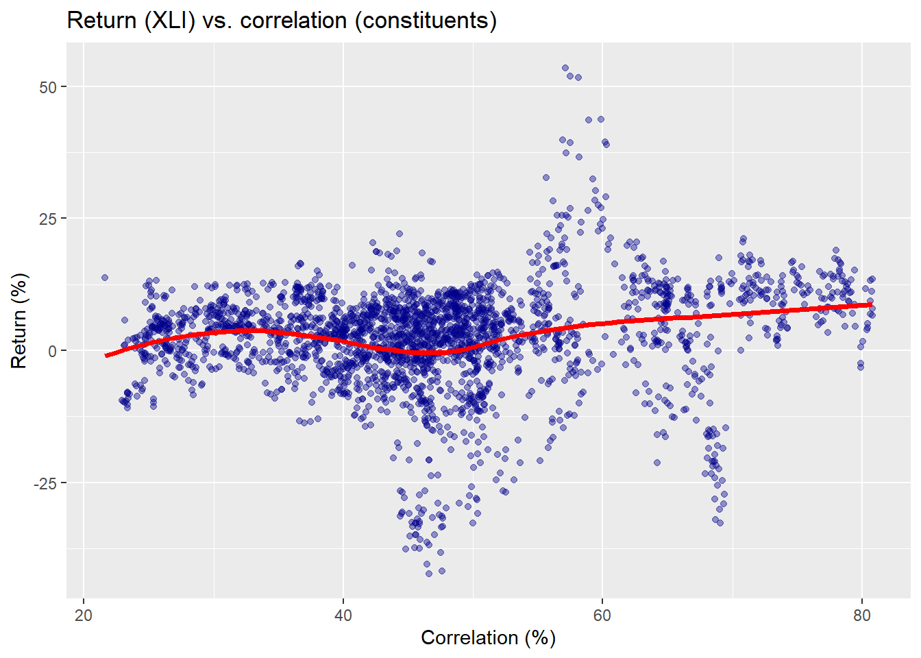
Here the red line is not a kernel regression, but another non-parametric method we use for ease of presentation.3 Now we’ll run through all the data wrangling and calculations to create multiple windows on separate 250 trading periods in our training set, which runs from about 2005 to mid-2015. We’ll select one of those periods to show what’s going on graphically to compare the different results and predictive models. First, we show a scatter plot of the causal subset of pairwise correlations and XLI returns for the 2007-2008 period.
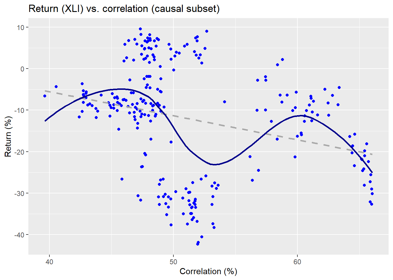
The linear regression is the dashed line and the non-parametric is the wavy line. Clearly, the relationship is on a downward trend as one might expect for that period. Now let’s look at the non-causal subset.
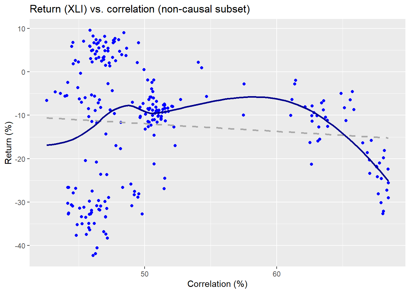
The non-parametric regression line implies a pretty weird function, while the linear regression suggests almost no relationship. Already, we can see some evidence that the causal subset may do a better job at explaining the returns on the index than the non-causal. We’ll run regressions on the returns vs. the correlation subsets for a kernel and linear model. We present the \(R^{2}\) results in the table below.
| Models | Causal | Non-causal |
|---|---|---|
| Kernel | 41.3 | 15.4 |
| Linear | 7.7 | 0.9 |
The causal subset using a kernel regression outperforms the linear model by an order of magnitude. Its explanatory power is more than double a kernel regression using the non-causal subset and better than two orders of magnitude vs. a linear model also using the non-causal subset.
Now we’ll run the kernel and linear regressions on all the periods. We present the \(R^{2}\) for the different regression models in a chart below.
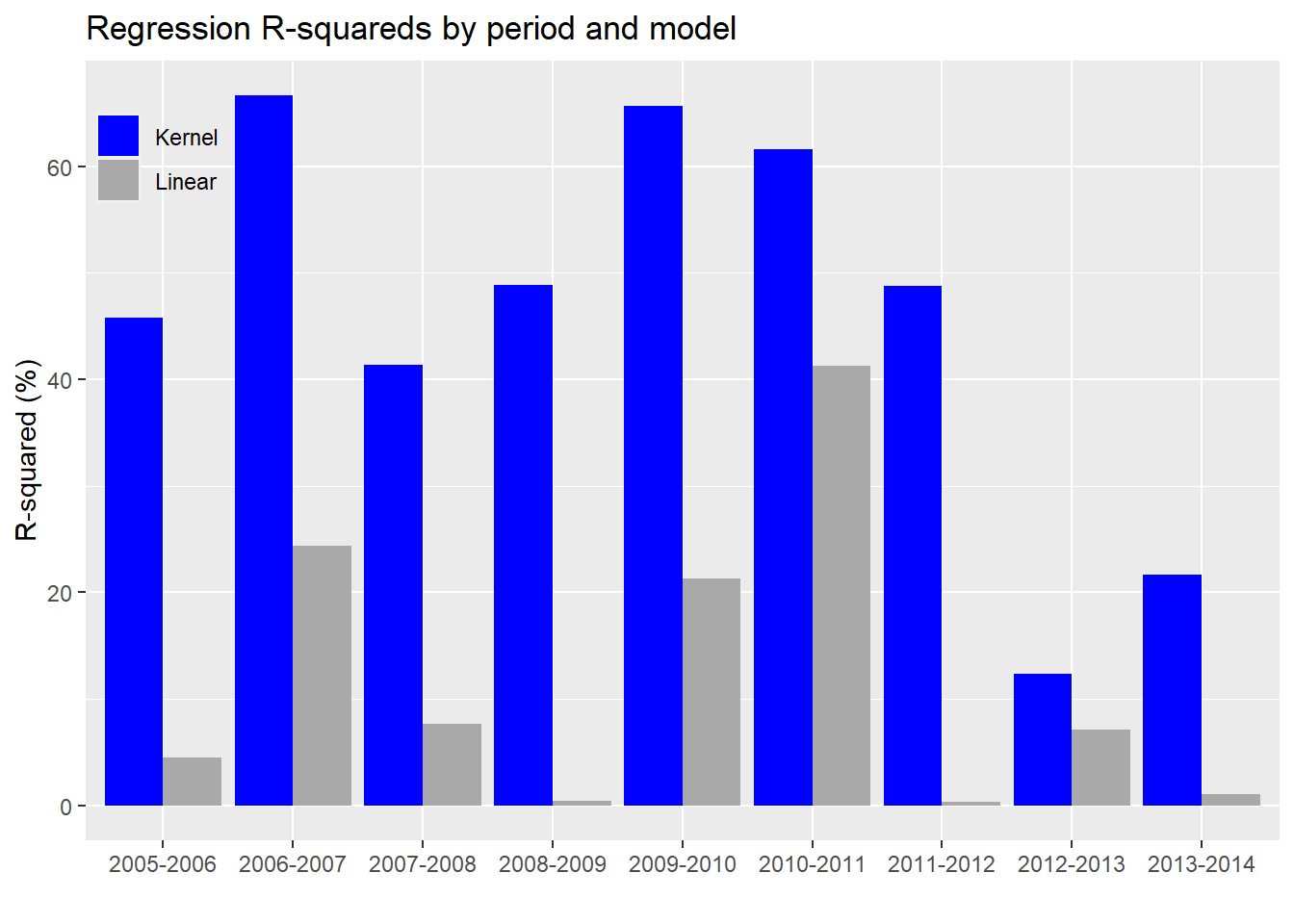
In every case, the kernel regression model does a better job of explaining the variability in the index’s returns than the linear model. For completeness, we’ll include the linear model with the non-causal constituents.

Based on the chart above, we see that the kernel regression outperforms linear regression based on the non-causal subset too. Interestingly, the non-causal subset sometimes outperforms the causal on the linear model. We’re not entirely sure why this is the case. Of course, that mainly happens in the 2005-2007 time frame. This could be the result of correlations changing in the forecast period on these few occasions. Or it might be due to periods where correlations among the non-causal constituents rise, suggesting a stronger linear relationship with forward returns (especially during an upward trending market) even if the causal link from the prior period is weak.
The final metric we’d like to check is the root mean-squared error (RMSE) on the kernel vs. linear regressions.
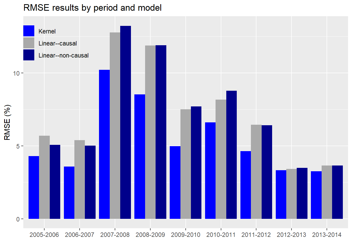
As evident, the kernel regression using the causal subset has a lower error than the linear regressions on either the causal or non-causal subsets. Notice too that the error is not stable across periods and increases (predictably) during market turbulence (2007-2009). Interestingly, the differences in error rates also rise and fall over time, more easily seen in the graph below.
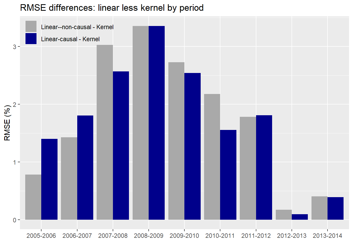
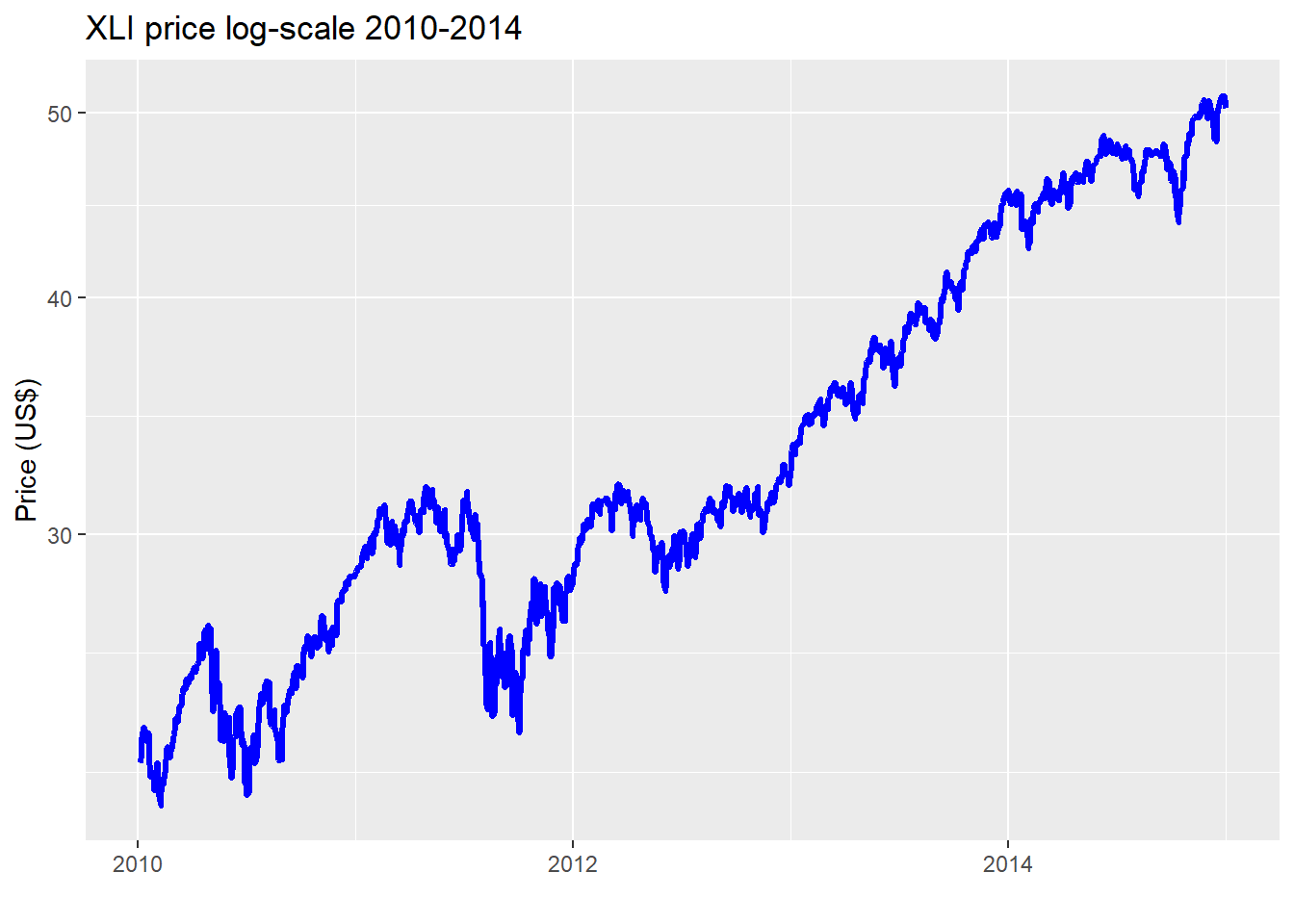
The average difference in error between the kernel and linear regression using the causal subset is about 1.7% points while it’s 1.8% points for the non-causal. While that difference doesn’t seem that different, we can see that there is some variability as shown in the graph. Whether fund managers would find that close to 2% point difference meaningful is likely to depend on the degree to which the lower error rate contributes to performance improvement. A better performing predictive model is one thing; whether it can be used to generate better risk-adjusted returns is another! Nonetheless, two points of achievable outperformance is nothing to sneeze at. Of concern, is the narrowing in performance in the 2012-2014 time frame. We suspect that is because that market enjoyed a relatively smooth, upwardly trending environment in that period as shown in the chart below.
Whether or not the narrowing of error between the kernel and linear regressions is likely to persist would need to be analyzed on the test set. But we’ll save that for another post. What have we learned thus far?
Generalized correlations appear to do a good job at identifying causal, non-linear relationships.
Using the output from a generalized correlation and employing a kernel regression algorithm, we can produce models that explain the variability in returns better than linear regressions using both causal and non-causal subsets.
The model error is lower for the causal subset kernel regressions vs. the other models too. However, that performance does appear to moderate in calm, upwardly trending markets.
Where could we go from here with these results? We might want to test this on other sector ETFs. And if the results bore out similar performance, then we could look to build some type of factor model. For example, we might go long the high causal and short the low causal stocks. Or we could go long the high causal and short the index to see if there is an “invisible” factor. Whatever the case, we’re interested to know what readers would like to see. More on generalized correlations or time to move on? Drop us a response at nbw dot osm at gmail. Until next time, the R and Python code are below.
One note on the Python code: we could not find an equivalent Python package to generalCorr. We did attempt to recreate it, but with the the complexity of the functions and the dependencies (e.g., R package np), it was simply taking too long. We also considered running R from within Python (using the rpy package), but realized that was quite an undertaking too! Hence, we imported the causal list created in R into our Python environment and then ran the rest of the analysis. We apologize to the Pythonistas. We try to reproduce everything in both languages. But in this case it was a task better suited for a long term project. We may, nevertheless, put a Python version on our TODO stack. If completed we’ll post here and on GitHub. Thanks for understanding!
R code:
# Built using R 3.6.2

## Load packages
suppressPackageStartupMessages({
  library(tidyverse)
  library(tidyquant)
  library(reticulate)
  library(generalCorr)
})

## Load data
prices_xts <- readRDS("corr_2_prices_xts.rds")

# Create function for rolling correlation
mean_cor <- function(returns)
{
  # calculate the correlation matrix
  cor_matrix <- cor(returns, use = "pairwise.complete")

  # set the diagonal to NA (may not be necessary)
  diag(cor_matrix) <- NA

  # calculate the mean correlation, removing the NA
  mean(cor_matrix, na.rm = TRUE)
}

# Create return frames for manipulation
comp_returns <- ROC(prices_xts[,-1], type = "discrete") # kernel regression
tot_returns <- ROC(prices_xts, type = "discrete") # for generalCorr

# Create data frame for regression
corr_comp <- rollapply(comp_returns, 60,
                       mean_cor, by.column = FALSE, align = "right")

xli_rets <- ROC(prices_xts[,1], n=60, type = "discrete")

# Merge series and create train-test split
total_60 <- merge(corr_comp, lag.xts(xli_rets, -60))[60:(nrow(corr_comp)-60)]
colnames(total_60) <- c("corr", "xli")
split <- round(nrow(total_60)*.70)

train_60 <- total_60[1:split,]
test_60 <- total_60[(split+1):nrow(total_60),]

# Create train set for generalCorr
tot_split <- nrow(train_60)+60
train <- tot_returns[1:tot_split,]
test <- tot_returns[(tot_split+1):nrow(tot_returns),]

# Graph originaal scatter plot
train_60 %>%
  ggplot(aes(corr*100, xli*100)) +
  geom_point(color = "darkblue", alpha = 0.4) +
  labs(x = "Correlation (%)",
       y = "Return (%)",
       title = "Return (XLI) vs. correlation (constituents)") +
  geom_smooth(method = "loess", formula = y ~ x, se=FALSE, size = 1.25, color = "red")


# Create helper function
cause_mat <- function(df){
  mat_1 <- df[,!apply(is.na(df),2, all)]
  mat_1 <- as.matrix(coredata(mat_1))
  out <- causeSummary(mat_1)
  out <- as.data.frame(out)
  out
}

# Create column and row indices
col_idx <- list(c(1:22), c(1,23:44), c(1,45:64))
row_idx <- list(c(1:250), c(251:500), c(501:750), c(751:1000),
                c(1001:1250), c(1251:1500), c(1501:1750), c(1751:2000),
                c(2001:2250), c(2251:2500))

# Create cause list for each period: which stocks cause the index
cause <- list()
for(i in 1:length(row_idx)){
  out <- list()
  for(j in 1:length(col_idx)){
    out[[j]] <- cause_mat(train[row_idx[[i]], col_idx[[j]]])
  }
  cause[[i]] <- out
}


# Bind cause into one list
cause_lists <- list()

for(i in 1:length(cause)){
  out <- do.call("rbind", cause[[i]]) %>%
    filter(cause != "xli") %>%
    select(cause) %>%
    unlist() %>%
    as.character()

  cause_lists[[i]] <- out

}

# Save cause_lists for use in Python
max_l <- 0
for(i in 1:length(cause_lists)){
  if(length(cause_lists[[i]]) > max_l){
    max_l <- length(cause_lists[[i]])
  }
}

write_l <- matrix(nrow = length(cause_lists), ncol = max_l)
for(i in 1:length(cause_lists)){
  write_l[i, 1:length(cause_lists[[i]])] <- cause_lists[[i]]

}

write.csv(write_l, "cause_lists.csv")


## Use cause list to run rolling correlations and aggregate forward returns for regression
cor_idx <- list(c(191:500), c(441:750), c(691:1000), c(941:1250),
                c(1191:1500), c(1441:1750), c(1691:2000), c(1941:2250),
                c(2191:2500))

# Add 1 since xli is price while train is ret so begin date is off by 1 biz day
ret_idx <- list(c(251:561), c(501:811), c(751:1061), c(1001:1311),
                c(1251:1561), c(1501:1811), c(1751:2061), c(2001:2311),
                c(2251:2561))


merge_list <- list()
for(i in 1:length(cor_idx)){
  corr <- rollapply(train[cor_idx[[i]], cause_lists[[i]]], 60,
                    mean_cor, by.column = FALSE, align = "right")
  ret <- ROC(prices_xts[ret_idx[[i]],1], n=60, type = "discrete")
  merge_list[[i]] <- merge(corr = corr[60:310], xli = coredata(ret[61:311]))
}

# Run correlations on non cause list
non_cause_list <- list()
for(i in 1:length(cor_idx)){
  corr <- rollapply(train[cor_idx[[i]], !colnames(train)[-1] %in% cause_lists[[i]]], 60,
                    mean_cor, by.column = FALSE, align = "right")
  ret <- ROC(prices_xts[ret_idx[[i]],1], n=60, type = "discrete")
  non_cause_list[[i]] <- merge(corr = corr[60:310], xli = coredata(ret[61:311]))
}


## Load data
merge_list <- readRDS("corr3_genCorr_list.rds")
non_cause_list <- readRDS("corr3_genCorr_non_cause_list.rds")

# Graphical example of one period
cause_ex <- merge_list[[3]]

cause_ex$corr_non <- rollapply(train[cor_idx[[3]], !colnames(train)[-1] %in% cause_lists[[3]]],
                                     60, mean_cor, by.column = FALSE, align = "right")[60:310]

# Graph causal subset against returns
cause_ex %>%
  ggplot(aes(corr*100, xli*100)) +
  geom_point(color = "blue") +
  geom_smooth(method="lm", formula = y ~ x, se=FALSE, color = "darkgrey", linetype = "dashed")+
  geom_smooth(method="loess", formula = y ~ x, se=FALSE, color = "darkblue") +
  labs(x = "Correlation (%)",
       y = "Return (%)",
       title = "Return (XLI) vs. correlation (causal subset)")

# Graph non causal
cause_ex %>%
  ggplot(aes(corr_non*100, xli*100)) +
  geom_point(color = "blue") +
  geom_smooth(method="lm", formula = y ~ x, se=FALSE, color = "darkgrey", linetype = "dashed")+
  geom_smooth(method="loess", formula = y ~ x, se=FALSE, color = "darkblue") +
  labs(x = "Correlation (%)",
       y = "Return (%)",
       title = "Return (XLI) vs. correlation (non-causal subset)")

# Run models
causal_kern <- kern(cause_ex$xli, cause_ex$corr)$R2
causal_lin <- summary(lm(cause_ex$xli ~ cause_ex$corr))$r.squared
non_causal_kern <- kern(cause_ex$xli, cause_ex$corr_non)$R2
non_causal_lin <- summary(lm(cause_ex$xli ~ cause_ex$corr_non))$r.squared

# Show table
data.frame(Models = c("Kernel", "Linear"),
           Causal = c(causal_kern, causal_lin),
           `Non-causal` = c(non_causal_kern, non_causal_lin),
           check.names = FALSE) %>%
  mutate_at(vars('Causal', `Non-causal`), function(x) round(x,3)*100) %>%
  knitr::kable(caption = "Regression R-squareds (%)")

## Linear regression
models <- list()
for(i in 1:length(merge_list)){
  models[[i]] <- lm(xli~corr, merge_list[[i]])
}

model_df <- data.frame(model = seq(1,length(models)),
                       rsq = rep(0,length(models)),
                       t_int = rep(0,length(models)),
                       t_coef = rep(0,length(models)),
                       P_int = rep(0,length(models)),
                       p_coef = rep(0,length(models)))

for(i in 1:length(models)){
  model_df[i,2] <- broom::glance(models[[i]])[1]
  model_df[i,3] <- broom::tidy(models[[i]])[1,4]
  model_df[i,4] <- broom::tidy(models[[i]])[2,4]
  model_df[i,5] <- broom::tidy(models[[i]])[1,5]
  model_df[i,6] <- broom::tidy(models[[i]])[2,5]
}

start <- index(train)[seq(250,2250,250)] %>% year()
end <- index(train)[seq(500,2500,250)] %>% year()

model_dates <- paste(start, end, sep = "-")

model_df <- model_df %>%
  mutate(model_dates = model_dates) %>%
  select(model_dates, everything())


## Kernel regresssion
kernel_models <- list()
for(i in 1:length(merge_list)){
  kernel_models[[i]] <- kern(merge_list[[i]]$xli, merge_list[[i]]$corr)
}


kern_model_df <- data.frame(model_dates = model_dates,
                       rsq = rep(0,length(kernel_models)),
                       rmse = rep(0,length(kernel_models)),
                       rmse_scaled = rep(0,length(kernel_models)))

for(i in 1:length(kernel_models)){
  kern_model_df[i,2] <- kernel_models[[i]]$R2
  kern_model_df[i,3] <- sqrt(kernel_models[[i]]$MSE)
  kern_model_df[i,4] <- sqrt(kernel_models[[i]]$MSE)/sd(merge_list[[i]]$xli)
}

## Load data
model_df <- readRDS("corr3_lin_model_df.rds")
kern_model_df <- readRDS("corr3_kern_model_df.rds")

## R-squared graph
data.frame(Dates = model_dates,
           Linear = model_df$rsq,
           Kernel = kern_model_df$rsq) %>%
  gather(key, value, -Dates) %>%
  ggplot(aes(Dates, value*100, fill = key)) +
  geom_bar(stat = "identity", position = "dodge") +
  scale_fill_manual("", values = c("blue", "darkgrey")) +
  labs(x = "",
       y = "R-squared (%)",
       title = "R-squared output for regression results by period and model") +
  theme(legend.position = c(0.06,0.9),
        legend.background = element_rect(fill = NA))

# NOn_causal linear model
non_models <- list()
for(i in 1:length(reg_list)){
  non_models[[i]] <- lm(xli~corr, non_cause_list[[i]])
}

non_model_df <- data.frame(model = seq(1,length(models)),
                           rsq = rep(0,length(models)),
                           t_int = rep(0,length(models)),
                           t_coef = rep(0,length(models)),
                           P_int = rep(0,length(models)),
                           p_coef = rep(0,length(models)))

for(i in 1:length(non_models)){
  non_model_df[i,2] <- broom::glance(non_models[[i]])[1]
  non_model_df[i,3] <- broom::tidy(non_models[[i]])[1,4]
  non_model_df[i,4] <- broom::tidy(non_models[[i]])[2,4]
  non_model_df[i,5] <- broom::tidy(non_models[[i]])[1,5]
  non_model_df[i,6] <- broom::tidy(non_models[[i]])[2,5]
}

non_model_df <- non_model_df %>%
  mutate(model_dates = model_dates) %>%
  select(model_dates, everything())

# Bar chart of causal and non-causal
data.frame(Dates = model_dates,
           `Linear--causal` = model_df$rsq,
           `Linear--non-causal` = non_model_df$rsq,
           Kernel = kern_model_df$rsq,
           check.names = FALSE) %>%
  gather(key, value, -Dates) %>%
  ggplot(aes(Dates, value*100, fill = key)) +
  geom_bar(stat = "identity", position = "dodge") +
  scale_fill_manual("", values = c("blue", "darkgrey", "darkblue")) +
  labs(x = "",
       y = "R-squared (%)",
       title = "R-squared output for regression results by period and model") +
  theme(legend.position = c(0.3,0.9),
        legend.background = element_rect(fill = NA))

## RMSE comparison
lin_rmse <- c()
lin_non_rmse <- c()
kern_rmse <- c()

for(i in 1:length(models)){
  lin_rmse[i] <- sqrt(mean(models[[i]]$residuals^2))
  lin_non_rmse[i] <- sqrt(mean(non_models[[i]]$residuals^2))
  kern_rmse[i] <- sqrt(kernel_models[[i]]$MSE)
}

data.frame(Dates = model_dates,
           `Linear--causal` = lin_rmse,
           `Linear--non-causal` = lin_non_rmse,
           Kernel = kern_rmse,
           check.names = FALSE) %>%
  gather(key, value, -Dates) %>%
  ggplot(aes(Dates, value*100, fill = key)) +
  geom_bar(stat = "identity", position = "dodge") +
  scale_fill_manual("", values = c("blue", "darkgrey", "darkblue")) +
  labs(x = "",
       y = "RMSE (%)",
       title = "RMSE results by period and model") +
  theme(legend.position = c(0.08,0.9),
        legend.background = element_rect(fill = NA))

## RMSE graph
data.frame(Dates = model_dates,
           `Kernel - Linear-causal` = lin_rmse - kern_rmse,
           `Kernel - Linear--non-causal` = lin_non_rmse - kern_rmse ,
           check.names = FALSE) %>%
  gather(key, value, -Dates) %>%
  ggplot(aes(Dates, value*100, fill = key)) +
  geom_bar(stat = "identity", position = "dodge") +
  scale_fill_manual("", values = c("darkgrey", "darkblue")) +
  labs(x = "",
       y = "RMSE (%)",
       title = "RMSE differences by period and model") +
  theme(legend.position = c(0.1,0.9),
        legend.background = element_rect(fill = NA))

avg_lin <- round(mean(lin_rmse - kern_rmse),3)*100
avg_lin_non <- round(mean(lin_non_rmse - kern_rmse),3)*100

## Price graph
prices_xts["2010/2014","xli"] %>%
  ggplot(aes(index(prices_xts["2010/2014"]), xli)) +
  geom_line(color="blue", size = 1.25) +
  labs(x = "",
       y = "Price (US$)",
       title = "XLI price log-scale") +
  scale_y_log10()
Python code:
# Built using Python 3.7.4

## Import packages
import numpy as np
import pandas as pd
import pandas_datareader as dr
import matplotlib.pyplot as plt
import matplotlib
%matplotlib inline
matplotlib.rcParams['figure.figsize'] = (12,6)
plt.style.use('ggplot')

## Load data
prices = pd.read_pickle('xli_prices.pkl')
xli = pd.read_pickle('xli_etf.pkl')

returns = prices.drop(columns = ['OTIS', 'CARR']).pct_change()
returns.head()

xli_rets = xli.pct_change(60).shift(-60)

## Import cause_lists created using R
# See R code above to create
cause_lists = pd.read_csv("cause_lists.csv",header=None)
cause_lists = cause_lists.iloc[1:,1:]

## Define correlation function
def mean_cor(df):
    corr_df = df.corr()
    np.fill_diagonal(corr_df.values, np.nan)
    return np.nanmean(corr_df.values)

## Create data frames and train-test splits
corr_comp = pd.DataFrame(index=returns.index[59:])
corr_comp['corr'] = [mean_cor(returns.iloc[i-59:i+1,:]) for i in range(59,len(returns))]
xli_rets = xli.pct_change(60).shift(-60)
total_60 = pd.merge(corr_comp, xli_rets, how="left", on="Date").dropna()
total_60.columns = ['corr', 'xli']

split = round(len(total_60)*.7)
train_60 = total_60.iloc[:split,:]
test_60 = total_60.iloc[split:, :]

tot_returns = pd.merge(xli,prices.drop(columns = ["CARR", "OTIS"]), "left", "Date")
tot_returns = tot_returns.rename(columns = {'Adj Close': 'xli'})
tot_returns = tot_returns.pct_change()
tot_split = len(train_60)+60
train = tot_returns.iloc[:tot_split,:]
test = tot_returns.iloc[tot_split:len(tot_returns),:]
train.head()

## Create period indices to run pairwise correlations and forward returns for regressions
cor_idx = np.array((np.arange(190,500), np.arange(440,750), np.arange(690,1000), np.arange(940,1250),
                np.arange(1190,1500), np.arange(1440,1750), np.arange(1690,2000), np.arange(1940,2250),
                np.arange(2190,2500)))

# Add 1 since xli is price while train is ret so begin date is off by 1 biz day
ret_idx = np.array((np.arange(250,561), np.arange(500,811), np.arange(750,1061), np.arange(1000,1311),
                np.arange(1250,1561), np.arange(1500,1811), np.arange(1750,2061), np.arange(2000,2311),
                np.arange(2250,2561)))

# Create separate data arrays using cause_lists and indices
# Causal subset
merge_list = [0]*9
for i in range(len(cor_idx)):
        dat = train.reset_index().loc[cor_idx[i],cause_lists.iloc[i,:].dropna()]
        corr = [mean_cor(dat.iloc[i-59:i+1,:]) for i in range(59,len(dat))]
        ret1 = xli.reset_index().iloc[ret_idx[i],1]
        ret1 = ret1.pct_change(60).shift(-60).values
        ret1 = ret1[~np.isnan(ret1)]
        merge_list[i] = np.c_[corr, ret1]

# Non-causal subset
non_cause_list = [0] * 9
for i in range(len(cor_idx)):
    non_c = [x for x in list(train.columns[1:]) if x not in cause_lists.iloc[3,:].dropna().to_list()]
    dat = train.reset_index().loc[cor_idx[i], non_c]
    corr = [mean_cor(dat.iloc[i-59:i+1,:]) for i in range(59,len(dat))]
    ret1 = xli.reset_index().iloc[ret_idx[i],1]
    ret1 = ret1.pct_change(60).shift(-60).values
    ret1 = ret1[~np.isnan(ret1)]
    non_cause_list[i] = np.c_[corr, ret1]


# Create single data set for example
cause_ex = np.c_[merge_list[2],non_cause_list[2][:,0]]

# Run linear regression
from sklearn.linear_model import LinearRegression
X = cause_ex[:,0].reshape(-1,1)
y = cause_ex[:,1]
lin_reg = LinearRegression().fit(X,y)
y_pred = lin_reg.predict(X)

# Graph scatterplot with lowess and linear regression
import seaborn as sns
sns.regplot(cause_ex[:,0]*100, cause_ex[:,1]*100, color = 'blue', lowess=True, line_kws={'color':'darkblue'}, scatter_kws={'alpha':0.4})
plt.plot(X*100, y_pred*100, color = 'darkgrey', linestyle='dashed')
plt.xlabel("Correlation (%)")
plt.ylabel("Return (%)")
plt.title("Return (XLI) vs. correlation (causal subset)")
plt.show()

# Run linear regression on non-causal component of cause_ex data frame
from sklearn.linear_model import LinearRegression
X_non = cause_ex[:,2].reshape(-1,1)
y = cause_ex[:,1]
lin_reg_non = LinearRegression().fit(X_non,y)
y_pred_non = lin_reg_non.predict(X_non)

# Graph scatter plot
sns.regplot(cause_ex[:,2]*100, cause_ex[:,1]*100, color = 'blue', lowess=True, line_kws={'color':'darkblue'}, scatter_kws={'alpha':0.4})
plt.plot(X_non*100, y_pred_non*100, color = 'darkgrey', linestyle='dashed')
plt.xlabel("Correlation (%)")
plt.ylabel("Return (%)")
plt.title("Return (XLI) vs. correlation (non-causal subset)")
plt.show()

## Run regressions on cause_ex
from sklearn_extensions.kernel_regression import KernelRegression
import statsmodels.api as sm

x = cause_ex[:,0]
X = sm.add_constant(x)
x_non = cause_ex[:,2]
X_non = sm.add_constant(x_non)
y = cause_ex[:,1]
lin_c = sm.OLS(y,X).fit().rsquared*100
lin_nc = sm.OLS(y,X_non).fit().rsquared*100

# Note KernelRegressions() returns different results than kern() from generalCorr
kr = KernelRegression(kernel='rbf', gamma=np.logspace(-5,5,10))
kr.fit(X,y)
kr_c = kr.score(X,y)*100

kr.fit(X_non, y)
kr_nc = kr.score(X_non, y)*100

print(f"R-squared for kernel regression causal subset: {kr_c:0.01f}")
print(f"R-squared for kernel regression non-causal subset: {kr_nc:0.01f}")
print(f"R-squared for linear regression causal subset: {lin_c:0.01f}")
print(f"R-squared for linear regression non-causal subset: {lin_nc:0.01f}")


## Run regressions on data lists
import statsmodels.api as sm

# Causal subset linear model
lin_mod = []
for i in range(len(merge_list)):
    x = merge_list[i][:,0]
    X = sm.add_constant(x)
    y = merge_list[i][:,1]
    mod_reg = sm.OLS(y,X).fit()
    lin_mod.append(mod_reg.rsquared)

start = train.index[np.arange(249,2251,250)].year
end = train.index[np.arange(499,2500,250)].year

model_dates = [str(x)+"-"+str(y) for x,y in zip(start,end)]

# Non-causal subset linear model
non_lin_mod = []
for i in range(len(non_cause_list)):
    x = non_cause_list[i][:,0]
    X = sm.add_constant(x)
    y = non_cause_list[i][:,1]
    mod_reg = sm.OLS(y,X).fit()
    non_lin_mod.append(mod_reg.rsquared)


# Causal subset kernel regression
from sklearn_extensions.kernel_regression import KernelRegression

kern = []
for i in range(len(merge_list)):
    X = merge_list[i][:,0].reshape(-1,1)
    y = merge_list[i][:,1]
    kr = KernelRegression(kernel='rbf', gamma=np.logspace(-5,5,10))
    kr.fit(X,y)
    kern.append(kr.score(X,y))


## Plot R-squared comparisons

# Causal kernel vs. linear
df = pd.DataFrame(np.c_[np.array(kern)*100, np.array(lin_mod)*100], columns = ['Kernel', 'Linear'])
df.plot(kind='bar', color = ['blue','darkgrey'])
plt.xticks(ticks = df.index, labels=model_dates, rotation=0)
plt.legend(loc = 'upper left')
plt.show()

# Causal kerner vs causal & non-causal linear
df = pd.DataFrame(np.c_[np.array(kern)*100, np.array(lin_mod)*100, np.array(non_lin_mod)*100],
                  columns = ['Kernel', 'Linear-causal', 'Linear--non-causal'])
df.plot(kind='bar', color = ['blue','darkgrey', 'darkblue'], width=.85)
plt.xticks(ticks = df.index, labels=model_dates, rotation=0)
plt.legend(bbox_to_anchor=(0.3, 0.9), loc = 'center')
plt.ylabel("R-squared (%)")
plt.title("R-squared output for regression results by period and model")
plt.show()

## Create RMSE lists
lin_rmse = []
for i in range(len(merge_list)):
    x = merge_list[i][:,0]
    X = sm.add_constant(x)
    y = merge_list[i][:,1]
    mod_reg = sm.OLS(y,X).fit()
    lin_rmse.append(np.sqrt(mod_reg.mse_resid))

lin_non_rmse = []
for i in range(len(non_cause_list)):
    x = non_cause_list[i][:,0]
    X = sm.add_constant(x)
    y = non_cause_list[i][:,1]
    mod_reg = sm.OLS(y,X).fit()
    lin_non_rmse.append(np.sqrt(mod_reg.mse_resid))

kern_rmse = []
for i in range(len(merge_list)):
    X = merge_list[i][:,0].reshape(-1,1)
    y = merge_list[i][:,1]
    kr = KernelRegression(kernel='rbf', gamma=np.logspace(-5,5,10))
    kr.fit(X,y)
    rmse = np.sqrt(np.mean((kr.predict(X)-y)**2))
    kern_rmse.append(rmse)

## Graph RMSE comparisons
df = pd.DataFrame(np.c_[np.array(kern_rmse)*100, np.array(lin_rmse)*100, np.array(lin_non_rmse)*100],
                  columns = ['Kernel', 'Linear-causal', 'Linear--non-causal'])
df.plot(kind='bar', color = ['blue','darkgrey', 'darkblue'], width=.85)
plt.xticks(ticks = df.index, labels=model_dates, rotation=0)
plt.legend(loc = 'upper left')
plt.ylabel("RMSE (%)")
plt.title("RMSE results by period and model")
plt.show()


## Graph RMSE differences
kern_lin = [x-y for x,y in zip(lin_rmse, kern_rmse)]
kern_non = [x-y for x,y in zip(lin_non_rmse, kern_rmse)]
df = pd.DataFrame(np.c_[np.array(kern_lin)*100, np.array(kern_non)*100],
                  columns = ['Kernel - Linear-causal', 'Kernel - Linear--non-causal'])
df.plot(kind='bar', color = ['darkgrey', 'darkblue'], width=.85)
plt.xticks(ticks = df.index, labels=model_dates, rotation=0)
plt.legend(loc = 'upper left')
plt.ylabel("RMSE (%)")
plt.title("RMSE differences by period and model")
plt.show()

## Graph XLI
fig, ax = plt.subplots(figsize=(12,6))
ax.plot(xli["2010":"2014"], color='blue')
ax.set_label("")
ax.set_ylabel("Price (US$)")
ax.set_yscale("log")
ax.yaxis.set_major_formatter(ScalarFormatter())
ax.yaxis.set_minor_formatter(ScalarFormatter())
ax.set_title("XLI price log-scale")
plt.show()
We’d like to thank Prof. Vinod for providing us an overview of his package. The implementation of the package is our own: we take all the credit for any errors.↩
Granger causality from C.W. Granger’s 1969 paper “Investigating Causal Relations by Econometric Methods and Cross Spectral Methods”↩
We used ggplot’s loess method for a non-parametric model simply to make the coding easier. A bit lazy, but we wanted to focus on the other stuff.↩